
I upgraded the graphics to my webpage over the weekend. Check out the new look to the Morgue:
http://www.mrpoesmorgue.com
New Look To The Morgue
Moderator: Beowulf
New Look To The Morgue

"Brian, if I parked a supertanker in Central Park, painted it neon orange, and set it on fire, it would be less obvious than your stupidity." --RedImperator
Not bad, though I would suggest that background could be just a bit less dark.
HAB: Crew-Served Weapons Specialist
"Making fun of born-again Christians is like hunting dairy cows with a high powered rifle and scope." --P.J. O'Rourke
"A man who has nothing for which he is willing to fight, nothing which is more important than his own personal safety, is a miserable creature and has no chance of being free unless made and kept so by the exertions of better men than himself." --J.S. Mill
-
Darksider
- Sith Acolyte
- Posts: 5271
- Joined: 2002-12-13 02:56pm
- Location: America's decaying industrial armpit.
It's a morgue. I think the dark background fits well.Ma Deuce wrote:Not bad, though I would suggest that background could be just a bit less dark.
And this is why you don't watch anything produced by Ronald D. Moore after he had his brain surgically removed and replaced with a bag of elephant semen.-Gramzamber, on why Caprica sucks
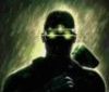
I was worried that the picture was too dark as well. Here's what it looked like after I played with it in Adobe PE, but before I added the lighting fx:Darksider wrote:It's a morgue. I think the dark background fits well.Ma Deuce wrote:Not bad, though I would suggest that background could be just a bit less dark.

I REALLY wanted to use this picture:

but they seem very protective of the pictures on that website, sell prints, etc. I wasn't sure they'd give me permission to use it. I used elements of another picture from another "abandoned buildings" website:

in the final picture. I got permission to use the morgue that I have now from a haunted house website. Here is the original:

What do you all think...should I try to get permission for the actual abandoned morgue picture, and add the open freezer doors to it, or keep what I have?
"Brian, if I parked a supertanker in Central Park, painted it neon orange, and set it on fire, it would be less obvious than your stupidity." --RedImperator

I suggest a consistent layout. Right now, when you´re on the "home" site and go, for example, to "make up and fx" the "Mr. Poes Morgue" headline flips to a slightly different place.
If you go to "star wars" the headline vanishes completely.
The font in "updates" is different from the font in web design.
In general there´s such a big variety of fonts used making it hard to focus on what exactly is text. On a quick look i counted about 10 different fonts. On a page that size you can easily do with one or two.
But that are a couple of nice photos.