Page 1 of 2
Chaos Fighter help needed. [pics!]
Posted: 2006-11-09 08:03pm
by Inquisitor Ryan
Ok people, i'm making a nice CG Battlefleet Gothic fleet movie showing off the chaos ships i've done. *(Will eventually try for one of every race except Tyranids, I suck at organic modelling...)*
But some help is needed, i've prepared a low poly doomfire bomber and will soon be doing a swiftdeath.
Here is the part I need help with, I can't find what they are armed with anywhere. Does anyone know and is kind enough to share that knowledge with me...
Here are the Low poly pics.
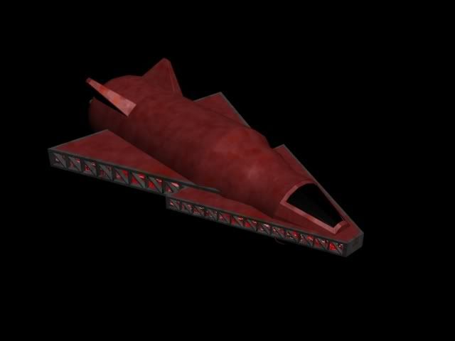
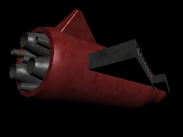
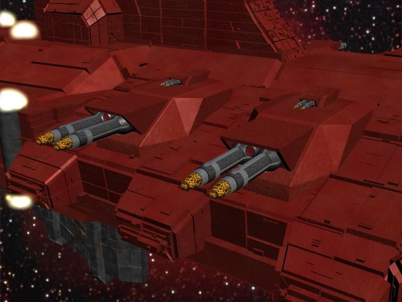
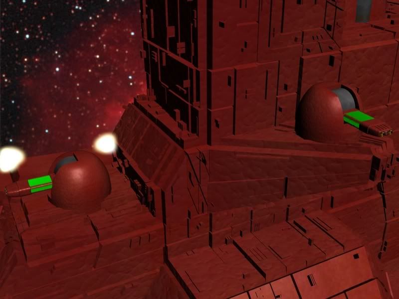
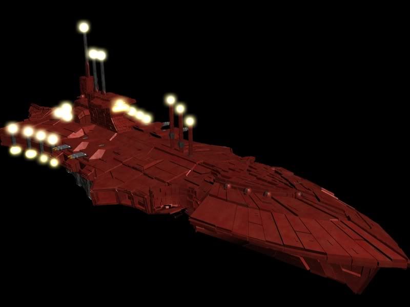
And because I am kind and caring. (Not likely, it's closer to boasting...) Here are some pics of a Devastation Class Cruiser i'm preparing for the animation.
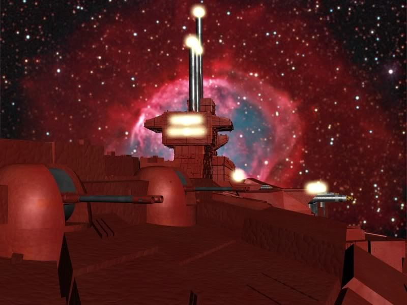
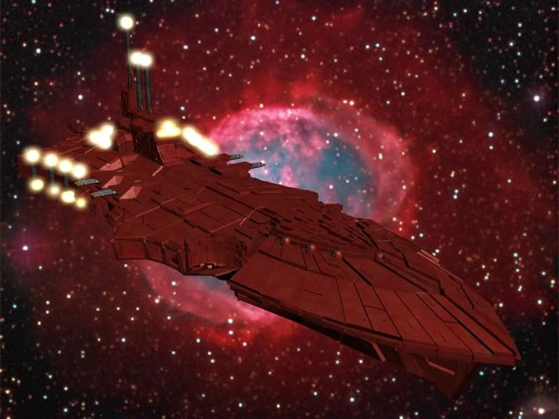
[/list]
Posted: 2006-11-09 08:37pm
by Stormbringer
Damn, kill my internet connection will you!
Either way, you should check out the Specialist Games website. They've got all the Battlelfleet Gothic stuff for download. That should tell you what you need to know as well as giving you all the info for anything else you need.
Posted: 2006-11-09 08:44pm
by Inquisitor Ryan
Got all the BFG stuff but it doesn't give the details for strike craft sadly. (Or decent pictures of them...)
Sorry bout the connection, should've warned in the title that there were pictures.
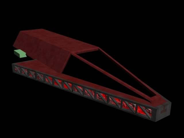
And here is another, a WIP shot of the Swiftdeath.
Posted: 2006-11-09 09:11pm
by LaserRifleofDoom
This should probably be moved to AMP, and get a 56k warning.
But sweet Devastation Class. The fighters are kinda meh. But awesome big-ship.
Posted: 2006-11-09 09:16pm
by Inquisitor Ryan
The fighters aren't meant to hold to close examination, they give me something to fly amongst the cruisers, battleships, escorts and Blackstone fortresses during the animation.
But 2 Things.
1: AMP?? Wheres that... forget it i'll find it.
2: Can I edit it to place a 56k warning, if not can a mod please add it.
Posted: 2006-11-09 09:19pm
by Inquisitor Ryan
And I forgot to add a couple updates for the curious.
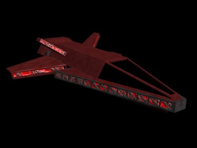
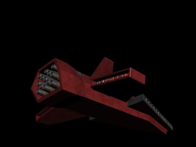
Completed Swiftdeath, low poly.
And thanks for the compliment about the Devastation LRoD.
Posted: 2006-11-09 09:57pm
by Elheru Aran
Check Forgeworld, they have a few Chaos vessels.
Here:
Hellblade fighter:
http://www.forgeworld.co.uk/hellblade.htm
Hell Talon fighter/bomber:
http://www.forgeworld.co.uk/helltalon.htm
Dreadclaw assault pod:
http://www.forgeworld.co.uk/dreadclaw.htm
Posted: 2006-11-10 12:15am
by Inquisitor Ryan
Thanks mate, I have most of them saved to the HD already.
The two fighters are short range atmospheric fighters primarily. (Source: Double Eagle, Dan Abnett)
As for the Dreadclaw.... I dunno if i'll do any scenes involving assault craft. *Mostly because i'm scared of not doing the Dreadclaw justice.*
Posted: 2006-11-10 03:54am
by NecronLord
This goes to AMP.
Posted: 2006-11-10 04:30am
by Inquisitor Ryan
Thanks NL....
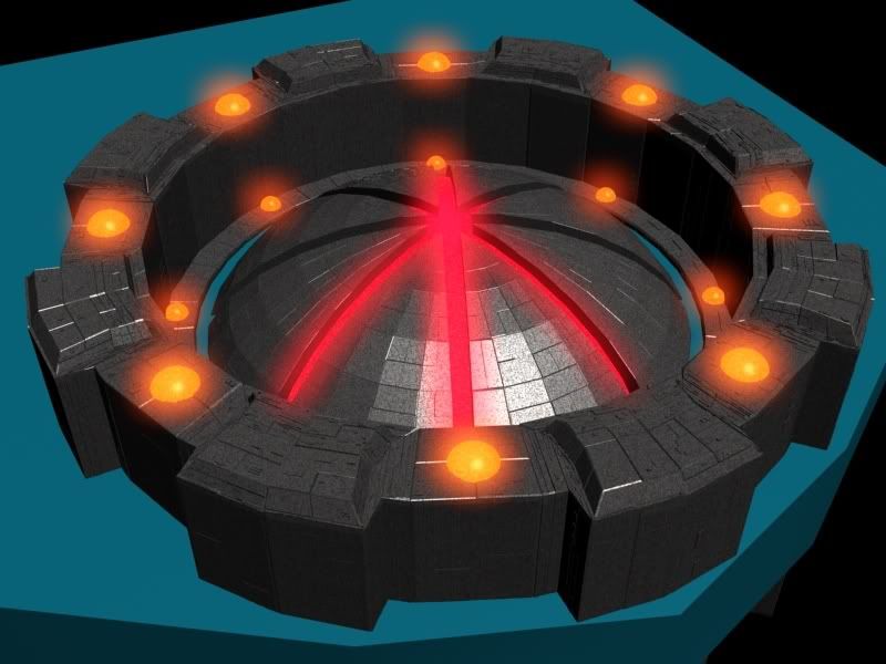
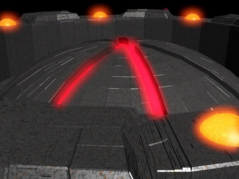
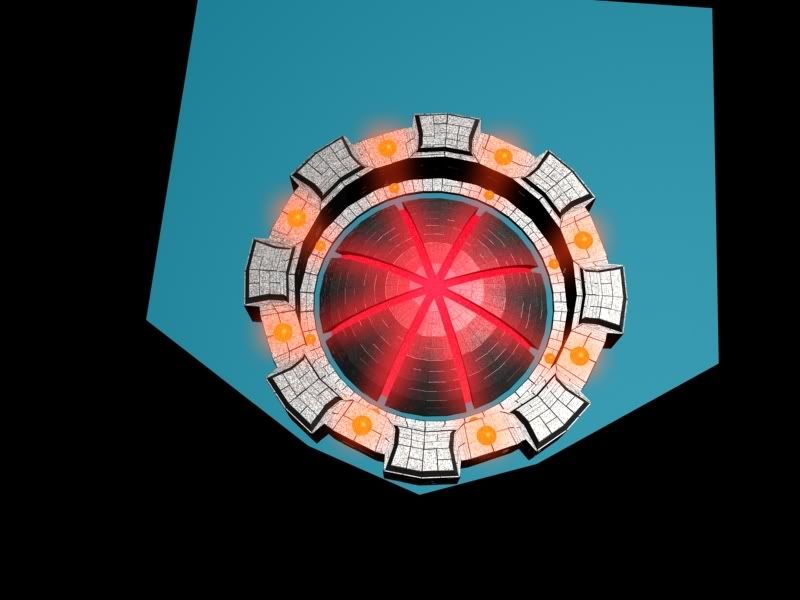
And here some WIP work on the Chaos Planet Killer.
Posted: 2006-11-10 08:20am
by Steel
Just one query, the fighters/bombers in BFG are supposed to be about the same size as a jumbo jet, according to one of the quotes, and much bigger than the atmospheric 1-2 man fighter craft, but with the size of that cockpit window it looks like a teeny one man type. Is that all meant to be a crew compartment?
Posted: 2006-11-10 02:36pm
by salm
Just a note for the textureing: I know this is still WiP but that procedural map (i guess it´s a noise map on the fighters and whatever it is on the carrier) doesn´t look very good. Procedural maps can be very cool because you don´t have to unwrap the beast but in this case i don´t think they´re applied very well.
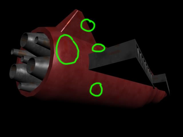
The orange spots on the first fighter "bite" the red color.
The blob thingies on the carrier look really bad. The sturtcture doesn´t fit to a ship like this at all.
Is that map in the bump slot as well? Looks a bit like it.
And the size of the noise map of the station is way too small. It looks like a plastic model over which somebody sprayed specles with a dirty toothbrush. Also the contrast between the light gray and dark gray parts is too hard.
If you want to use procedural mapping on this thing i suggest wrapping up several maps into each other using mix maps.
Here´s a cool tutorial for that. It´s for Max but you can just do the same in whatever 3D package you´re using. It´s for an organic object but to understand procedurals it´s very good.
Complex Shaders
And for renderings like this it´s allways good to kick in some GI if your package supports it (and most do.). It´s doesn´t take long to add and makes the result 10 times better.
If you don´t want to spend time on texturing it yet i suggest rendering it in plain gray or something like that. It just looks better.
I´d also reduce the intensity and perhaps the size of the Glow you´re using for that lights. More doesn´t necessarily equal better.
Posted: 2006-11-10 08:45pm
by Inquisitor Ryan
Steel: I know, they aren't meant to hold up to close scrutiny. They are for mostly distance shots, I will someday make a more scale-correct model for both.
salm: About the first fighter, I don't get what your saying, I don't see any orange spots.
Yes they are procedural maps on everything using a Plugin called symbiontMAX, And the blob things on the carrier I assume your referring to one of my earlier attempt to add lights. That will change, drastically...
And the size of the noise map of the station is way too small. It looks like a plastic model over which somebody sprayed specles with a dirty toothbrush. Also the contrast between the light gray and dark gray parts is too hard.
It's a 30 Kilometre long planet destroying warship, that texture is designed to hold up to extremely close scrutiny. Naturally at a distance it begins to look spotted, also most of these are based of plastic models. *Pointed out for Irony's sake*
Thanks for the link to that tutorial, I can always use a new tut.
GI is actually the only lightsource in the scenes.
Also this is pretty much the limit on my texturing ability.
I couldn't make a texture and map it onto a model if you threw an instruction manual in my face on how to do so. As such I now rely on Symbiont Max.
More updates today.
Posted: 2006-11-10 10:29pm
by Inquisitor Ryan
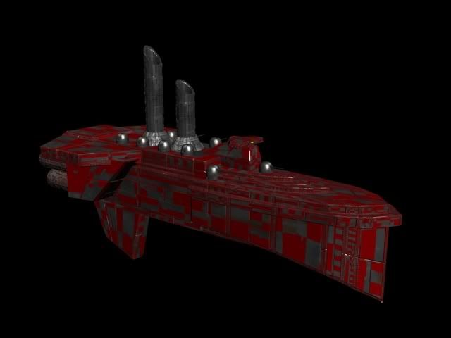
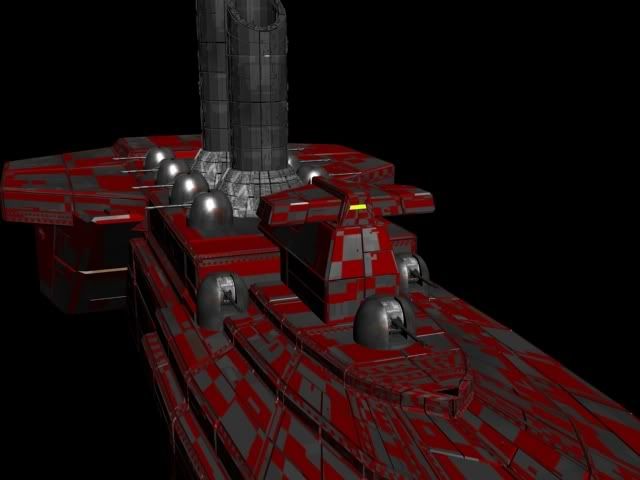
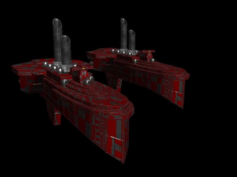
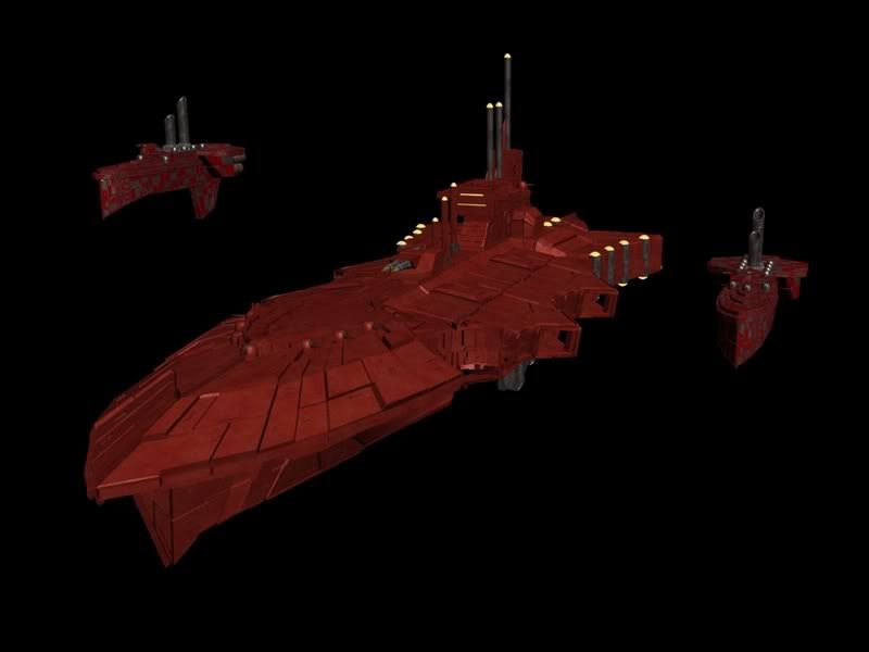
Ok more updates on the models. Two new classes., cookies to the first person to guess them.
A cookie to the first person to guess the new ship...
[/img]
Posted: 2006-11-11 12:40am
by Zor
Why does a starship need smokestacks? Is it powered by Chaos berzerkers shoveling coal into giant furnases or something?
Zor
Posted: 2006-11-11 03:37am
by Inquisitor Ryan
I never understood that myself. But hey they have them on the real model so they're on mine too. (Might add some bloody looking smoke coming out of them.
Posted: 2006-11-11 05:15am
by Sriad
Zor wrote:Why does a starship need smokestacks?
Pressure from corrupt Union bosses.
Posted: 2006-11-11 05:59am
by Inquisitor Ryan
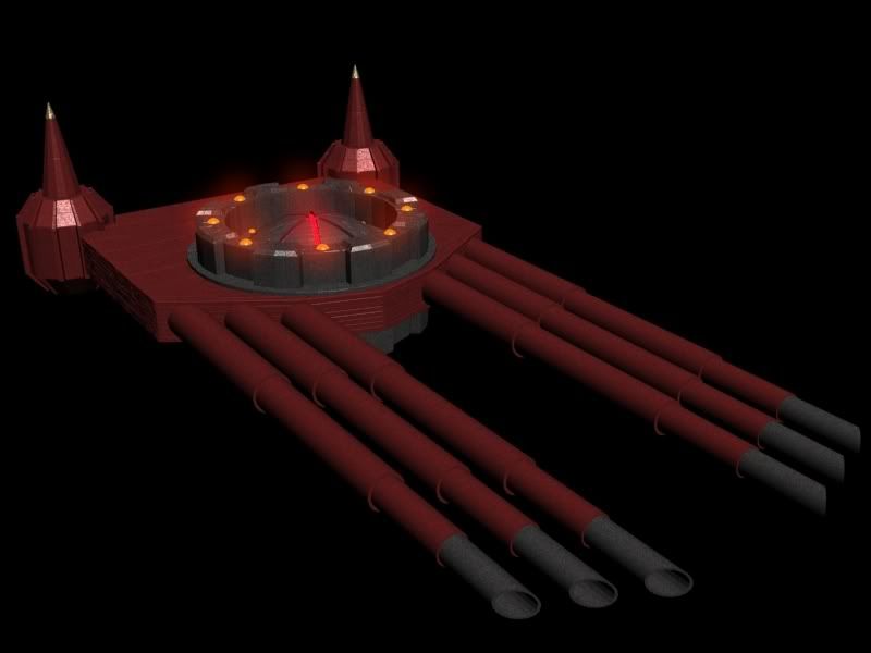
'nother update.
PK This time.
Posted: 2006-11-11 09:26am
by salm
Inquisitor Ryan wrote:
salm: About the first fighter, I don't get what your saying, I don't see any orange spots.
It's a 30 Kilometre long planet destroying warship, that texture is designed to hold up to extremely close scrutiny. Naturally at a distance it begins to look spotted,
I´m talking about this one:

and it looks like speccled by a toothbrush. Real planet destroying warship never look like they´ve been treated with a dirty toothbrush. Even from really far away or really close up. Your shades of gray are too far appart and the size is too small.
I´d try a fairily large noise map with another noise map in each slot which again is fairily large.
Like this:
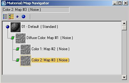
Make the two colors of these two noise maps close togeter like on color 134/134/134 and the other 94/94/94.
I mean like this:
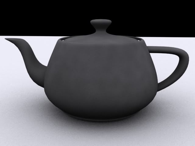
also most of these are based of plastic models. *Pointed out for Irony's sake*
Then the question of course is do you
want your cg models to look like plastic models.
GI is actually the only lightsource in the scenes.
Honestly? In which way. This doesn´t look GI at all. The Max skylight for one generates these typical - how do you say - ambient occlusion shadows as seen in the teapot image which are not there in your renders. Also if you render with a skylight you don´t get these speculars which can be seen in these images.
This is not really that important now because you´ll do the lighting and rendersetup later on, i´m just noting that it looks nicer for wip images like these.
Also this is pretty much the limit on my texturing ability.
I couldn't make a texture and map it onto a model if you threw an instruction manual in my face on how to do so. As such I now rely on Symbiont Max.
Aye, unwraping is a bitch, i know what you mean.
Here´s another plugin that might be interesting for you:
Greeble
I could imagine that this combined with a couple of noise maps looks quite good. I mean if you use the noise maps as posted above and put 4 different greebles with slightly different colors and brightness but same size and offsets into the noise maps map slots.
Posted: 2006-11-11 09:48am
by Inquisitor Ryan

Greeble is a major part of all these models so far. (Especially the Planet Killer
As for the rest, i'll see what I can do, I still don't see the Orange spots but that could be a difference in the brightness settings of out computers.
Posted: 2006-11-14 06:34pm
by Inquisitor Ryan
Planet Killer Updates.
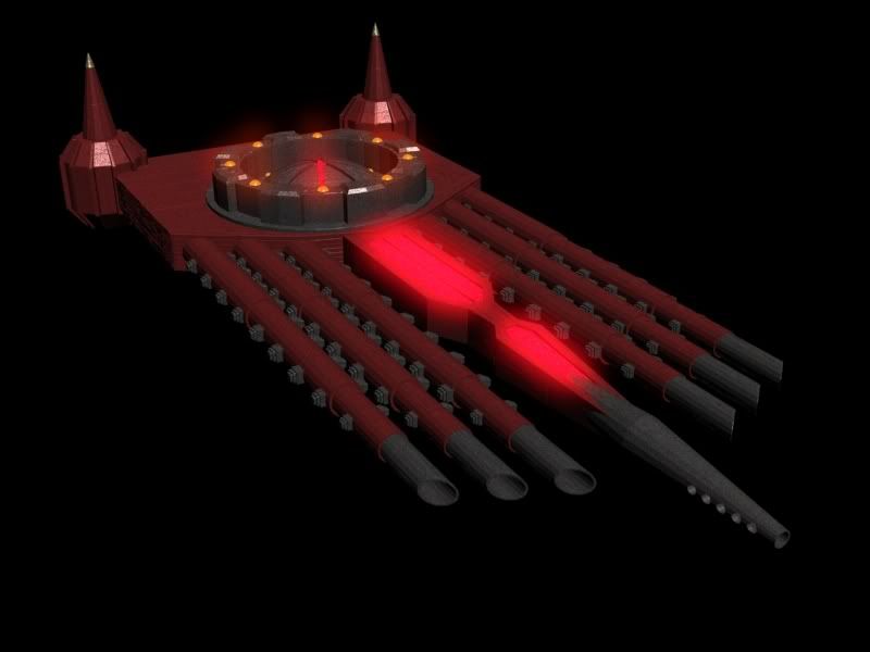
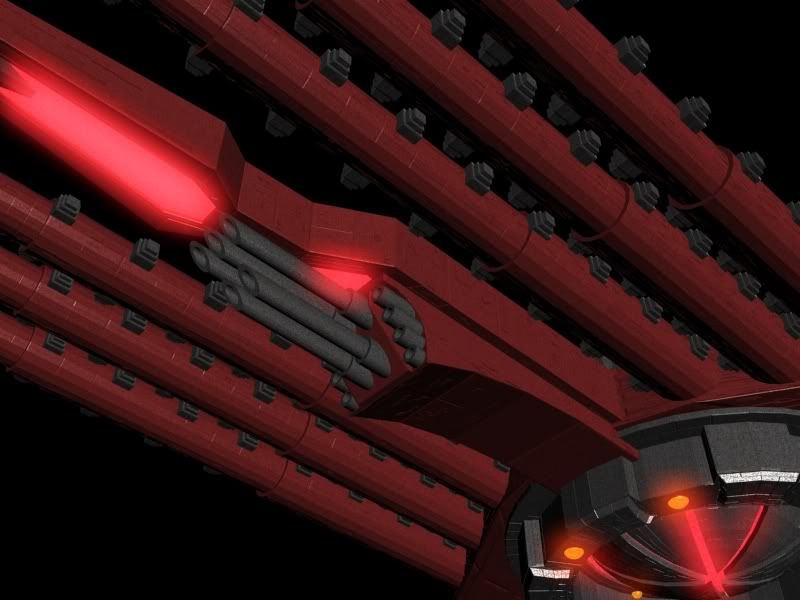
[/img]
Posted: 2006-11-19 07:40pm
by Inquisitor Ryan
Posted: 2006-11-20 07:35am
by Coalition
Hmm, I'd guess Iconoclasts, am I right?
The task group looks like a Styx being escorted by the Iconoclasts.
Do I get a cookie?
Posted: 2006-11-20 08:16am
by Inquisitor Ryan
Absolutely correct on both accounts, you most certainly do get a digital cookie!!!

Posted: 2006-11-20 04:07pm
by salm
Nice character. Your model?


 [/list]


 [/list]


 [/img]


 [/img]