Page 1 of 1
How to draw water in.
Posted: 2007-09-05 05:12am
by Inara
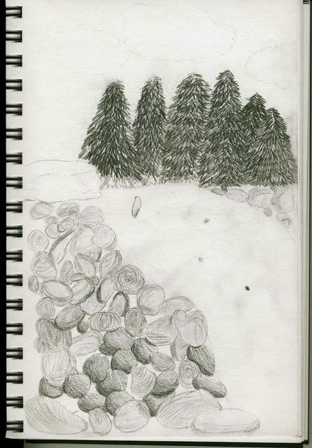
Hokay, so... I'm starting to explore my artistic abilities... and would really like to know how I should go about adding water to this drawing I have in the works.
See, that empty-ish space SHOULD be a stream-ish thing... but... I'm not sure how to make my rivers/streams more realistic vs. childish and fake.
Any suggestions?
Posted: 2007-09-05 07:42pm
by Inara
....Nobody can help? Nobody? Really?
-wonders if she titled it poorly-
Posted: 2007-09-05 08:10pm
by Tasoth
best bet is to reference some pictures. When you do get around with drawing it, adding the individual crests with a light pencil first would probably help before you start shading in highlights and shadows. The fun starts when you actually have to break up those highlights because of the way water moves. Also, do you have any water flowing rapidly over protruding rocks or a drop off. That means mist and foam.
YAY! FOAM!
Posted: 2007-09-05 08:50pm
by Havok
How real do you want it to look?
Posted: 2007-09-05 09:25pm
by Inara
About as real as the trees look.
Posted: 2007-09-06 02:28am
by Dalton
Mist and foam, as Tasoth suggested, as well as some motion lines to suggest movement and depth.
Posted: 2007-09-06 03:28am
by Old Plympto
Can we have a bigger image? Maybe 550-600px in width? It'll help us determine better how to advise you.
Posted: 2007-09-06 07:56am
by Rye
Draw some horizontal lines near the top at where you want the river bank to be, draw the trees with horizontal waviness depending on how wavy the water is, or, if that's a waterfall, which is what it looks like, essentially draw a curtain of clouds folding out of the surface. Best bet is to get some reference pictures and copy.
Posted: 2007-09-06 08:09am
by Pick
I'd first correct my perspective and draw those rocks as being smaller the further they are away

.
Posted: 2007-09-06 08:23am
by Old Plympto
Pick wrote:I'd first correct my perspective and draw those rocks as being smaller the further they are away
.
Pick, she speaketh the truth. Before you can work on the water you have to get the rock sizes correct. The progression of the rock sizes based on perspective can also dictate the point-of-view angle of the picture, which will help us figure out how to draw the waves and foam sizes on the river.
Apart from the small strokes further and large strokes closer rule for water, you might also draw heavier strokes for the reflection of the pine trees in the water.
Posted: 2007-09-06 08:52am
by Old Plympto

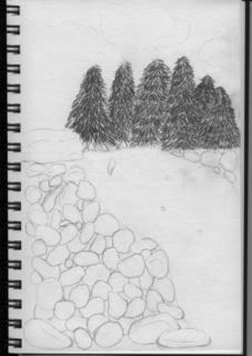
Okay, here goes. Now assuming my reproduction is close to your original work:
1. First sorry about 4 instead of 5 trees. Just me being lazy.
2. I'm not really sure what this is. I reproduced it as a boulder.
3. The rocks. Notice that the foreground rocks are generally larger than the background rocks.
4. The waves. I just scribbled curves to represent ripples in water. Notice that generally the ones further off are smaller and thinner, and closer waves are bigger and thicker lines. You'll have to study how different illustrators do water effects and go with the one that you're comfortable with.
5. Notice also that in the water are thicker lines that form the reflection of the four trees. The calmer the water, the more defined the tree reflections. Not this one though, the water is quite rough here.
Hope that helps.
Posted: 2007-09-06 03:14pm
by Inara
Thanks. Wow. That really helps. I'll definitely work on those rocks... I wasn't really trying very hard there... but I'll work on it a bit more. Also, this is what I've done so far...
(It's larger, as per request of Old Plympto)
P.S. That largish rock thing
is supposed to be a boulder. >.>