Page 1 of 1
Darkevilme's 3d art.
Posted: 2009-09-24 11:26am
by Darkevilme
Re: Darkevilme's 3d art.
Posted: 2009-09-25 02:27pm
by salm
The modelling is good. The materials, lighting and rendering not so much.
Re: Darkevilme's 3d art.
Posted: 2009-09-25 06:32pm
by Darkevilme
Salm, i'll admit...i have no freaking clue about lighting whatsoever beyond 'things should be visible. Which probably explains it.
Though I've identified some weak points in the look of it materials wise that i'll be redoing...i think i got lazy towards the end of the project. And uh, no clue how to make the rendering work better.
Re: Darkevilme's 3d art.
Posted: 2009-09-26 09:21am
by salm
A good start would be to read up on ambient occlusion and global illumination.
Re: Darkevilme's 3d art.
Posted: 2009-09-26 10:28am
by Thanas
What is it supposed to represent? A cruiser?
Re: Darkevilme's 3d art.
Posted: 2009-09-26 05:19pm
by Kuja
Looks like some kind of city-ship.
Re: Darkevilme's 3d art.
Posted: 2009-09-27 07:20am
by TheLostVikings
Kuja wrote:Looks like some kind of city-ship.
Agreed, those rods and domes at the top immediately reminded me of buildings as well.
Re: Darkevilme's 3d art.
Posted: 2009-09-27 07:42pm
by Darkevilme
I tweaked it a little for this pic, reduced city size, redid the outer arm materials and added ambient lighting. It's meant to be a really large warship. It's the second re-invention of one i've posted before in fact.

Re: Darkevilme's 3d art.
Posted: 2009-09-28 08:56am
by salm
You don´t need ambient lighting. You need
global illumination or fake it with ambient occlusion.
Re: Darkevilme's 3d art.
Posted: 2009-09-28 03:29pm
by Darkevilme
I meant Ambient Occlusion, I cant get satisfying results from multiple lights as of yet, but i think i may have been too conservative with the ambient.
This is it ramped up to about 1/2.

Re: Darkevilme's 3d art.
Posted: 2009-09-29 09:41am
by Thirdfain
Dark, I'm reposting this work you did for me last year, just on account of how awesome it is.

The Anarcho-Syndicalist guided missile cruiser
Monarchs and Fascists Fear the Revolution of the Black Banner Fleet.
PS, just to be clear, this is Darkevilme's work and not mine.
Re: Darkevilme's 3d art.
Posted: 2009-09-29 02:02pm
by Crossroads Inc.
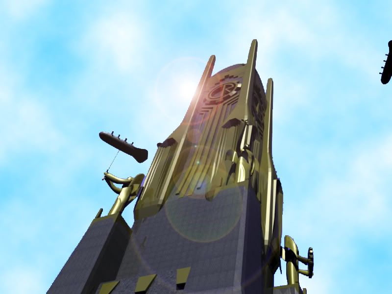
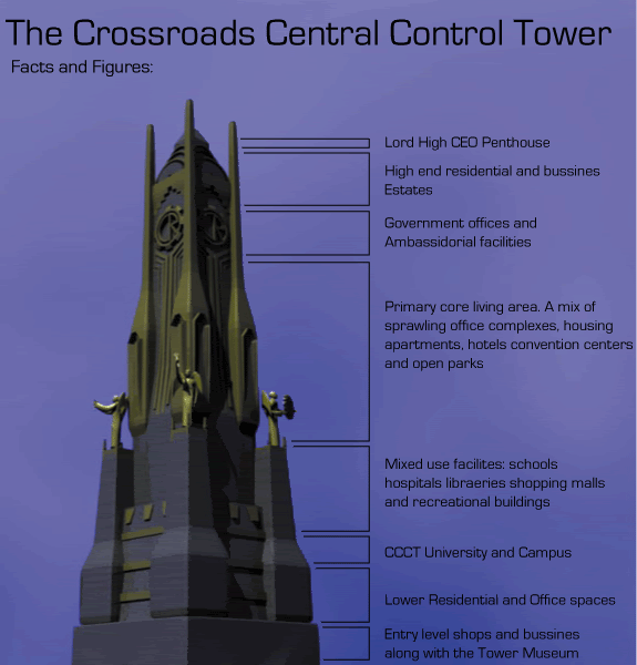
the Crossroads Central Control Tower, also wonderfully made by our lady DarkEvil


Re: Darkevilme's 3d art.
Posted: 2009-09-29 04:57pm
by Bluewolf
Not bad at all. What programs do you use and on top of that, do you take requests/commisions?
Re: Darkevilme's 3d art.
Posted: 2009-09-29 07:04pm
by Darkevilme
I use the opensource crazyness that is known as Blender.
I mainly do this as a form of recreation so i'll consider any requests people have and do them if they'd be fun to do.
Re: Darkevilme's 3d art.
Posted: 2009-09-29 09:29pm
by salm
A big (and easy) improvement would be using a better background. The current starfield sucks.
Re: Darkevilme's 3d art.
Posted: 2009-09-30 02:57pm
by Bluewolf
Darkevilme wrote:I use the opensource crazyness that is known as Blender.
I mainly do this as a form of recreation so i'll consider any requests people have and do them if they'd be fun to do.
Hmmn I may have something for you to do if thats OK but I will PM you on it.

On topic, well, I agree on the starfield, it looks meh and drags the pic down. Some minor texture work can also touch the pic up in my mind.
Re: Darkevilme's 3d art.
Posted: 2009-10-01 01:08pm
by Darkevilme
Attempt at touching things up and giving it a new background.

Re: Darkevilme's 3d art.
Posted: 2009-10-01 05:22pm
by salm
Better, but the starfield is still suxorz. Also, you might have to turn up your monitors brightness to see it but the moon has a dark gray box around it. NASA has good backgrounds for stuff like that. Or google for Hubble.
Here for example
Re: Darkevilme's 3d art.
Posted: 2009-10-02 05:01pm
by Darkevilme
I considered taking a nasa background. Then i decided to try and make my own. It's certainly better i feel.

Re: Darkevilme's 3d art.
Posted: 2009-10-03 07:44am
by Bluewolf
Looks much better than the previous starfield. Part of me wants to be a party pooper and complain about that many bright stars close by but I wont. You are getting there though.

Re: Darkevilme's 3d art.
Posted: 2009-10-03 08:36am
by salm
Yes, that´s a lot better. Personally i´d desaturate the blue nebula to get a more consistent background. Kind of like this:

Re: Darkevilme's 3d art.
Posted: 2009-10-03 12:20pm
by Bluewolf
That does look a lot better, Slam and on top of that, making the nebula a little smaller could help make it look better. At least imo.
Re: Darkevilme's 3d art.
Posted: 2009-10-03 12:51pm
by Darkevilme
New trimmed and faded nebula. Also made the moon round again. Well this has certainly been educational.

Re: Darkevilme's 3d art.
Posted: 2009-10-03 01:10pm
by Bluewolf
That is much better in my mind. It looks a lot more interesting and less...well tacky.
What do you think Slam?
Re: Darkevilme's 3d art.
Posted: 2009-10-03 03:16pm
by salm
Yes, that looks good.


