Page 1 of 1
Medieval Illumination (56K DIE)
Posted: 2015-09-02 11:27pm
by LadyTevar
Re: Medieval Illumination (56K DIE)
Posted: 2015-09-03 04:20am
by Thanas
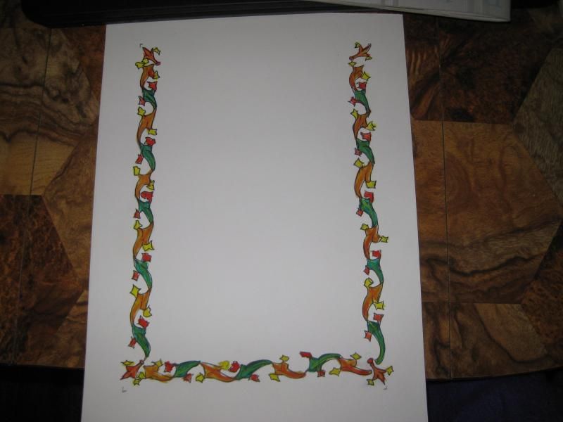
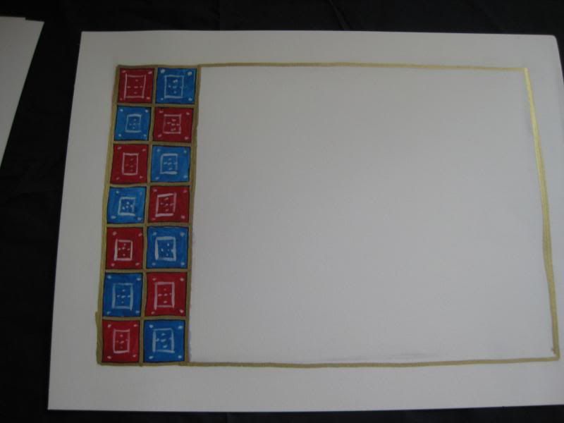
I really like the fifth and seventh one.
Re: Medieval Illumination (56K DIE)
Posted: 2015-09-03 12:56pm
by Elheru Aran
I concur; you have a nice grasp on vines and floral motifs. I also like #6, having tried similar work I know doing white on other colours can be tricky, but you've done nicely.
Re: Medieval Illumination (56K DIE)
Posted: 2015-09-03 06:24pm
by SpottedKitty
Looks good; I particularly like the last one. Ever tried Celtic-style knotwork? The intertwined stylised animal shapes can get a bit "busy", though.
Re: Medieval Illumination (56K DIE)
Posted: 2015-09-04 07:05am
by LadyTevar
Elheru: White atop other colors works best after you've let the base color dry, which doesn't take that long with gouache. #1,3, and 6 are all based on existing examples, where various white or gold designs were picked out over solid backgrounds.
The florals on #2 and #4 are entirely free-hand, and my best work IMHO. I filled a paintbrush with green, and then let the brush paint the stems and vines. All the flowers are based on ones found in various prayer books (popular in the Rennassiance). I have several in my sketchbook, so I just picked what I felt like doing.
I added more to #2 -- there's now a long line of ants circling up between the flowers, and ending with a single ant on the outside of the yellow. I hope I didn't overdo that one.
Thanas: #5 and #7 are simple repeating motifs. All I have to do is measure how many I need to fill the page, and then pick colors. Amusingly, those two were done the same day, with the same colors.
SpottedKitty: My attempts at Celtic Animals have been few, mostly birds. Since I free-hand the scrolls, it's hard to map out a true Celtic animal. So, I trace other people's patterns. I did do a very nice Celtic Bear that got many compliments, but I forgot to take pics.
Sometimes, they doesn't work as well as I hope... you'll never see the "Lion & Horse" that I attempted. Damn thing took over a year to get on paper and painted, and then, ONLY THEN, do I realize the leg I was painting for the horse was actually the lion's. The pattern I'd traced did not have 4-legged animals -- each beast had only three (3) legs. It got ripped up in disgust.
Re: Medieval Illumination (56K DIE)
Posted: 2015-09-04 07:11am
by Thanas
What I like about 5&7 is their elegant simplicity. They leave enough space so I can see huge, lovely gold-patterned medieval letters on the white space. I have a bit of trouble seeing that with #4.
Re: Medieval Illumination (56K DIE)
Posted: 2015-09-04 08:04am
by LadyTevar
Thanas wrote:What I like about 5&7 is their elegant simplicity. They leave enough space so I can see huge, lovely gold-patterned medieval letters on the white space. I have a bit of trouble seeing that with #4.
Oh, there's plenty of room for all the fancy calligraphy on every scroll, since they're on 9x12 vellum-style art paper. The white border around each scroll is exactly 1inch indentation per side, which puts them all in proper perspective:
On #4, the upper vine is 2inches wide, while the lower vine is 2.5inches tall.
#3 and #5 are exactly 1inch wide, while #7 is about .75inch.
#1, 2, and 6 are exactly 2inches wide.
The swans cover 7x3inches in area.
Also, #4 would be a scribe's chance to play with a miniscule lettering hand, which was common on the prayer books that style of vine work comes from
Re: Medieval Illumination (56K DIE)
Posted: 2015-09-04 08:50am
by Ahriman238
#6 really appeals to me for reasons I find hard to articulate. But all of them are beautiful, Lady Tev.
Re: Medieval Illumination (56K DIE)
Posted: 2015-09-04 10:03am
by Thanas
LadyTevar wrote:Thanas wrote:What I like about 5&7 is their elegant simplicity. They leave enough space so I can see huge, lovely gold-patterned medieval letters on the white space. I have a bit of trouble seeing that with #4.
Oh, there's plenty of room for all the fancy calligraphy on every scroll, since they're on 9x12 vellum-style art paper. The white border around each scroll is exactly 1inch indentation per side, which puts them all in proper perspective:
It is not a space issue, it is a perspective issue. #4 will have the natural focus of the eye on the fancy stuff at the side. At this point the side show becomes center stage, which is a bit unbecoming.
Re: Medieval Illumination (56K DIE)
Posted: 2015-09-06 01:19am
by LadyTevar
Thanas wrote:
It is not a space issue, it is a perspective issue. #4 will have the natural focus of the eye on the fancy stuff at the side. At this point the side show becomes center stage, which is a bit unbecoming.
It would all depend on the scibal hand used. This isn't going to be Book of Kells large-size gold-leaf calligraphy; that would be better suited to the swans. The huge vine is better suited to Carolingian miniscule, a more flowing style to match the vinework.
Re: Medieval Illumination (56K DIE)
Posted: 2015-09-06 11:41am
by Rogue 9
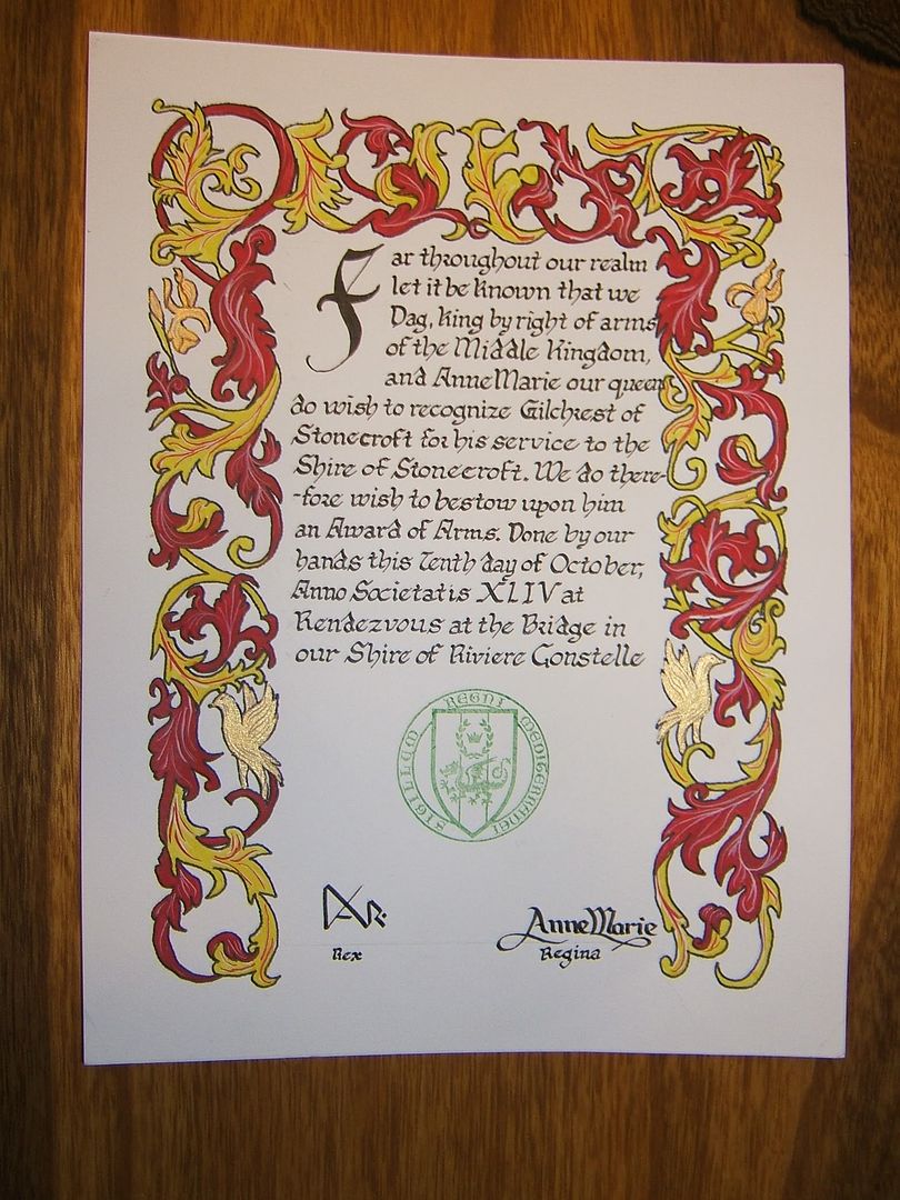
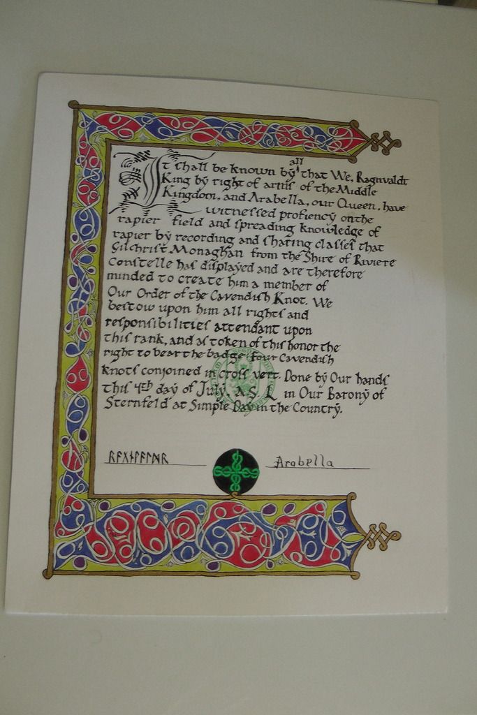
For perspective, these are my award scrolls. Tev didn't do any of the illumination (we're in separate kingdoms, after all), but it shows what they look like after the calligraphy.


Re: Medieval Illumination (56K DIE)
Posted: 2015-09-12 03:02pm
by LadyTevar
Those are Beautiful! Congrats on the Cavendish Knot!
The reason Scribes are so good at fitting words into spaces is they have flexibility on wording. As long as the Honoree's name, the Award name, a little of why s/he is getting the award, and the Date, Event, and Royal's Names are in it, the Scribe can wing it. They also have to leave room for the Royal Signatures, and in MidRealm's case, for the Seal. In Æthelmearc, we just have an extra place for the Presiding Herald to sign beneath the Royals, as a witness.


