Page 1 of 1
Painting feedback
Posted: 2005-02-02 10:16pm
by Tasoth
With my painting teacher from last semester inviting me back to use the studio when there is no class, I've decided I need to paint. Something fantastic at that. So I've decided a nice ol' Angel rising above the hordes of hellesque composition. Problem is, I've come up with four rather interesting angels to use and can't decide. I want your feed back.
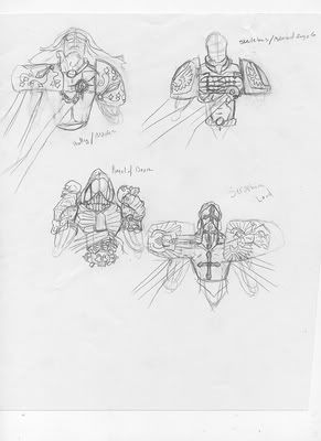
The four in question. Just a torso drawing of each. I meant to color them, but I'm feeling rather lazy. From top left to right are: Angel of Mercy, planning silver and green for that. Angel of Retribution. Sanguinus inspired and possibly a gold/bronze color scheme. Angel of Death. Silver and dark blues and purple. Serpahic Lord. Again, golds and whites.
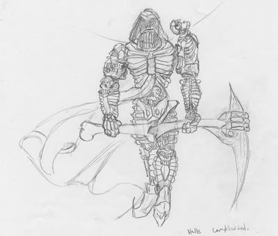
Angel of Retribution.More complicated sketch. Wanted to work on the design of him. Yet to draw the wings in because wings are complicated. Cookies to whoever can read the scrawled notes.
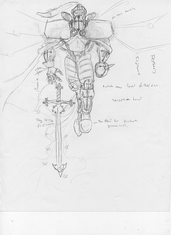
Seraphic Lord. Going for big and imposing. The high muckities in the Dionysian Hierarchy of Angels. Six wings for this beast.
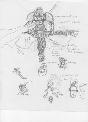
The Angel of Death is still a WIP and the Angel of Mercy is in my Chem 2 textbook.
Posted: 2005-02-02 10:21pm
by Lucifer
For painting, I think the second one is good. I don't know about the first one because it seems more like a plan for something you're considering to draw and paint later. The last one might also be good, but I do like the form of the second one.
Posted: 2005-02-02 10:23pm
by Tasoth
yeah, the first is just a plan for designs to differentiate between the four.
Posted: 2005-02-02 10:28pm
by Lucifer
In a painting, I think it's better to have one focus instead of four, unless you can strategetically place them in such a way that's harmonious, instead of merely sticking them here and there.
Posted: 2005-02-03 12:36am
by Cal Wright
I don't know how skilled you are at painting, but I'm going to give you a few things I keep in mind when I do one.
First off, I did a few paintings on 3'x4' canvases. Unless your painting on that scale and using a very fine brush avoid the designs with real intricate details. One of the things for me was wrestling the fine points, while keeping my motion up. It could just be me, but when I paint I like things to flow more. I keep my tech to the drawings.
Second make sure you have references. This goes for any art what so ever bar none. I had one painting with a sword, so I borrowed one from a friend and brought it to an art class once. For earth I had, you guessed it pics of earth.
If your wanting a single focus, I stick things in the center. I don't care what any books or handouts ever said, when I wanted that one thing, it was in the center. If you want more, you might want to triangulate. I used a large triangle in the middle, and then off shoot from that. Either that or a swirl like patern.
As for the figures, I can't really say. I'd have to see some larger shots. It's a little to small for me. Like I said though, I'd eliminate the ones with too much detail. Rely on values and blending and you'll make a figure pop the fuck out.
Posted: 2005-02-03 12:38am
by Pick
The Seraphic Lord looks good, but as always, no offense intended to you in any form (since it looks quite good, indeed) I always recommend sketching it from several perpectives with posing aid from an anatomy book. It can help you improve greatly with your sense of three dimensions.

Posted: 2005-02-07 11:06pm
by Bob the Gunslinger
I'd like to see the composition with the full torsos and wings. If you're going for a certain composition, that's cool, but otherwise you might want to try "unbalancing" your angels' position or posture. A really good book I would recommend for that kind of advice would be "Drawing the Marvel Way." Yeah, it's cheesy, but it taught me a lot.
Also, is the second angel based loosely on a space marine?
Posted: 2005-02-08 01:37am
by Tasoth
Thats because it is.
Mr.Angel of Death.