Page 1 of 1
Anyone wanna design flash (tattoo) for me? ($50!!)
Posted: 2005-03-30 01:59am
by Queeb Salaron
So here's the deal. It's that time of year again when Queeb starts shopping for tattoos. So here's the deal. I'm looking to get my family motto done, but I need something a bit out-of-the-ordinary. As it turns out, my family crest is pretty kick-ass. This is what one interpretation looks like:

Now, I want a similar design, but edgier. (The guy I have doing the tat does amazing work, so I'm not worried about the detail being too complex.) I want the wording in the belt to stay there, and I want the Gaelic text below to remain. In addition, I would like the words, "Na Siach" to appear below (the Gaelic of my last name), as well as the phrase, "Force nae Friend, Fear nae Foe."
Hell, let's make a game of it, just to make it worth your while. $50 to the winner. I'll give you two weeks.
Posted: 2005-04-01 03:20pm
by Queeb Salaron
Anyone thinking about taking on the project? I see a bunch of people have looked...
Posted: 2005-04-01 10:24pm
by SeebianWurm
I'm thinking about it but have not done any work yet.
Posted: 2005-04-01 10:51pm
by Tinkerbell
Define edgier.
Posted: 2005-04-01 11:39pm
by Queeb Salaron
xBlackFlash wrote:Define edgier.
Hmm. Forgot to do that.

The idea is to have the drawing as dark and foreboding as possible. I'd like the hand and the dagger to be rich in detail, maybe showing the tendons popping as the hand grips the hilt of the knife. Dramatic lighting/shading might not be a bad idea, either.
I'm looking for something a little more angular, too. Not cubist, obviously, but don't be afraid of severe angles and straight lines.
And please, don't add anything to make it corny; no blood dripping from the dagger, no lensflares, nothing like that.
Lots of black ink, lots of detail, lots of shadow, lots of sharp angles. I guess that's the best definition of "edgier" I can conjure at the moment.
EDIT: I'd also like the hand and dagger to figure more prominently than the belt, if that's possible. I don't care how this is done, so long as it really pops. Remember that I have relatively pale skin (if the Gaelic didn't give it away, I'm rather Irish/Scottish), so the darker the design, the more it wil pop.
Posted: 2005-04-02 12:41am
by AnimeJet
sounds interesting.. (and 50 bucks! =O).. i might try some stuff during class..
So is the tattoo B&W or color too?
Posted: 2005-04-02 06:52am
by Zac Naloen
AnimeJet wrote:sounds interesting.. (and 50 bucks! =O).. i might try some stuff during class..
So is the tattoo B&W or color too?
it'd be more than 50 bucks if it was colour
Posted: 2005-04-02 08:42pm
by AnimeJet
Does the belt have to be in a circle? Or am i going too far off base >_>
Posted: 2005-04-02 09:50pm
by Tasoth
Proudly kicking off the competition and firmly setting the bar for last place, I present to you Squeeb's tat.
Not as edgy as the new looney tunes cartoon, but I tried.
Posted: 2005-04-02 10:01pm
by Queeb Salaron
Tasoth wrote:Proudly kicking off the competition and firmly setting the bar for last place, I present to you Squeeb's tat.
Snip
Not as edgy as the new looney tunes cartoon, but I tried.
I should disqualify it just because you called me Squeeb.

Right idea, and I like the idea of the belt around the forearm.
And no, the belt doesn't have to be circular. But the belt is an important image, and must be present.
And yes, black and white is perfectly fine. In fact, any color entries are going to be converted to B&W anyway, so you might as well not waste your time.
Posted: 2005-04-03 12:33am
by AnimeJet
Sorry for so many questions, but since Tasoth posted his.. does the added text have to be litereally under "an cireann ceann cinnian" or can it be anywhere that looks nice... hehe.. maybe i should just post the sketch and then in it after you give it the Ok .. x_x
Posted: 2005-04-03 01:34am
by Queeb Salaron
I'm very open-minded. Go ahead and post the sketch. If the layout looks good, but I'd like the text somewhere else, I'll let you know.
Posted: 2005-04-03 03:02am
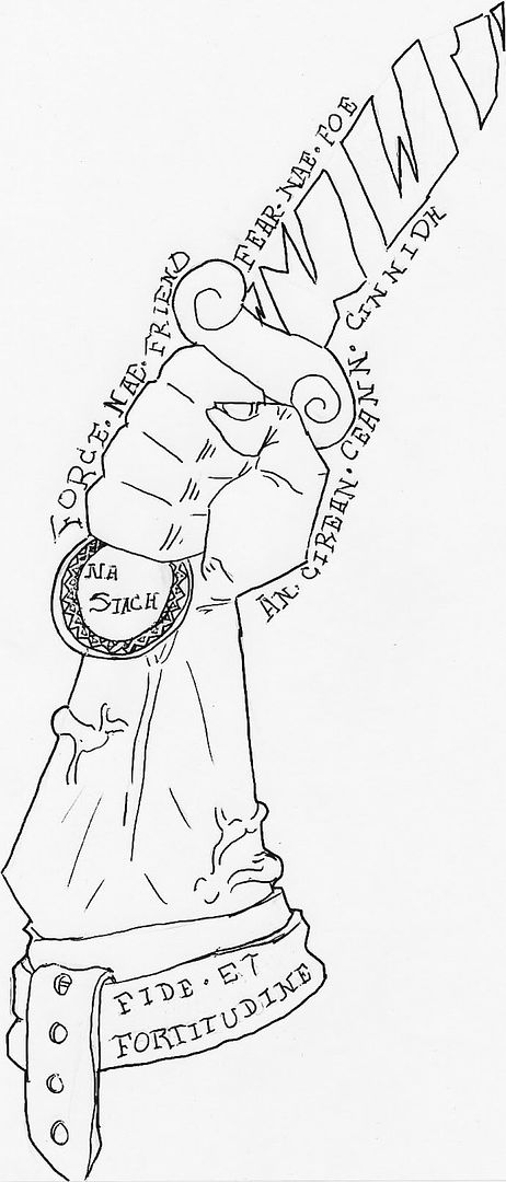
by AnimeJet
Here's what i have so far, keep in mind i haven't chosen a font yet so the letters on there are just placers XD

Posted: 2005-04-03 03:13am
by Queeb Salaron
The dagger is a bit too ornate for my tastes, but the idea isn't bad. It still feels like the belt is more prominent than the hand, and there's no real intensity to the drawing, I feel.
And you forgot the "Na Siach."
Posted: 2005-04-03 03:17am
by AnimeJet
That's cause i didn't know where to put it, same with the force/fear. I actually shrunk the belt already, lol. I was also thinking about putting the daggar in a different posistion (like stabbing instead of thrusting) but that might violate some hidden crest meaning or something, oh well. thats about the best i could do, hehe
Posted: 2005-04-03 03:24am
by Queeb Salaron
AnimeJet wrote:That's cause i didn't know where to put it, same with the force/fear. I actually shrunk the belt already, lol. I was also thinking about putting the daggar in a different posistion (like stabbing instead of thrusting) but that might violate some hidden crest meaning or something, oh well. thats about the best i could do, hehe
And a good one it was.

But for future reference, yes, the dagger has to be held in a thrusting (as opposed to stabbing) manner. It does indeed violate some hidden crest meaning.
Posted: 2005-04-06 11:06pm
by Queeb Salaron
Bumpage.
C'mon guys... $50!!!
Posted: 2005-04-10 12:00am
by Queeb Salaron
Time's running out. Any last submissions must be made by 4/11 at noon EST, or they won't be eligible.
Posted: 2005-04-10 12:23am
by Slartibartfast
Didn't design it, but I found it on the net and thought it was "edgy". Maybe you can write your motto around it somewhere

Posted: 2005-04-10 12:29am
by Queeb Salaron
That's a chainsaw... And there's no belt... and... just no.

Posted: 2005-04-10 12:30am
by Slartibartfast
Dagger, chainsaw, it's all a matter of scale.
Posted: 2005-04-10 04:32am
by Rogue 9
Faith and Strength, eh? Interesting.