Page 1 of 1
DS's Digital Manipulations (Pic Heavy)
Posted: 2005-04-12 11:35am
by DarkSilver
Welcome and pull up a seat...
I figured, what the hell, and decided with the image manipulations I been doing lately, it's ashame I'm not really showing off my piss poor work to anyone.
So you unlucky people get to be my captive audience.
Hold still, the tazers and injections will only take a few moments, and are pretty painful, but mostly harmless.
Posted: 2005-04-12 11:42am
by DarkSilver
First batch up for show....a collection of TF based images....
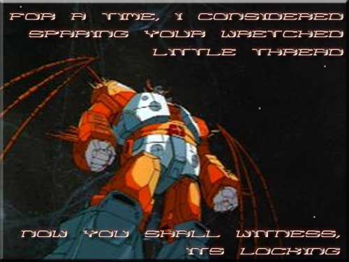
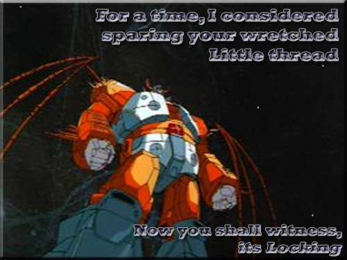
First up, a Thread Locked image, simple and to the point, staring everyone's favorite World munching Transformer,
Unicron:
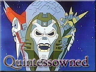
Next up, a Owned image, for those so recently spanked in the debates, featuring the
Death face of a
Quintesson Judge
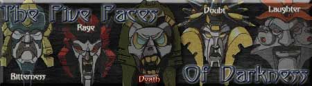
Next, a sig banner image, featuring the
Quintesson's:
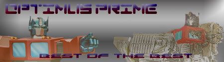
A small tribute to the greatest Autobot Leader and bearer of the Matrix,
Optimus Prime, the Image on the right is a tribute to his return and apparent second death from the Third Season episode "
Dark Awakening":
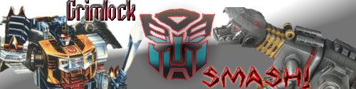
And last but not least, the most popular and violent of the dinobots, the one Autobot who declared proudly "
Me Grimlock kick butt!",
Grimlock:
(Yes, I do have a small TF fixation.......)
Posted: 2005-04-12 02:57pm
by DPDarkPrimus
That's the wrong "its", Transfan.
Posted: 2005-04-12 03:03pm
by DarkSilver
easily correctable....
now you see it....
Posted: 2005-04-14 06:50pm
by DarkSilver
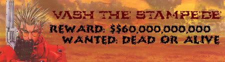
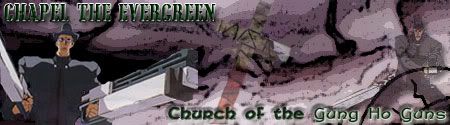
Eh...I got on another photoshop kick this afternoon, and I got onto a Trigun kick (been watching it on Adult Swim lately)...so...I made two Trigun banners (may work on more later...)
and a Avatar...
Posted: 2005-04-26 09:06pm
by DarkSilver
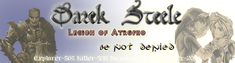
two more personal banners....been experimenting with some plugins I found on a old disc, and with png transparency....
first the "new" filters:
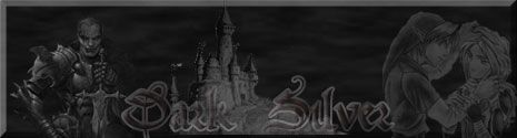
next my first real png image:
I need to figure out a way to cut down the filesize on the png's, that's 116k file, png-24 format.
png-8 just looks craptacular.
anyway, opinions appreciated.
Posted: 2005-04-27 12:05am
by Dangermouse
Snip cool images.
Nice work.
I like the angle on the Cybertron image. My only recommendation would be to consider making the text a little bigger or choosing a font color with more contrast. Its a tough call since you do not want to overlay on top of Cybertron and face his wraith.
I really like the two images immediately above, especially the color choice for the bottom banner. My only minor nitpick would be to consider reducing the glow effect around the center text to make reading it easier on the eye.
The filter effect rocks out. The addition of the castle is pretty cool but again you lose some of the text contrast against it. Maybe reduce it slightly and move the text higher so that is contrasted against the dark background?
Really like the filter effect, which one are you using?
Posted: 2005-04-27 12:51am
by DarkSilver
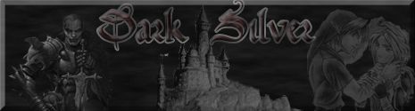
revisioned of the above two
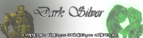
On the png file, it's a transparent background, so it should blend in with just about everything....the only problem comes in when people use a white background, which throws off the right side of the banner.
the filters used in the jpg is a basic outside bevel for the edges, with difference clouds (photoshop 6.0 since it's all I have on this laptop), then gone over with Photolab CSI monochrome filters. all additional image layers where done with the CSI monochrome filter as well, with the test being beveled, satined, pattern overlayed then set to a transpanrecy of 46%. The castle in the image is taken from the login screen of Ultima Online 2d, it is the image used up to and including the Lord Blackthorn's Revenge expansion, it may have been changed thereafter, but I'm not sure since I quit by the next expansion.
I'm still toying with these.....I want to figure out a way to reduce the filesize of the png format while retaining the quality I have now, unfortunatly I may not be able to do such...
and thank you for the comment and advice Dangermouse, was begining to think people just didn't want to hurt my feelings by telling me they sucked.
Posted: 2005-04-27 06:01am
by Petrosjko
*swipes Unicron locked pic with DS' permission.*
Posted: 2005-04-27 06:21am
by DarkSilver
Petrosjko wrote:*swipes Unicron locked pic with DS' permission.*
swipe this one to...
Posted: 2005-04-27 09:41pm
by Dangermouse
Even better. Other than maybe shifting the text away from the border a little bit or even scaling down the in-layer images ever so slighty to buy yourself some more background for your eye to rest at, I can't think of anything else you may want to consider. Thanks for posting the images.
Wow. Unicron one looks pretty sweet now. <Steals image>.
Posted: 2005-05-11 10:06pm
by DarkSilver
Just intime for the release of Episode III on May 20th....
It's rather massive, 358kb in size, but I couldn't get it any lower without sacrificing even more of the coloration and image integrety. Created using fresh image captures from the Transformers the Movie DVD (thanks to Dalton for telling me the program to use)
