Page 1 of 1
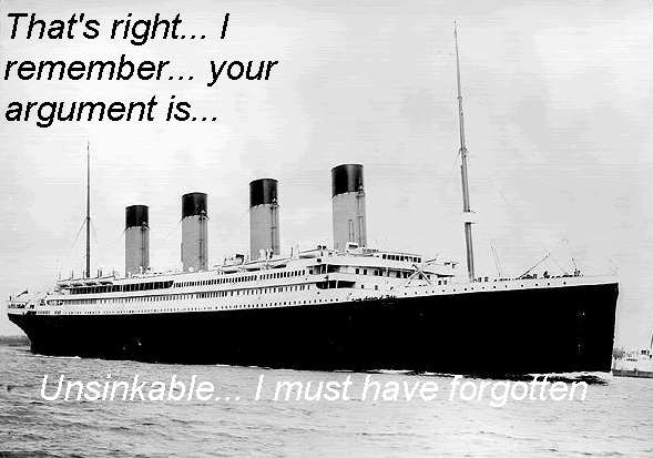
A Picture for forum use I am trying to make.
Posted: 2005-10-25 07:36pm
by The Guid
I am trying to make an image for use on forums to mock people similar to the "noob" pictures and the like. Any ideas of how to make it better/funny(er)?

I feel it might be too wordy right now but I was rather fond of the concept.
P.S. If a mod feels this is not worthy of AMP then I immediatly apologise and will happily see it limp off to Testing...
P.P.S. Or Hall of Shame

Posted: 2005-10-25 07:39pm
by Instant Sunrise
Anti-alias the text and add a stroke around it.
Posted: 2005-10-25 07:54pm
by The Guid
I am afraid I am an absolute n00b at this sort of thing (apologies for "l33t sp33k") and I have no idea what that means!
Will go look up! Much to learn I still have...
Posted: 2005-10-25 09:02pm
by Qwerty 42
I would personally lose the ellipses and make the text on the bottom darker, but I'm no great shakes at this. I'd have it read
"That's right, I remember. Your argument is unsinkable.
Titanic
I must have forgotten."
Posted: 2005-10-25 10:36pm
by Surlethe
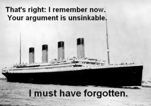
Maybe something like this:

I love the concept.
Posted: 2005-10-25 10:42pm
by Temjin
One small nitpick: The Titanic was never advertised as "unsinkable." "The Unsinkable Titanic" was first mentioned in newspapers after the accident to add irony.
Posted: 2005-10-25 10:50pm
by Metatwaddle
I don't know - although Surlethe's version is certainly an improvement, I liked the big emphasis on "unsinkable".
And re: the nitpick, I don't think anyone will notice, let alone care

Great idea for a pic.
Posted: 2005-10-25 11:09pm
by The Guid
Surlethe wrote:Maybe something like this:

I love the concept.
Thanks.

.
*Steals better version!

(If that's OK!)
I don't know - although Surlethe's version is certainly an improvement, I liked the big emphasis on "unsinkable".
Aye, I see what you mean but I think the stand alone "I must have forgotten" is an improvement because it just oozes sarcasm, which I love.
Posted: 2005-10-25 11:19pm
by darthdavid
Posted: 2005-10-25 11:48pm
by The Guid
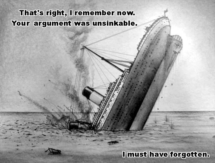
Interesting. One gets a different effect by showing it actually sinking rather than the sinking being presumed.

I won't be able to decide which one to use! I need to go and drink lots so I can tell you guyshe how much I luvvsh you all.
Posted: 2005-10-26 01:13am
by Surlethe
The Guid wrote:*Steals better version!

(If that's OK!)
'Tis fine by me; enjoy!

Posted: 2005-10-26 01:36pm
by Cyborg Stan
I perfer Surlethe's version over darthdavid's. DD's has too many commas, a 'was instead of 'is', and the unsinkable part is in quotation marks. Other than that, I would've made the 'I must have forgotten part' a bit bigger and bolder.
And I was going to post this eariler, but my computer kept crashing. In any case, you've probably figured this out by now, but here are examples of antialiasing and strokes. Hopefully, these should be self-explantory.
Examples of letters not antialiased, magnified 4x for visibility.

Same, but with AA.

Why you want strokes

Posted: 2005-10-26 02:48pm
by darthdavid
How's this?

(RELOAD IF IT SHOWS UP THE SAME AS ABOVE)
Posted: 2005-10-26 04:54pm
by Duckie
Shouldn't it be "Your argument", not "You argument"?
Posted: 2005-10-26 05:35pm
by darthdavid
FUCK!!!
Posted: 2005-10-26 05:40pm
by darthdavid
These aren't the droids you're looking for (refresh if your browser's cached it...).
