Page 1 of 2
Crossroads Fantasy Art *Bird Done, Robo-Bird started!*
Posted: 2006-03-28 07:19pm
by Crossroads Inc.
Ok, So I have this piece, it's kinda done, but not really. See, I'm really good at drawing creative stuff, but I kinda stink with anatomical parts. Basically I need some help.suggestions on a few parts of THIS:
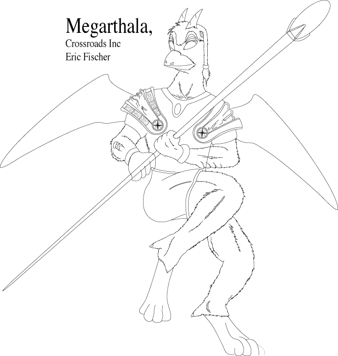
Be brutal, please, I'll need the help.
Posted: 2006-03-28 07:39pm
by Gil Hamilton
He looks finger licking good.
However, foreshortening is your friend. You don't want to be like the Egyptians and draw in all bits at their full visual length. Alot of making that image look a bit more realistic is to spend some time in front of the mirror studying home, exactly you look when you make such poses. This can involve a balancing act sometimes, but it is well worth it.
Furthermore, you've got to make the bits twist a bit. The torso is going one way and his arse and lower are going in another direction. You need to put some twisting indicators there to make him not look like his torso is on a lazy susan.
Your hands look funny, but there isn't really advice I can give there except practice practice practice. Alot of life drawing is just filling sheets of paper with anatomy. Over and over again, until you know how the human form works inside and out, then you practice some more and make studies and get sick of drawing your 87th foot.
After you figure that out, then do studies about how cloth interacts with bodies, how it drapes, where it clings, et cetera. Unless you want to put everyone in hot spandex and latex suits. If so, you've got a career in drawing old school X-Men comics.
It looks like you are basically at the beginning of being on your way, all told. Kept practicing. If you have a margin on a piece of notes or homework, fill it with doodles. Even if they are inappropriate. Collect references and studies. That's how pro artists do it, they don't just draw angel wings from memory, they have binders with wing references for real animals.
Posted: 2006-03-28 07:43pm
by TheBlackCat
Overall it seems very good. My primary issue is the head. It looks squashed horizontally, it is just too tall for its width. Also, it sticks out in the front with the beak but is flush with the neck in the back, making it look kind of unbalanced. The angle of the line between horns on the head and the angle of the beak also doesn't match the angle of eyes, making parts of the head look twisted relative to other parts. Remember the head and face in particular will be the first thing people will focus on, so it is critical to get it right.
The arms also look kind of scrawny compared to the chest and legs. I would make them more muscular.
I might also suggest giving some sort of texture or form to the wings. The rest of the body is pretty intricate and detailed, while the wings are completely homogeneous.
I would also put the nostrils further up on the beak, right near where the beak meets the head. This is where it normally is on birds, so it would look more natural because most people know what birds look like (although they might not be able to figure out what is causing it, I think many people would probably sense something is wrong with the beak with the nostrils where they are).
Posted: 2006-03-28 08:05pm
by Pick
Posted: 2006-03-28 08:13pm
by Lord Revan
I generally draw static shapes (buildings, spaceships ect.), so my advice won't that complex, but if you want to study how cloth and/or solid shapes generally used in armors behave.
Posted: 2006-03-28 08:24pm
by Crossroads Inc.
First off I LOVE you guys. 3 posts and 30min worth of material to look over! But I love Pick most!!!

A few things is this fellow was based on an old alien race I cam up with. The blunted "beak" is actually part of the apperance, as I didn't want them appearing too bird like (which is why the wings are so small, as I wanted them to appear 'vistigial') That said, the head does need work, and the comments about it being 'squished' are quite valid, as well as needed to add a "lobe" in the back where a brain would obviously extend too.
The arms where supposed to be smaller then the legs, as they where originally powerful runenrs (the wings used to glide) however I may have over done the differances in size there. On the wings again and textures. One of the things I need work on is textures. Working in pencil its very easy to do repeating things like feathers or scales (the bottom 'furless' parts of his legs are supposed to be scaled btw)
It is harder to do it on the computer however, it's not something I can't do, it's just tidieous.
Notes on several other things, like the bending of joints, nostrols, head, etc. thats all fantastic as like I said, its the more anatomical parts I need help with (basically trying to make the beast 'believable')
The hands do look really fun, and his body is really twsited. Part of this just comes from the intense action pose I have him in. He is literally jumpin in the air, and in the process of turning his body. Facing one way and looking around. Obviously its not an easy pose to do, but some of Picks sketches are going to help a LOT!!!
the one thing I'm still wondering about is his toosh. I really do not do well with clothing, (usually why I don't draw them

) and the 'spandex' look of his pants right now is more of a placeholder. I need it to be tight, but still look like fabric.
I think I'm going to try starting from skratch, drawing a 'nude' version, and then lay the cloths on top instead of trying to do both at once. Since the whole thing is on computers, its not going to be too hard

Posted: 2006-03-28 08:34pm
by Lord Revan
Copy/pasting works for scales/feathers (at least for me).
Posted: 2006-03-28 08:40pm
by Elheru Aran
Feathers aren't too hard unless you're trying to do detail.
Take a look at this:
http://img.photobucket.com/albums/v131/ ... uinius.jpg
Each 'feather' is basically just a short line of color. Long feathers are at the rear edge of the wing, short feathers at the leading edge and in the middle.
Here:
See what I mean?
This works better on paper irl or with a tablet, but you could give it a try...
Posted: 2006-03-28 08:46pm
by Lord Revan
you also might want do something like

it's simple color/basic shape study for a costume (I made in quite a short time with using just MS Paint).
Posted: 2006-03-28 08:51pm
by Pick
You're welcome, Crossroads

. I'm glad I could help!
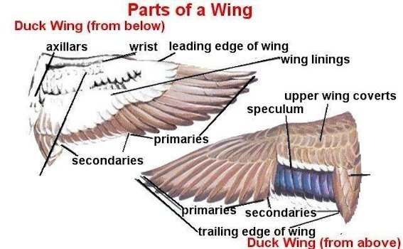
I'm going to take a moment though to talk learning wings, as long as it's come up. I think it's important to remember that wings come in as many shapes and forms as people's legs. You've got the people with cankles, you've got the tree-trunk syndrome, you've got the well-fleshed hooker... *cough* anyway!
When looking for reference images, always bear in mind the attributes you are looking for. In your particular case, I would probably say that the wings there would be best referenced with the wings of the peregrine falcon (
This being a nice example).
In general, think of feathers as shingles. Sure, some are coming in different sizes (depending on the type of wing you're looking for), but always bear in mind how they overlap as well as how the density of feathers is going to rely very heavily on the size of the feathers and how spread the wing is. Just like you get more space between progressively larger pebbles in a jar, you're going to notice a similar pattern with the gap between feathers.
Now, since your large focus right now is on anatomy, you can
always remember this: the wing is just an arm. It obeys the same rules and has generally the same form.
This is a good image for showing what I mean.
Good luck!
Posted: 2006-03-28 08:54pm
by Crossroads Inc.
Thanks again all!!!
I'll prolly vanish for a bit while I implament all this

Posted: 2006-03-31 02:42pm
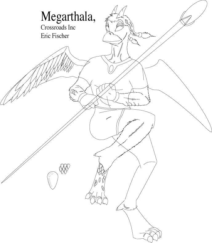
by Crossroads Inc.
Whee!
Striped down the old pic, added a lot of suggestions (thanks all)
I never cease to enjoy how easy it is to draw on a computer! I can duplicate, copy, edit, save, and of course "Un-do" whever I want
So anyways, I took away most of the detail and figured I'd get the "body" Just right this time around before plunging ahead and adding all of the finer details and such.
I added some experimental parts, Feathers in one area, test scales elsewhere. Again feedback welcome!
Posted: 2006-03-31 03:02pm
by Gil Hamilton
Starting to get there, mate. Concerning his staff. Remember, he's not holding a stiff ribbon, he's holding a very thin conic with a big goose egg on it. Right now, your staff looks flat. Round out it's bits.
Posted: 2006-03-31 03:08pm
by Crossroads Inc.
Gil Hamilton wrote:Starting to get there, mate. Concerning his staff. Remember, he's not holding a stiff ribbon, he's holding a very thin conic with a big goose egg on it. Right now, your staff looks flat. Round out it's bits.
Well, something to keep in mind for a lot of this, is that i've gone back to the 'skelton' phase. With computers, its easy to get carried away and do lots of detail, but it's not needed till the basic form is down pact. So yes, when the time comes, the rod, body, feet, etc, will all get shaping details and be fleshed out.
Posted: 2006-03-31 03:35pm
by Elheru Aran
And you might want to make sure his hands aren't transparent...
Posted: 2006-03-31 04:55pm
by Lord Revan
looking better, though you might think of where wing attach on the boby and mobify (if needed) the shape acordingly at the moment it look's like there's nothing beond the part we see (at least to me).
Posted: 2006-03-31 09:27pm
by Gil Hamilton
Also something I noticed on looking at your image. You may want to revamp it so you don't make a direct copy of the lines that Pick drew on your image. That's not technically a kosher thing to do as an artist.

Posted: 2006-03-31 11:17pm
by Pick
On tracing: I don't mind at all. He's learning to improve. As far as I'm concerned, those only took a few minutes of my time and were
intended to help him better his picture. Even if it's traced, it's useful for the short term while he gets the hang of what works in a picture and so he can start with detail. After all, in the future, they're still useful tips to bear in mind. Even so, in the case that it arises again with a different person, Crossroads, it might be a good idea to have that permission established (silly, I know!)
As for the newer version, big improvement! I really like how you've begun to add the feathers and the scales, as well. I'm not actually a fan of drawing on the computer, myself, but I'm glad you're taking advantage of some of the upsides to it
. I also like the addition of claws!!
Posted: 2006-03-31 11:38pm
by Gil Hamilton
I didn't think you'd care Pick, but there are plenty of people who think that tracing their art is an "sock full of quarters beating"able offense.
It's not a big deal, but I was just saying.
Posted: 2006-03-31 11:49pm
by Pick
Gil Hamilton wrote:I didn't think you'd care Pick, but there are plenty of people who think that tracing their art is an "sock full of quarters beating"able offense.
It's not a big deal, but I was just saying.
Oh, I know, but I wanted to make sure that he was aware. I don't want there to be any panic
.
Posted: 2006-03-31 11:58pm
by Crossroads Inc.
Well I didn't really "Trace Picks drawings, I basically just altered some of the lines. All of the detail and bits fro my first image will be re added once I finalize a few things, it's not like I'm redrawing the whole thing either.
Theres a differance between "taking someones advice" and "Tracing" after all.
Posted: 2006-04-04 09:21pm
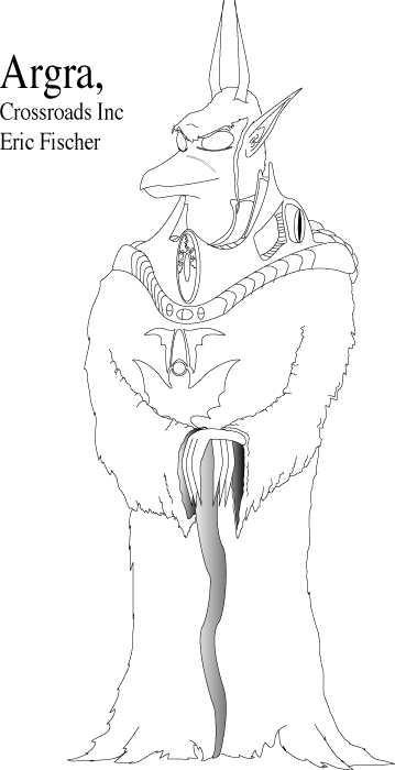
by Crossroads Inc.
In the MEAN time, I got bored this afternoon and sketched up this Dragon,Kosh,Yoda, thing... Almost done with the nift Dancing Bird thing, but thought this was kinda cute. Well, as "cute" as a Dragon,Kosh,Yoda, thing can be
Posted: 2006-04-04 10:33pm
by Spanky The Dolphin
I like that one, actually, neat.
Posted: 2006-04-05 12:46am
by Crossroads Inc.
Hey thanks a lot. I just tossed that one together for fun really. Started off trying to draw a Kosh "Encounter Suit" and then deciding to make a real person in it. Drew up some cool logos on the robes, and decided to put an aged Dragonish type fellow in it. You know, the sort of guy who looks like he's seen it out, like Yoda!

Anyways, I've practiclly finished Dancing Bird 2.0. Just kinda waiting to get this to page two, so I don't end up posting the image at the bottom of page one

Posted: 2006-04-05 03:00am
by Ford Prefect
Hey, that's actually really cool, Crossroads. I see an improvement, actually. I like it.


