Page 1 of 1
Space Fighter ( 3D Texture Job)
Posted: 2006-09-14 06:50am
by salm
Hi,
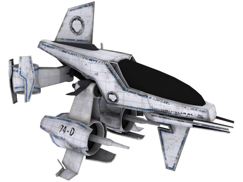
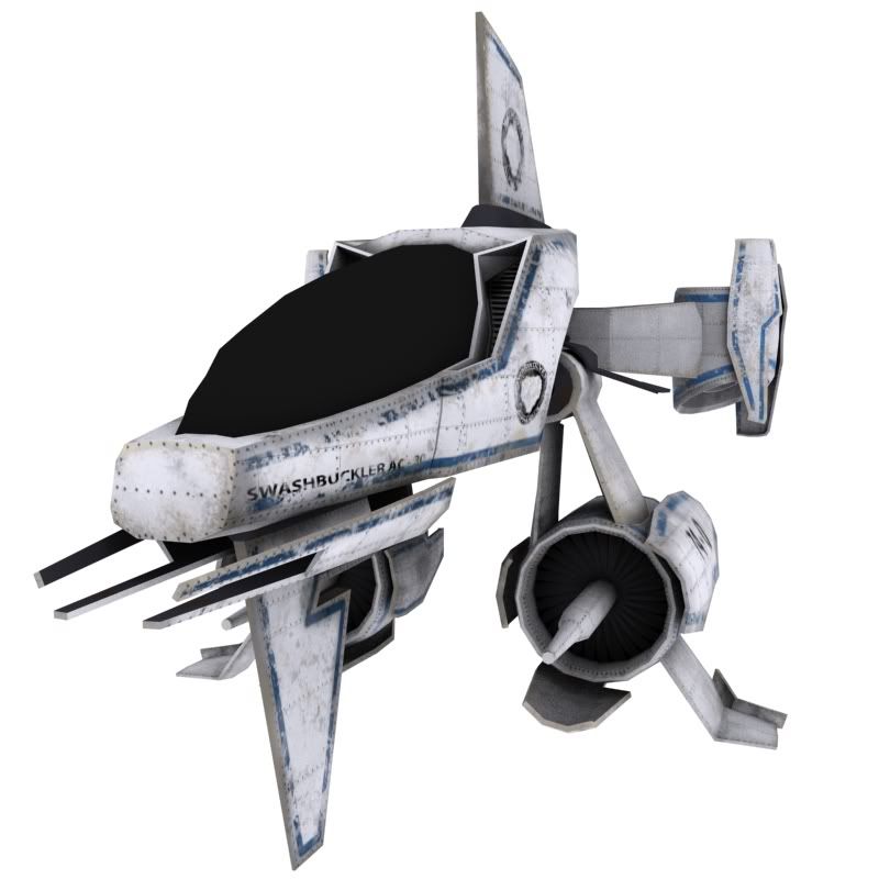
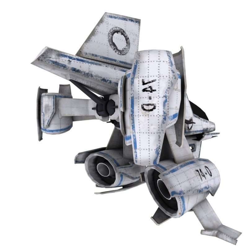
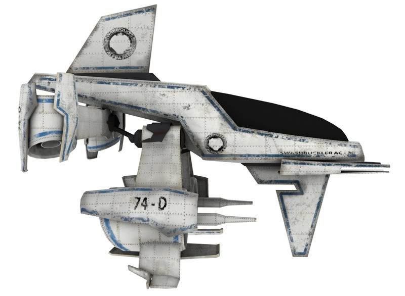
This is a Space Fighter a friend of mine designed and modeled for our common Uni Project. I did the texturing and I´m pretty much satisfied with it. Still got to do the Material for the glass parts.
This is pretty much the most complex object i´ve ever textured. I´m not that much of a texturer but i like it anyways.
We named it the Swashbuckler AC 30 because Swashbuckler is a cool word and AC 30 because we needed some numbers and letters in adition.
Note: The mirrored Text in the third picture is already repaired.


Posted: 2006-09-14 10:51am
by White Haven
Hmm...what're those aft vertical thrusters for? They look awful beefy....too off-center to be useful for VTOL in atmosphere. Are they gimbaled for use as oversized maneuvering jets?
Posted: 2006-09-14 10:55am
by Balrog
I agree with Haven, the aft thrusters look meh. Plus with the bottom thrusters it looks like the thing is just going to spin around like a wheel. Otherwise, very cool model.
Posted: 2006-09-14 11:19am
by Shroom Man 777
The graphics are pretty awesome! But the design is a bit funny. Now if you move the bottom thrusters to the back and the butt thrusters frontwards (to the center, making it more stable for VTOL), then you'd have a functional craft.
Posted: 2006-09-14 11:50am
by Tasoth
I like it. Got a question, where can I find material libraries to use with a modelling program?
Posted: 2006-09-14 07:25pm
by lPeregrine
I assume this is intentionally low-poly, for a game maybe? Besides "add more details/rounded corners/etc", I'll suggest:
1) Break up the even panel grid. The perfectly even rectangles look a bit weird, you'd expect some different shapes that match the shape of the hull. Making them larger would help too, you wouldn't really expect a surface to be covered in dozens of small squares, you'd have one or two large panels.
2) Add some specular maps. Right now, it's dull and flat, without any variation in highlights. A subtle map there (with variations over the panels) would help a lot. Painted metal isn't mirror-reflective, but there's still some highlights.
3) Fade the bolts a bit. Right now they look painted on and over-emphasized. Try a more subtle version, with some bump mapping. The ship was painted after the hull plates were added, so the bolts would've been painted over. Instead of black dots, you'd have a slight shadow, and a slight variation in color/highlight.
Posted: 2006-09-14 07:36pm
by Adrian Laguna
Why does the "space fighter" have turbines?
Posted: 2006-09-14 09:54pm
by Singular Quartet
Adrian Laguna wrote:Why does the "space fighter" have turbines?
Why not? I've made up some technology that would require gigantic fucking turbines for forward motion. I've seen spacecraft that fly using propellers. It's his universe, he can bullshit a reason for it.
Also, the unit itself reminds me of R-Type quite a bit.
Posted: 2006-09-15 10:58am
by salm
Sorry, i can´t change the model since it´s not mine. I did the texturing. The model was done by someone else.
@Tasoth:
It´s best to paint them yourself in Photoshop.
Anyway you can get nice textures at places like
mayang.com
animax.it
3d-rekonstruktionen.de
@Peregrin:
Yeah it´s intentionally lowpoly for a CAVE project. It runs in VRML which can use neither specular nor bumpmaps. That was a real problem with the glass on the cockpit because the supported reflection map sucks so bad that it´s best not used.
Lots of people don´t like the shapes of the pamels, so i might change that.
You´re right with the paint over the bolts. I didn´t think about that.
@Adrian Laguna:
If it makes sounds while flying through space (which it does) it can just as well be propelled by turbines.

Posted: 2006-09-15 03:06pm
by Marko Dash
Looks a bit like the result of an affair between a GDI orca and a NOD rocket buggy.
Posted: 2006-09-15 08:29pm
by Darksider
The Top section reminds me of a Corporate Sector Athourity IRD fighter from X-wing: Alliance.

