Page 1 of 2
Random Artwork...
Posted: 2006-09-19 06:43pm
by Einhander Sn0m4n
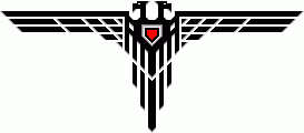
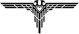
I needed a document section divider and got carried away a bit, as usual.
Result:

Posted: 2006-09-19 08:11pm
by Ford Prefect
That's mad cool, Ein.
Posted: 2006-09-20 12:41am
by Ace Pace
Gonna use it as a TBO chapter divider?
Posted: 2006-09-20 12:45am
by Einhander Sn0m4n
Ace Pace wrote:Gonna use it as a TBO chapter divider?
No, but everyone here can use it as they see fit!

Posted: 2006-09-20 12:48am
by Ace Pace
Black on white is better, I'm going to do my next TBO compilation with that.
Posted: 2006-09-20 08:13am
by The Yosemite Bear
now if I just fill in one of the eyes....
Posted: 2006-09-26 07:11pm
by Einhander Sn0m4n
The Yosemite Bear wrote:now if I just fill in one of the eyes....
Hmm?
Posted: 2006-09-26 07:38pm
by Companion Cube
Einhander Sn0m4n wrote:The Yosemite Bear wrote:now if I just fill in one of the eyes....
Hmm?
He's referring to the IoM symbol from WH40K:

Posted: 2006-09-27 02:53am
by The Yosemite Bear
yes in the grim future of SDN there is only flamewar, to your bolter's battle brethren the troll greenskins are comming.
Posted: 2006-10-09 04:58pm
by Einhander Sn0m4n
Posted: 2006-10-10 08:45pm
by Einhander Sn0m4n
Sorry for the lack of explanation; I was drunk off my fucking ass when I posted that.
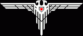
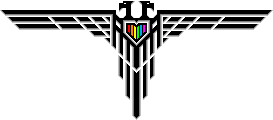
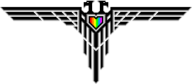
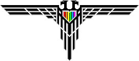
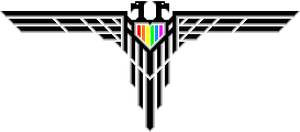
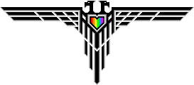
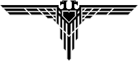
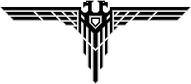
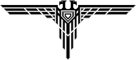
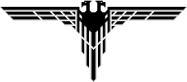
Those are four versions of a crest I made for GALE Force. I'd like opinions as to which one is the best. Personally I like 2 and 4.
Posted: 2006-10-10 08:58pm
by Soontir C'boath
I like number two. The colours aren't too bright or dark like the others.
Posted: 2006-10-17 12:39pm
by Einhander Sn0m4n

Okay, 2 it is. I used PDN to make a tiny bit of gradient between each color to get rid of the dithering.
Posted: 2006-10-17 12:40pm
by Ace Pace
Einy, I'd love a B&W version of that as a TBO chapter divider, can you whip one up?
Posted: 2006-10-17 12:47pm
by Einhander Sn0m4n
Posted: 2006-10-17 12:56pm
by Einhander Sn0m4n
Hmm, I got to thinking: These would make good rank badges...
Posted: 2006-10-17 01:03pm
by Einhander Sn0m4n

New attempt at invert colors.
Posted: 2006-10-17 01:04pm
by Ace Pace
Nah, dosn't fit, not the same sense.
Posted: 2006-10-17 05:37pm
by Einhander Sn0m4n

GALE Force Invert.
Posted: 2006-10-17 05:40pm
by Darth Raptor
The rainbow shield on the Homokorps Krest needs to be larger, otherwise the Aquila is a really good choice- even if it is a little... Imperial.
Posted: 2006-10-17 05:59pm
by Einhander Sn0m4n
Darth Raptor wrote:The rainbow shield on the Homokorps Krest needs to be larger, otherwise the Aquila is a really good choice- even if it is a little... Imperial.

How's this?
Posted: 2006-10-17 06:13pm
by Darth Raptor
Aces!

Posted: 2006-10-17 11:25pm
by Elheru Aran
Hmm, a question. Could you try redesigning it a little so the tops of the heads are even with the wings' leading edge? Just curious how that'd look... ta

Posted: 2006-10-19 12:53pm
by Shroom Man 777
I love it! Can you do a version where the "chest" of the bird is solid, and on it is an iron cross with wings set on red? Can you make a one-headed eagle?
I intend on using it for my space nazis.
Posted: 2006-10-19 12:57pm
by Col. Crackpot
Einhander Sn0m4n wrote:

Skymarshall Ein of the Gay Luftwaffe??
