Romney's Tax Plan

N&P: Discuss governments, nations, politics and recent related news here.

Moderators: Alyrium Denryle, Edi, K. A. Pital

User avatar
Master of Ossus
Darkest Knight
Posts: 18213
Joined: 2002-07-11 01:35am
Location: California

Post by Master of Ossus »

brianeyci wrote:Too bad Stas Bush doesn't agree with you dumbass. But of course you will probably dismiss him as a communist nutjob.
Or this whole argument as an appeal to popularity?
I am well aware that the shit goes up in powers of ten, ten to the power of one, ten to the power of two, ten to the power of three. But it is not as honest as Stas Bush's graph with a direct one to one scale -- it was chosen specifically to make my point seem more ridiculous, ironically violating your own point earlier about requiring income brackets to be the same amount, or the independent variables to be the same distance.
Bullshit. A logarithmic scale was clearly selected as an honest way of showing a distribution function. Furthermore, I explained to you several times about the logarithmic scale. For you to THEN come out and decry it as being dishonest (and, particularly, in the retarded manner that you selected) is one of the most hilarious things I have seen all week. Further, that you don't understand the superiority of the graph that I presented for the purposes we have here is laughable. I have explained this to you, and you have totally ignored this.
And you mention it, as if mentioning it addresses the problem of dishonest representation. You deliberately fucked around with the scale to make the graph appear more like the normal distribution when my entire point is i - 1 > i. You don't see a fucking problem with that? Here's a hint dickbrain, see if you can remember how to factor and pick out 1/x from P(x).
I didn't make that graph, you dumbass. Obviously the people who made that graph felt that a logarithmic scale was a reasonable way of presenting the information, and frankly I agree with them. Logarithmic scales are good ways to compare when the density drops off dramatically as you increase another variable.
Stas already gave a good reason to exclude the end of the graph, and so did Glocksman. There's no reason to include the infirm, the sick, the elderly, the unemployed with people actually contributing to the economy. There's even no reason to include people totally disconnected from the global economy, such as much of Africa. You have anything to say to this point? Or are we going to include tress, Darth Vader and Japanese robots who also don't work?
You gotta be kidding me. This whole debate began when you made the unbelievable claim that "logic dictates for every man living a certain lifestyle, there must be two or three men making a lesser lifestyle below him and two or three men in a branch below that, and so on until the base which would contain the most people. A pyramid." Do these sick people, elderly, unemployed, and those "totally disconnected from the global economy" not have lifestyles to fit inside your retarded pyramid?
Face it dickbrain -- you had to resort to dicking around with the scale. What about the point I made about China, which does not have that drop at the end in Stas's graph? Why the fuck not? Because anti-capitalist forces such as regulation, strong central government and anti-corruption are weak there. You going to say anything about this?
:roll:

1. I did not make that graph, you dumbass. In the meantime, you had to "resort" to relying on graphs that totally obscured the necessary information that YOU were trying to use (e.g., the distribution of wealth WITHIN countries--which is apparently why you didn't accept my World Factbook stuff in the first place).
2. Of COURSE Stas' graph doesn't have a tail! IT USES THE FUCKING MEDIAN INCOME FOR EACH COUNTRY/REGION AND STOPS THERE, THEREBY IGNORING DISTRIBUTION WITHIN EACH COUNTRY--a fundamental element of your theory. When your data uses only a measure of the average, it loses data on the extremes. That was a large problem with Stas' graph in the first place, you moron. Is this too difficult a concept for you, or will you retroactively figure it out like you did with logarithms?
3. In fact, China has an extremely pronounced left-hand tail, as shown by the graph that I presented, which shows the distribution of income within China as well as that of the world and some other countries. So yoru bullshit about "anti-capitalist forces such as regulation, strong central government and anti-corruption are weak there" somehow eliminating a left-hand tail is laughable.
4. Furthermore, am I reading this right? Did you HONESTLY claim that CHINA has "weak" "anti-capitalist forces such as regulation [and a] strong central government?" Are you serious? CHINA has a weak central government?

Brian, you have shown that you are quite adept at backpedaling, misreading graphs, and out-and-out lies. Moreover, virtually all of your replies this thread have been so incomprehensible that no one can figure out what you're talking about. I'm going to ask you something, again.

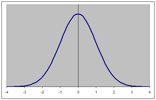
Do you actually think that this graph looks more like this than it does like this?
"Sometimes I think you WANT us to fail." "Shut up, just shut up!" -Two Guys from Kabul

Latinum Star Recipient; Hacker's Cross Award Winner

"one soler flar can vapririze the planit or malt the nickl in lass than millasacit" -Bagara1000

"Happiness is just a Flaming Moe away."
User avatar
K. A. Pital
Glamorous Commie
Posts: 20813
Joined: 2003-02-26 11:39am
Location: Elysium

Post by K. A. Pital »

Master of Ossus wrote:Do these sick people, elderly, unemployed, and those "totally disconnected from the global economy" not have lifestyles to fit inside your retarded pyramid?
Actually he's right, no they don't fit into the "pyramid" or syphon or whatever. The graph for population distribution by income, when looking at equal quintilles, deciles or even percentiles, closely resembles a sharp-edged pine tree.

Yes, logarithmic scale for some research makes sense because there's more fluctuation of incomes in a group which houses more people, but those fluctuations don't really change the big picture - for most people in a country, the wealth rising is a pyramid.
Master of Ossus wrote:]IT USES THE FUCKING MEDIAN INCOME FOR EACH COUNTRY/REGION AND STOPS THERE, THEREBY IGNORING DISTRIBUTION WITHIN EACH COUNTRY
Distribution inside the US on a linear scale is resembling a syphon or an oil dropper, anyways, doesn't it, and in other countries too? There's no fundamental difference between an oil dropper and a pyramid - each new linear gradation of the pyramid, be it decile, quintille or percentile, would show more people below than above for the greater part of the population.

I guess this was Brian's point, not that it's a perfect pyramid or something.

And in that he's correct, for the majority of the population inside countries each new quintille of the wealth "tree" is housing less people than the previous.

The left-side, the rapid "cutdown" of the lowest quintille/decile (different for various countries) is only valid for the smaller number of population. This reverse-pyramid with rather fast rising sides represents the poorest in a society, the outcasts, people out of the economic and productive process for the most part. Not to mention that they do not constitute the majority of the population, so the "poverty trap" which the reverse-pyramid represents is not viable for the other 80-90% of the population, usually, who are distributed in a reductive manner from bottom to top.

Were the national distributions ignored, really, the world graph would look like this, wouldn't it?
Image

From here: Rich-o-meter
Lì ci sono chiese, macerie, moschee e questure, lì frontiere, prezzi inaccessibile e freddure
Lì paludi, minacce, cecchini coi fucili, documenti, file notturne e clandestini
Qui incontri, lotte, passi sincronizzati, colori, capannelli non autorizzati,
Uccelli migratori, reti, informazioni, piazze di Tutti i like pazze di passioni...

...La tranquillità è importante ma la libertà è tutto!
Assalti Frontali
User avatar
Master of Ossus
Darkest Knight
Posts: 18213
Joined: 2002-07-11 01:35am
Location: California

Post by Master of Ossus »

brianeyci wrote:Master of Asses was the one who came out and said "pyramid invalid, normal distribution better," I did not go the other way around. I tried to get it through his thick skull that there's little difference with the coffee mug turning into a torus, but he didn't get it.
I have ABSOLUTELY no idea what you're trying to say, there.
This is all a defense of my pyramid hypothesis, not proof that a pyramid is better than a normal distribution.
If your hypothesis is worse than a normal distribution, then why did you insist that economics textbooks should present your hypothesis? Why wouldn't they just show a normal distribution, or even the actual graphs?
He doesn't seem prepared to accept there are more people in lower income brackets in general than in higher income brackets, and that capitalist societies tend to this. In fact Stas and Glock make good points that all the data points below the mean should be excluded, by virtue of non-contributors to the economy.
I'm sorry; I hadn't realized that people at the mean defined the entry point of contributing to the economy. I further didn't realize that people below that point lacked "lifestyles," and were therefore inapplicable for your pyramid theory. Also, yeah, if you cut a bell-curve in half and count only the people to the right of the peak, of COURSE it's true that you'll be able to form some stupid pyramid with what's left. Do you not even recognize the tautological cream-puff that your hypothesis is becoming in face of a more reasonable description of the data, which I presented from the very fucking start after you brought up this nonsense?
"Sometimes I think you WANT us to fail." "Shut up, just shut up!" -Two Guys from Kabul

Latinum Star Recipient; Hacker's Cross Award Winner

"one soler flar can vapririze the planit or malt the nickl in lass than millasacit" -Bagara1000

"Happiness is just a Flaming Moe away."
User avatar
K. A. Pital
Glamorous Commie
Posts: 20813
Joined: 2003-02-26 11:39am
Location: Elysium

Post by K. A. Pital »

Oh, and really, the Y = 1/X[/img] is rather accurately representing the distribution for 80-90% of the population, were I to judge by the graph presented here:

And no, of course it doesn't fucking resemble [url=http://www.tushar-mehta.com/excel/chart ... ormal2.gif]that
in the fucking slightest - don't be a fucking retard and NEVER compare linear distribution graphs with logarithmic scale graphs, because the meaning and purpose is different.
Lì ci sono chiese, macerie, moschee e questure, lì frontiere, prezzi inaccessibile e freddure
Lì paludi, minacce, cecchini coi fucili, documenti, file notturne e clandestini
Qui incontri, lotte, passi sincronizzati, colori, capannelli non autorizzati,
Uccelli migratori, reti, informazioni, piazze di Tutti i like pazze di passioni...

...La tranquillità è importante ma la libertà è tutto!
Assalti Frontali
User avatar
K. A. Pital
Glamorous Commie
Posts: 20813
Joined: 2003-02-26 11:39am
Location: Elysium

Post by K. A. Pital »

Also, yeah, if you cut a bell-curve in half and count only the people to the right of the peak, of COURSE it's true that you'll be able to form some stupid pyramid with what's left.
He's not cutting it in half, retard - the right "HALF" houses 80-90% percent of the FUCKING POPULATION.
Lì ci sono chiese, macerie, moschee e questure, lì frontiere, prezzi inaccessibile e freddure
Lì paludi, minacce, cecchini coi fucili, documenti, file notturne e clandestini
Qui incontri, lotte, passi sincronizzati, colori, capannelli non autorizzati,
Uccelli migratori, reti, informazioni, piazze di Tutti i like pazze di passioni...

...La tranquillità è importante ma la libertà è tutto!
Assalti Frontali
User avatar
Master of Ossus
Darkest Knight
Posts: 18213
Joined: 2002-07-11 01:35am
Location: California

Post by Master of Ossus »

Stas Bush wrote:
Master of Ossus wrote:Do these sick people, elderly, unemployed, and those "totally disconnected from the global economy" not have lifestyles to fit inside your retarded pyramid?
Actually he's right, no they don't fit into the "pyramid" or syphon or whatever. The graph for population distribution by income, when looking at equal quintilles, deciles or even percentiles, closely resembles a sharp-edged pine tree.

Yes, logarithmic scale for some research makes sense because there's more fluctuation of incomes in a group which houses more people, but those fluctuations don't really change the big picture - for most people in a country, the wealth rising is a pyramid.
1. Logarithmic scales make senes when there are fluctuations in higher income levels; not when there are fluctuations in a group which houses more people.
Master of Ossus wrote:Distribution inside the US on a linear scale is resembling a syphon or an oil dropper, anyways, doesn't it, and in other countries too? There's no fundamental difference between an oil dropper and a pyramid - each new linear gradation of the pyramid, be it decile, quintille or percentile, would show more people below than above for the greater part of the population.
Look, I'll buy the argument that if you take away all the data points that don't fit Brian's theory (e.g., those that fall "below" the peak--a significant fraction of the population), then you can make Brian's pyramid theory work. In comparison with a normal distribution, though, he's simply wrong. There are clear left-hand tails in the US and in every other country (and the world).
I guess this was Brian's point, not that it's a perfect pyramid or something.

And in that he's correct, for the majority of the population inside countries each new quintille of the wealth "tree" is housing less people than the previous.
I believe you are confused. A quintile, by definition, houses the same same number of people as any other quintile. I can't actually say I understand what you're trying to say.
The left-side, the rapid "cutdown" of the lowest quintille/decile (different for various countries) is only valid for the smaller number of population. This reverse-pyramid with rather fast rising sides represents the poorest in a society, the outcasts, people out of the economic and productive process for the most part.
Again, if Brian's only point was that, ignoring the part of the population for which his theory does not fit at all, his theory can kinda, sorta describe the population of the world and the US, then it works. But his insistence on using his theory as being BETTER than a normal curve, which DOES account for all of these people that you have to ignore in order to get the pyramid, makes no sense to me.
Not to mention that they do not constitute the majority of the population, so the "poverty trap" which the reverse-pyramid represents is not viable for the other 80-90% of the population, usually, who are distributed in a reductive manner from bottom to top.

Were the national distributions ignored, really, the world graph would look like this, wouldn't it?
Image
I have presented the world graph, above. It clearly exhibits the left-hand tail that my hypothesis predicted and that his denied. The graph that you originally posted ignores distribution WITHIN countries, which is why it looks like a line graph with discrete readings as opposed to a distribution with continuous density data.
"Sometimes I think you WANT us to fail." "Shut up, just shut up!" -Two Guys from Kabul

Latinum Star Recipient; Hacker's Cross Award Winner

"one soler flar can vapririze the planit or malt the nickl in lass than millasacit" -Bagara1000

"Happiness is just a Flaming Moe away."
User avatar
K. A. Pital
Glamorous Commie
Posts: 20813
Joined: 2003-02-26 11:39am
Location: Elysium

Post by K. A. Pital »

Logarithmic scales make senes when there are fluctuations in higher income levels
Please tell me why then the log scale is not reversed? Less discrete income groupings are used for higher levels, more discrete - for lower income levels.
Look, I'll buy the argument that if you take away all the data points that don't fit Brian's theory (e.g., those that fall "below" the peak--a significant fraction of the population)
Look, all who fall below the peak for the US constitute a quintille at best if taking your graph.
A quintile, by definition, houses the same same number of people as any other quintile. I can't actually say I understand what you're trying to say.
Yeah, I messed up words. The argument: for the absolute majority of the population (80-100%) each higher decille, quintille or percentile has an income disproportionately higher than it's size, i.e. a reverse correlation. It means a higher income level (that's the messed up part) houses less people than the lower income level for the absolute majority of the population.
But his insistence on using his theory as being BETTER than a normal curve, which DOES account for all of these people that you have to ignore in order to get the pyramid, makes no sense to me.
It's not his insistence, I guess the point is that his theory is valid for 80-100% of a countries population, while the reverse - where each new income level houses more people - is valid only for the poorest 0-20% of population.
It clearly exhibits the left-hand tail that my hypothesis predicted and that his denied.
Oh please. Should I tell you once again that you DO NOT compare linear and log graphs, since they aren't comparable and show different things? Blunt distribution on a linear scale isn't itself changed in any way by choosing a log scale. :lol:
Lì ci sono chiese, macerie, moschee e questure, lì frontiere, prezzi inaccessibile e freddure
Lì paludi, minacce, cecchini coi fucili, documenti, file notturne e clandestini
Qui incontri, lotte, passi sincronizzati, colori, capannelli non autorizzati,
Uccelli migratori, reti, informazioni, piazze di Tutti i like pazze di passioni...

...La tranquillità è importante ma la libertà è tutto!
Assalti Frontali
User avatar
brianeyci
Emperor's Hand
Posts: 9815
Joined: 2004-09-26 05:36pm
Location: Toronto, Ontario

Post by brianeyci »

Stas Bush wrote:He's not cutting it in half, retard - the right "HALF" houses 80-90% percent of the FUCKING POPULATION.
Looks like Master of Asses is still too stupid to understand what the fuck he is doing. What a lying sack of shit. He says that the pyramid is invalid and his "bell curve" is more valid. I wonder if he manages to work out what equation exactly creates a more valid approximation. If he did he'd realize a coffee mug was a torus, or that a bell curve can be changed to a pyramid without changing the information. I realize it's a difficult concept to grasp for someone who hasn't taken topology, but he should still be able to understand it.

That is, f(x1) = f(x2) => x1 = x2 or the graph is injective so by dicking around with the scale he is not changing the hypothesis xi-1 > xi at all for over 90% of the population. What a fucking peabrain, thinking that changing the shape of the graph based on dicking around with the scale somehow changes the information.
User avatar
K. A. Pital
Glamorous Commie
Posts: 20813
Joined: 2003-02-26 11:39am
Location: Elysium

Post by K. A. Pital »

If you choose the log scale, you have to account for it. You don't fucking post a linear-scale Bell distribution and then say "Well, my log graph looks like this linear graph", that's fucking RETARDED.

Compressing the same Bell curve to a linear scale would yield the "pine tree" model which I proposed and which I believe is generally correct - 80-100% of population have a reducive distribution along annual income rates - the higher the income, the less population are obtaining it, whilst only the poorest show an opposite dynamic.

Indeed this distribution could be also useful to determine where the poverty ends - where making less and less makes you a minority until you become a bum who has nothing and definetely doesn't have large numbers - and where the income "rise" starts, where each new income group is smaller numerically than the previous one.
Lì ci sono chiese, macerie, moschee e questure, lì frontiere, prezzi inaccessibile e freddure
Lì paludi, minacce, cecchini coi fucili, documenti, file notturne e clandestini
Qui incontri, lotte, passi sincronizzati, colori, capannelli non autorizzati,
Uccelli migratori, reti, informazioni, piazze di Tutti i like pazze di passioni...

...La tranquillità è importante ma la libertà è tutto!
Assalti Frontali
User avatar
brianeyci
Emperor's Hand
Posts: 9815
Joined: 2004-09-26 05:36pm
Location: Toronto, Ontario

Post by brianeyci »

Stas Bush wrote:Oh please. Should I tell you once again that you DO NOT compare linear and log graphs, since they aren't comparable and show different things? Blunt distribution on a linear scale isn't itself changed in any way by choosing a log scale
But Master didn't make that graph! Master didn't make that graph! So he didn't choose it! What a fucking dick head. I wonder how long he dug through Google, and whether he rubbed his hands like a maniac or smiled like a moron when he found it, thinking it devastating to my point.

I wonder why such resistance in viewing society as stratified. In his first post he says this is impossible. Perhaps he is afraid that the logical conclusion of this thread will be capitalism sucks for the vast majority of people. He need not be afraid of that -- the conclusion was made already in many threads in this forum, and also by anyone with half a brain. I think J mentioned that capitalism was "rigged" for those with more money in her investment thread and nobody championed capitalism. Or someone did, and Mike even brought up Marx, Marx of all people, to say that even though Marx's methods were wrong, his premise, that too many people make money without doing anything for it, was right. He also doesn't need to be afraid, because capitalism although flawed is so far the best system we have combined with government regulation and socialism on select issues like healthcare and infrastructure.

No, the only thing Master of Asses has to be afraid of is becoming even more of a laughing stock as he blatantly denies there can be income brackets, even though for all practical purposes income brackets exist.
User avatar
K. A. Pital
Glamorous Commie
Posts: 20813
Joined: 2003-02-26 11:39am
Location: Elysium

Post by K. A. Pital »

As for the world, there you have linear scales of distribution for both x and y - and you could clearly see that the majority of the world's population are in for a steep reduction level: even a modest income of 5000 is attainable for figures below 200,000,000, not even speaking of higher levels.

Most people live below that, and follow the same reduction pattern - the richer they become, the fewer of them remains on the higher income level.
Image
Lì ci sono chiese, macerie, moschee e questure, lì frontiere, prezzi inaccessibile e freddure
Lì paludi, minacce, cecchini coi fucili, documenti, file notturne e clandestini
Qui incontri, lotte, passi sincronizzati, colori, capannelli non autorizzati,
Uccelli migratori, reti, informazioni, piazze di Tutti i like pazze di passioni...

...La tranquillità è importante ma la libertà è tutto!
Assalti Frontali
User avatar
K. A. Pital
Glamorous Commie
Posts: 20813
Joined: 2003-02-26 11:39am
Location: Elysium

Post by K. A. Pital »

It also shouldn't be surprising IMHO that the last billion (1b-800m) of people exhibit a falling trend - that's roughly corresponding to extreme form of poverty headcount, just as the last quintille and below in the US roughly corresponds to the poverty rates in the country (12-17%).
Lì ci sono chiese, macerie, moschee e questure, lì frontiere, prezzi inaccessibile e freddure
Lì paludi, minacce, cecchini coi fucili, documenti, file notturne e clandestini
Qui incontri, lotte, passi sincronizzati, colori, capannelli non autorizzati,
Uccelli migratori, reti, informazioni, piazze di Tutti i like pazze di passioni...

...La tranquillità è importante ma la libertà è tutto!
Assalti Frontali
User avatar
brianeyci
Emperor's Hand
Posts: 9815
Joined: 2004-09-26 05:36pm
Location: Toronto, Ontario

Post by brianeyci »

Only a dishonest lying cunt would say a bell curve more accurately represents the income distribution of a region, or even the world (but I will settle for a region.) When you "bell curve" a set of grades, you find the median value and try and manipulate the numbers so there's equal grades on both sides of the median. "Bell curving" and "bell curve", which is not a mathematical term but a slang term, invariably refers to the standard normal distribution. That is, equal distance between independent variables.

You should find income distribution figures for the Soviet Union. That will really stick a craw in his nuts, knowing that more people were in the middle class in a dirty commie haven. Oh shit... that's right, he doesn't believe in the existence of the middle class and believes it to be a modern fabrication. Better alert the IRS.
User avatar
Master of Ossus
Darkest Knight
Posts: 18213
Joined: 2002-07-11 01:35am
Location: California

Post by Master of Ossus »

Stas Bush wrote:Please tell me why then the log scale is not reversed? Less discrete income groupings are used for higher levels, more discrete - for lower income levels.
Let me ask you this: is it more likely that two people who are both making money in the range of $1,000/year have identical incomes (down to, say, the dollar level) or is it more likely that two people making in the range of $100,000/year have identical incomes down to that level of specificity? Clearly, the DENSITY will be lower, adjusted for data at $1 granules, at the lower levels--because each dollar difference shows a much greater impact in terms of their actual earnings than at very high levels of income. Suppose (hypothetically) that we had two equally sized populations, with one making income at about the $1000 level and one making income at about the $100,000 level. If you had one dollar increments and a linear scale, which one would look "higher," given even slight variations in the actual income of both groups? Use of a logarithmic scale is, therefore, appropriate such that the areas under the curve properly correspond with the size of the populations.
Look, all who fall below the peak for the US constitute a quintille at best if taking your graph.
You seriously think that the "peak" in 2000 only captures 20% of the total populace to its left? It looks more like 30-40% to me. Regardless, Brian's original claim has been shown to be erroneous, unless you redefine the "base" to constitute not people living in the lowest income bracket but people who constitute the highest density of incomes.
Yeah, I messed up words. The argument: for the absolute majority of the population (80-100%) each higher decille, quintille or percentile has an income disproportionately higher than it's size, i.e. a reverse correlation. It means a higher income level (that's the messed up part) houses less people than the lower income level for the absolute majority of the population.
Right--that's exactly why the logarithmic scale is appropriate.
It's not his insistence, I guess the point is that his theory is valid for 80-100% of a countries population, while the reverse - where each new income level houses more people - is valid only for the poorest 0-20% of population.
Which therefore defeats Brian's original argument. "When I mentioned a pyramid structure a long time ago in some debate I don't even remember, Ossus said it doesn't make any sense. Nevermind that logic dictates for every man living a certain lifestyle, there must be two or three men making a lesser lifestyle below him and two or three men in a branch below that, and so on until the base which would contain the most people. A pyramid."

Now, I disagree with your assessment of the percentages involved--the world graph shows around 30% of people below the "peak," and MANY countries and the world display "multiple peaks," at least for some portion of 1970-2000. Both of these phenomenon are inconsistent with Brian's theory, which he claimed was dictated by logic.

And, again, if you simply define the base to consist of the population that shows the highest density of incomes (and, I guess, say that those lower are the sub-basement, or something), then yeah, I agree that society forms a pyramid. But, frankly, given the context that's clearly NOT what he's talking about. And let's not even go into how little evidence he's presented for his claim.
Oh please. Should I tell you once again that you DO NOT compare linear and log graphs, since they aren't comparable and show different things? Blunt distribution on a linear scale isn't itself changed in any way by choosing a log scale. :lol:
No, but it displays differently (and arguably more reasonably). My main problem with your graph isn't the scale that it chose to use--a linear graph is defensible, although the log graph is usually preferred for academic work. The problem is that the granules are WAY too large--it ignores income distribution within a country or region, even though the distribution within a country is extremely significant. Take China, for instance--Chinese workers tail off at about the $800 level on the left and the $50,000 level on the right. Your graph would erase this disparity, and suggest that the hundreds of millions of Chinese workers ALL make around $5000, even though this is not a reasonable representation of Chinese income for the purposes of examining income disparity within the global population.
"Sometimes I think you WANT us to fail." "Shut up, just shut up!" -Two Guys from Kabul

Latinum Star Recipient; Hacker's Cross Award Winner

"one soler flar can vapririze the planit or malt the nickl in lass than millasacit" -Bagara1000

"Happiness is just a Flaming Moe away."
User avatar
Master of Ossus
Darkest Knight
Posts: 18213
Joined: 2002-07-11 01:35am
Location: California

Post by Master of Ossus »

brianeyci wrote:Only a dishonest lying cunt would say a bell curve more accurately represents the income distribution of a region, or even the world (but I will settle for a region.) When you "bell curve" a set of grades, you find the median value and try and manipulate the numbers so there's equal grades on both sides of the median. "Bell curving" and "bell curve", which is not a mathematical term but a slang term, invariably refers to the standard normal distribution.
True--it refers to a group of curves that are approximated by a normal distribution, multiplied by a constant.
That is, equal distance between independent variables.
?
You should find income distribution figures for the Soviet Union. That will really stick a craw in his nuts, knowing that more people were in the middle class in a dirty commie haven. Oh shit... that's right, he doesn't believe in the existence of the middle class and believes it to be a modern fabrication. Better alert the IRS.
Oh my god. The USSR-FSU income distribution is SHOWN IN THE GRAPH THAT I PROVIDED, up until 1989. How fucking stupid are you?
"Sometimes I think you WANT us to fail." "Shut up, just shut up!" -Two Guys from Kabul

Latinum Star Recipient; Hacker's Cross Award Winner

"one soler flar can vapririze the planit or malt the nickl in lass than millasacit" -Bagara1000

"Happiness is just a Flaming Moe away."
User avatar
Master of Ossus
Darkest Knight
Posts: 18213
Joined: 2002-07-11 01:35am
Location: California

Post by Master of Ossus »

Stas Bush wrote:If you choose the log scale, you have to account for it. You don't fucking post a linear-scale Bell distribution and then say "Well, my log graph looks like this linear graph", that's fucking RETARDED.
They show the same information. It's just really frickin' hard to estimate the AREA of very thin lines compared to the AREA of larger blocks, so the logarithmic scale is used instead of a linear one.
Compressing the same Bell curve to a linear scale would yield the "pine tree" model which I proposed and which I believe is generally correct - 80-100% of population have a reducive distribution along annual income rates - the higher the income, the less population are obtaining it, whilst only the poorest show an opposite dynamic.

Indeed this distribution could be also useful to determine where the poverty ends - where making less and less makes you a minority until you become a bum who has nothing and definetely doesn't have large numbers - and where the income "rise" starts, where each new income group is smaller numerically than the previous one.
I mean, again, I suppose that if you define the "base" (or poverty line, or whatever) to constitute the group that shows the highest density with respect to income, then brian's theory can hold up. Otherwise....
Last edited by Master of Ossus on 2008-02-02 02:32pm, edited 1 time in total.
"Sometimes I think you WANT us to fail." "Shut up, just shut up!" -Two Guys from Kabul

Latinum Star Recipient; Hacker's Cross Award Winner

"one soler flar can vapririze the planit or malt the nickl in lass than millasacit" -Bagara1000

"Happiness is just a Flaming Moe away."
User avatar
Master of Ossus
Darkest Knight
Posts: 18213
Joined: 2002-07-11 01:35am
Location: California

Post by Master of Ossus »

brianeyci wrote:But Master didn't make that graph! Master didn't make that graph! So he didn't choose it! What a fucking dick head. I wonder how long he dug through Google, and whether he rubbed his hands like a maniac or smiled like a moron when he found it, thinking it devastating to my point.
For the record, I found this graph by typing "world income distribution" into google. It was the first result that came up. And, yes, it does destroy your point.
I wonder why such resistance in viewing society as stratified. In his first post he says this is impossible.
More lies, you cockmonkey. My first post in this thread refers clearly to "middle class Americans."
Perhaps he is afraid that the logical conclusion of this thread will be capitalism sucks for the vast majority of people.
How does it suck for the vast majority of people? Even according to Stas Bush (your ONLY defender), 80-90% of the world's population lives above the "base" that you two have created. I'd say that would indicate that it sucks for a fairly small fraction of people. If you claim that it "sucks" to live the life of an average Chinese person, then I can see that, but I don't think that China's population feels as if capitalism is such a horrible thing. The fall of the USSR in 1990 corresponds roughly to the emergence of the multiple-peak Chinese income distribution, which has clearly uplifted a substantial fraction of the populace out of the abject poverty that the whole country was in during the 1970's, when the average Chines person pulled in less than $1000/year.
He need not be afraid of that -- the conclusion was made already in many threads in this forum, and also by anyone with half a brain. I think J mentioned that capitalism was "rigged" for those with more money in her investment thread and nobody championed capitalism. Or someone did, and Mike even brought up Marx, Marx of all people, to say that even though Marx's methods were wrong, his premise, that too many people make money without doing anything for it, was right. He also doesn't need to be afraid, because capitalism although flawed is so far the best system we have combined with government regulation and socialism on select issues like healthcare and infrastructure.
Holy shit! Marx was anti-capitalist! Stop the presses.
No, the only thing Master of Asses has to be afraid of is becoming even more of a laughing stock as he blatantly denies there can be income brackets, even though for all practical purposes income brackets exist.
Where have I denied that income brackets exist, you lying sack of pond-scum? I've referred repeatedly to class distinctions in this very thread!
"Sometimes I think you WANT us to fail." "Shut up, just shut up!" -Two Guys from Kabul

Latinum Star Recipient; Hacker's Cross Award Winner

"one soler flar can vapririze the planit or malt the nickl in lass than millasacit" -Bagara1000

"Happiness is just a Flaming Moe away."
User avatar
K. A. Pital
Glamorous Commie
Posts: 20813
Joined: 2003-02-26 11:39am
Location: Elysium

Post by K. A. Pital »

Use of a logarithmic scale is, therefore, appropriate such that the areas under the curve properly correspond with the size of the populations.
No, they fucking don't, you fucking asshole, since the "area under the curve" in a logarithmic scale in one case (left side) corresponds to the lowest quintille alone, but in the other case to all the other quintilles together, e.g. 80% of the fucking population. Fuck you and don't you ever try to peddle this lie, the log distribution does not create areas corresponding to population sizes you asstard.
You seriously think that the "peak" in 2000 only captures 20% of the total populace to its left? It looks more like 30-40% to me.
"Looks"? Are you a motherfucking moron who can't read fucking graphs you post yourself, you idiot? You're a motherfucking moron, and now that's clear for all:
Image
Look, fucker, the reverse dynamic is only valid for the poorest 20% of the population - you know, it's even written in the fucking HEAD of the graph, the upper line. Read that carefully and stop pretending reverse dynamics are valid for half of the population - they're only for the poorest quintille.
Right--that's exactly why the logarithmic scale is appropriate.
That's why it's absolutely irrelevant for 80% of the population that the poorest 20% have a reverse dynamic, i.e. greater incomes correspond to greater number of people.
Now, I disagree with your assessment of the percentages involved--the world graph shows around 30% of people below the "peak," and MANY countries and the world display "multiple peaks," at least for some portion of 1970-2000.
How the fuck can you "disagree" with my "assessment"? 30% of the world's population showing a reverse dynamic? Care to prove that with figures? A graph which shows that "30% of the population" are a reverse syphon?
My main problem with your graph isn't the scale that it chose to use--a linear graph is defensible, although the log graph is usually preferred for academic work.
DEFENSIBLE? What's here to "defend", the fact that you use a linear graph to see distribution of humans in income brackets?
The problem is that the granules are WAY too large--it ignores income distribution within a country or region, even though the distribution within a country is extremely significant.
Okay, I've had enough of this fucking shit. Take a country graph and show me a country which has a distribution that, on a national level, does not resemble that of the US. Do not pick North fucking Korea, though. And I've already given a graph with smaller granules.
Your graph would erase this disparity, and suggest that the hundreds of millions of Chinese workers ALL make around $5000, even though this is not a reasonable representation of Chinese income
Give me the China graph, and let's see if it shows a pinetree like the US one the case is closed, allright? I never said the world graph is meant to be an exact headcount of all people in any income bracket everywhere.
Lì ci sono chiese, macerie, moschee e questure, lì frontiere, prezzi inaccessibile e freddure
Lì paludi, minacce, cecchini coi fucili, documenti, file notturne e clandestini
Qui incontri, lotte, passi sincronizzati, colori, capannelli non autorizzati,
Uccelli migratori, reti, informazioni, piazze di Tutti i like pazze di passioni...

...La tranquillità è importante ma la libertà è tutto!
Assalti Frontali
User avatar
brianeyci
Emperor's Hand
Posts: 9815
Joined: 2004-09-26 05:36pm
Location: Toronto, Ontario

Post by brianeyci »

Well then dickmonkey, you're an inconsistent piece of shit who holds many contradictory opinions. Not surprising, given you need to change modes of thinking from "economist manipulating graphs" to argue logically but then revert to economist thinking when it suits you. Wealth does not equal happiness... what a fucking joke.
Master of Asses wrote:No, I don't--the American class structure is a comparatively new phenomenon that does not appear to be a necessary aspect of society
You said that you retard. "Not a necessary aspect of society" -- might as well not fucking consider it then! So tell me again how when you mention "middle class" it is consistent with this statement -- either mentioning middle class is a fucking red herring, or you carted the goalposts around like a moron. When I said first post, I meant first post in reply to me.

Guess what you moron -- a normal distribution looks like a fucking pyramid too. Only the standard normal distribution does not, what is colloquially known as a bell curve. If you admit that my model is not incorrect, but merely less accurate because yours takes into account elderly, people in Africa living off the grid, unemployed and so on, then I win you asshole. A normal distribution with its x-axis shifted to the left still satisfies my hypothesis for the vast majority of independent variables. It still looks like a pyramid you dick. It's only wrong for the people off-the-grid, not contributing to the economy at all, unemployed, the extreme poor.
User avatar
K. A. Pital
Glamorous Commie
Posts: 20813
Joined: 2003-02-26 11:39am
Location: Elysium

Post by K. A. Pital »

Even according to Stas Bush (your ONLY defender), 80-90% of the world's population lives above the "base" that you two have created. I'd say that would indicate that it sucks for a fairly small fraction of people.
You're a fucking idiot, aren't you? How the fuck are PAUPERS, i.e. people in POVERTY, the "base" of an economy? :roll: I've already noted that reverse-dynamic percentage corresponds to the poverty rates for the United States and seems to do so for the world, too - roughly of course, but then the "peak people" is also an approximation. Do the words "poorest quintille" which I said, look like I'm saying they are a BASE for the economy, you asstard?

And of course most of the world doesn't live in "poverty", idiot, and a "pyramid" doesn't mean the BASE houses MORE units of measure than the ENTIRE FUCKING PYRAMID, you fucking asshole.

How the fuck do you figure that any of us even argued that the number of people at the end of a pyramid should be GREATER than the number of people on ALL OTHER LEVELS of the same pyramid combined? It should only be greater than the number of people on the level ABOVE IT.

You ass. Even a fucking pyramid scheme only has more people at the level below than at the level above, not more people below than involved in the entire pyramid - and we're talking about an entire economy here, not just a financial scam. So fuck you and your bullshit.
Lì ci sono chiese, macerie, moschee e questure, lì frontiere, prezzi inaccessibile e freddure
Lì paludi, minacce, cecchini coi fucili, documenti, file notturne e clandestini
Qui incontri, lotte, passi sincronizzati, colori, capannelli non autorizzati,
Uccelli migratori, reti, informazioni, piazze di Tutti i like pazze di passioni...

...La tranquillità è importante ma la libertà è tutto!
Assalti Frontali
User avatar
K. A. Pital
Glamorous Commie
Posts: 20813
Joined: 2003-02-26 11:39am
Location: Elysium

Post by K. A. Pital »

Oh, and in case you smartass fucker EVER fucking TRY to assert that population size, based on AREA of a LOG GRAPH:
Image
Image

Never, EVER fucking claim that areas of a log graph represent percentages of population or pop. numbers.
Lì ci sono chiese, macerie, moschee e questure, lì frontiere, prezzi inaccessibile e freddure
Lì paludi, minacce, cecchini coi fucili, documenti, file notturne e clandestini
Qui incontri, lotte, passi sincronizzati, colori, capannelli non autorizzati,
Uccelli migratori, reti, informazioni, piazze di Tutti i like pazze di passioni...

...La tranquillità è importante ma la libertà è tutto!
Assalti Frontali
User avatar
Gil Hamilton
Tipsy Space Birdie
Posts: 12962
Joined: 2002-07-04 05:47pm
Contact:

Post by Gil Hamilton »

brianeyci wrote:Guess what you moron -- a normal distribution looks like a fucking pyramid too. Only the standard normal distribution does not, what is colloquially known as a bell curve. If you admit that my model is not incorrect, but merely less accurate because yours takes into account elderly, people in Africa living off the grid, unemployed and so on, then I win you asshole. A normal distribution with its x-axis shifted to the left still satisfies my hypothesis for the vast majority of independent variables. It still looks like a pyramid you dick. It's only wrong for the people off-the-grid, not contributing to the economy at all, unemployed, the extreme poor.
While the Filthy Socialist Liberal Dirtbag in me howls to scream at MoO on this, I don't think you are getting what he's saying, Brian. None of those charts look like a pyramid. They are distributions. That means they are small at the bottom of the chart and at the top. A pyramid is large at the bottom and tiny at the top.

A distribution such as the one you folks are talking about, even with a DRAMATIC right skew (as you find in those income charts with the logarithmic abcissa) are not pyramidic, because the weight of the curve is not the greatest at the bottom and smaller as the chart moves along the axis, which in the case you are talking about would have the highest percentage of the population in extreme poverty and then ascend the chart from there. This is not what the chart shows, you are wrong. At best, you can argue that it's more Hershey's Kiss shaped.

Besides, it's the skew of the curve that's the issue, not whether or not you consider it Bell Shaped (which is is, even with a dramatic skew).
"Show me an angel and I will paint you one." - Gustav Courbet

"Quetzalcoatl, plumed serpent of the Aztecs... you are a pussy." - Stephen Colbert

"Really, I'm jealous of how much smarter than me he is. I'm not an expert on anything and he's an expert on things he knows nothing about." - Me, concerning a bullshitter
User avatar
Master of Ossus
Darkest Knight
Posts: 18213
Joined: 2002-07-11 01:35am
Location: California

Post by Master of Ossus »

Stas Bush wrote:Give me the China graph, and let's see if it shows a pinetree like the US one the case is closed, allright? I never said the world graph is meant to be an exact headcount of all people in any income bracket everywhere.
Fine. There it is. It shows significant discontinuities, unlike the US graph (because of the huge urban-rural split). Even if you decided to totally ignore the urban-rural gap which creates that big discontinuity around the $30-40,000 mark (there are more households in China making $40-50,000 than there are households making $30-40,000), you'd have to ignore the huge drop at the very bottom (which is understated, actually, because the bottom category is a decile and the ones above it capture 5000 increments).
Last edited by Master of Ossus on 2008-02-02 03:48pm, edited 1 time in total.
"Sometimes I think you WANT us to fail." "Shut up, just shut up!" -Two Guys from Kabul

Latinum Star Recipient; Hacker's Cross Award Winner

"one soler flar can vapririze the planit or malt the nickl in lass than millasacit" -Bagara1000

"Happiness is just a Flaming Moe away."
User avatar
brianeyci
Emperor's Hand
Posts: 9815
Joined: 2004-09-26 05:36pm
Location: Toronto, Ontario

Post by brianeyci »

Gil Hamilton wrote:While the Filthy Socialist Liberal Dirtbag in me howls to scream at MoO on this, I don't think you are getting what he's saying, Brian. None of those charts look like a pyramid. They are distributions. That means they are small at the bottom of the chart and at the top. A pyramid is large at the bottom and tiny at the top.

A distribution such as the one you folks are talking about, even with a DRAMATIC right skew (as you find in those income charts with the logarithmic abcissa) are not pyramidic, because the weight of the curve is not the greatest at the bottom and smaller as the chart moves along the axis, which in the case you are talking about would have the highest percentage of the population in extreme poverty and then ascend the chart from there. This is not what the chart shows, you are wrong. At best, you can argue that it's more Hershey's Kiss shaped.

Besides, it's the skew of the curve that's the issue, not whether or not you consider it Bell Shaped (which is is, even with a dramatic skew).
Only if you include those who aren't contributing to the economy. If the goal is to find links between those who make money in the economy, including the bottom who make none due to illness, unemployment and so on is retarded.

And of course the practical reality is that taxes (what this thread is about, god) are assessed not through a continuous function but through brackets, step functions. So it will resemble a pyramid, the steps being rather abrupt and without question. For exmaple, 1000 dollars this tax bracket, 1001 dollars that tax bracket.
User avatar
Master of Ossus
Darkest Knight
Posts: 18213
Joined: 2002-07-11 01:35am
Location: California

Post by Master of Ossus »

brianeyci wrote:Well then dickmonkey, you're an inconsistent piece of shit who holds many contradictory opinions. Not surprising, given you need to change modes of thinking from "economist manipulating graphs" to argue logically but then revert to economist thinking when it suits you. Wealth does not equal happiness... what a fucking joke.
Fuck you, asshole. Did you bother to read the article I linked to, earlier?
Master of Asses wrote:No, I don't--the American class structure is a comparatively new phenomenon that does not appear to be a necessary aspect of society
You said that you retard. "Not a necessary aspect of society" -- might as well not fucking consider it then! So tell me again how when you mention "middle class" it is consistent with this statement -- either mentioning middle class is a fucking red herring, or you carted the goalposts around like a moron. When I said first post, I meant first post in reply to me.
Way to take something out of context, moron. I was talking about how the class structure was not a LOGICALLY NECESSARY function of society--not one that doesn't exist. In fact, if you bothered to read the sentence that you quoted, I acknowledged its existence in that very statement, by noting that it was a "comparatively new phenomenon."
Guess what you moron -- a normal distribution looks like a fucking pyramid too. Only the standard normal distribution does not, what is colloquially known as a bell curve. If you admit that my model is not incorrect, but merely less accurate because yours takes into account elderly, people in Africa living off the grid, unemployed and so on, then I win you asshole. A normal distribution with its x-axis shifted to the left still satisfies my hypothesis for the vast majority of independent variables. It still looks like a pyramid you dick. It's only wrong for the people off-the-grid, not contributing to the economy at all, unemployed, the extreme poor.
This isn't true--see what Gil Hamilton said. See the China graph I just linked to. I'm sick of your ridiculous lies.
"Sometimes I think you WANT us to fail." "Shut up, just shut up!" -Two Guys from Kabul

Latinum Star Recipient; Hacker's Cross Award Winner

"one soler flar can vapririze the planit or malt the nickl in lass than millasacit" -Bagara1000

"Happiness is just a Flaming Moe away."
Post Reply