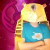
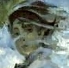
This is an idea for a cover I'm using for a moosey story I've got in the works, I quite like it, but I'm buggered if I can find any logical position for the important stuff like the title without making it look too busy. The black pattern is a large version of the same symbol in my sig and av, which I thought would look a bit snazzy, but I'm not sure whether it's too busy for use as a cover. It seems simple, but as I said, I just can't figure out where to put a title or what format to use for the title - as each font I try just looks a bit crap.
Those with better art skills and more art-ily minded, I'd welcome any thoughts on ways to improve the composition, or versions of the cover with MSpaint style directions on it. I'd even welcome 'it's crap as a cover, best start again'.
"...a fountain of mirth, issuing forth from the penis of a cupid..." ~ Dalton / Winner of the 'Frank Hipper Most Horrific Drag EVAR' award - 2004 / The artist formerly known as The_Lumberjack.
Evil Brit Conspiracy: Token Moose Obsessed Kebab Munching Semi Geordie
My vote goes for plain white font. Something simple. Probably bolded. In that red space on the bottom right corner.
If it looks like crap though, by all means beat me.
Darth Wong wrote:The American "family values" agenda is simple: alter the world so that you can completely ignore your child and still be confident that he is receiving the same kind of Christian upbringing that you would give him if you weren't busy.
I´d move the dark pattern thingy to so that the circle with the animals is in the bottom right corner. Then you have enough space for the title and other text at the top.
Thanks for the suggestions, both of you. Will try out both ideas tonight and post the results for comparison and/or improvement. Need to get the revision out of the way first, just so you know it's appreciated and not ignored.
"...a fountain of mirth, issuing forth from the penis of a cupid..." ~ Dalton / Winner of the 'Frank Hipper Most Horrific Drag EVAR' award - 2004 / The artist formerly known as The_Lumberjack.
Evil Brit Conspiracy: Token Moose Obsessed Kebab Munching Semi Geordie
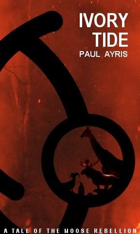
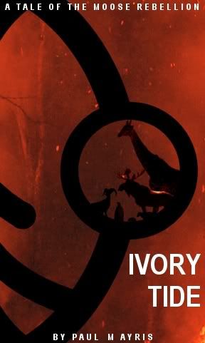
Well, here we are. Two different versions, which one looks best? Is it still too cluttered? I still find myself with limited potential positions for objects to be placed in, hence the rather awkward positioning of the author's name, title and intro-type line.
"...a fountain of mirth, issuing forth from the penis of a cupid..." ~ Dalton / Winner of the 'Frank Hipper Most Horrific Drag EVAR' award - 2004 / The artist formerly known as The_Lumberjack.
Evil Brit Conspiracy: Token Moose Obsessed Kebab Munching Semi Geordie
Darth Wong wrote:The American "family values" agenda is simple: alter the world so that you can completely ignore your child and still be confident that he is receiving the same kind of Christian upbringing that you would give him if you weren't busy.
"On the infrequent occasions when I have been called upon in a formal place to play the bongo drums, the introducer never seems to find it necessary to mention that I also do theoretical physics." -Richard Feynman
Avalon616 wrote:I really really like both of them. I think the first is a slightly better layout though.
When is this book being printed, so I can buy it?! *judges book by cover, and decides... AWESOME*
I was tending towards the first one myself, the cover design was me trying to get something of those books about things like the cold war going there, but that still looked kickass. Also don't really want visualisations on the cover as I think that ruins the imagination. This book, at the current rate, will be out in 10 years time, as I'm currently just finished chapter 3 and I'm in the exhausted 'ugh, no more words for a month' phase.
"...a fountain of mirth, issuing forth from the penis of a cupid..." ~ Dalton / Winner of the 'Frank Hipper Most Horrific Drag EVAR' award - 2004 / The artist formerly known as The_Lumberjack.
Evil Brit Conspiracy: Token Moose Obsessed Kebab Munching Semi Geordie
Test shot, I'm not overly big on the black to be honest, obviously that would mean that we'd have to move the tagline to the top which might crowd it more, but I think the black sits as quite dark against the backdrop, bit difficult to read. I'm currently favouring the white.
"...a fountain of mirth, issuing forth from the penis of a cupid..." ~ Dalton / Winner of the 'Frank Hipper Most Horrific Drag EVAR' award - 2004 / The artist formerly known as The_Lumberjack.
Evil Brit Conspiracy: Token Moose Obsessed Kebab Munching Semi Geordie
I like the white. It keeps a color scheme simple, but contrasts the dark red and black. I like the first layout more because it puts everything in there you wanted wthout it becoming busy. Also why I don't like the second one that much....seems kind of scattered.
Darth Wong wrote:The American "family values" agenda is simple: alter the world so that you can completely ignore your child and still be confident that he is receiving the same kind of Christian upbringing that you would give him if you weren't busy.
salm wrote:The black font is problematic becaust it´s the same color as the pattern thingy.
My thoughts as well, between the two of you, XBF and yourself have pretty much summed up my feelings on the covers as well in the past couple of posts. And in fact, the positioning and the colouring were both of your ideas, as using white hadn't honestly occurred to me, so well done! I think you guys are right, the more I look at the first one, the happier I am with it.
"...a fountain of mirth, issuing forth from the penis of a cupid..." ~ Dalton / Winner of the 'Frank Hipper Most Horrific Drag EVAR' award - 2004 / The artist formerly known as The_Lumberjack.
Evil Brit Conspiracy: Token Moose Obsessed Kebab Munching Semi Geordie
Darth Wong wrote:The American "family values" agenda is simple: alter the world so that you can completely ignore your child and still be confident that he is receiving the same kind of Christian upbringing that you would give him if you weren't busy.
salm wrote:The black font is problematic becaust it´s the same color as the pattern thingy.
My thoughts as well, between the two of you, XBF and yourself have pretty much summed up my feelings on the covers as well in the past couple of posts. And in fact, the positioning and the colouring were both of your ideas, as using white hadn't honestly occurred to me, so well done! I think you guys are right, the more I look at the first one, the happier I am with it.
You need a slight blur on the white letters. They look almost out of place.
{} Thrawn wins. Any questions? {} Great Dolphin Conspiracy {} Proud member of the defunct SEGNOR {} Enjoy the rythmic hip thrusts {} In my past life I was either Vlad the Impaler or Katsushika Hokusai {}
I like your cover designs a lot. You are very talented. I hope you don't mind, but I downloaded the images and modified the cover a bit for a different take:
And the template if you do not like the font choice:
Dangermouse wrote:I like your cover designs a lot. You are very talented. I hope you don't mind, but I downloaded the images and modified the cover a bit for a different take:
That's an interesting take on it, certainly, although I think the black is a bit thick and perhaps 'a tale of the moose rebellion' doesn't need to be in quite as large a font. That might help bring out the bottom letters, will also try and put some blur or aftereffect on the letters to bring them more into the picture.
Ta y'all.
"...a fountain of mirth, issuing forth from the penis of a cupid..." ~ Dalton / Winner of the 'Frank Hipper Most Horrific Drag EVAR' award - 2004 / The artist formerly known as The_Lumberjack.
Evil Brit Conspiracy: Token Moose Obsessed Kebab Munching Semi Geordie
El Moose Monstero wrote:]That's an interesting take on it, certainly, although I think the black is a bit thick and perhaps 'a tale of the moose rebellion' doesn't need to be in quite as large a font. That might help bring out the bottom letters, will also try and put some blur or aftereffect on the letters to bring them more into the picture.
Ta y'all.
Agreed. My main goal was to get more background space between the black curve and the edge of the cover so I reduced the main figure and extended the background along the side edge. It seemed less confining and cluttered that way. The reversal was purely by accident. I accidently hit a flip button and decided I liked the result. My original version had one black bar across the top and then I extended the curve along the bottom. I punted on that one since I couldn't extend the background on the bottom in a decent way. The background is very intricate so extending it is not trivial (at least for someone with my beginning skills).
I think that is also why I like the top version a bit more. The title in the bottom version seems very boxed in; the top version is not as overwhelming to the eye. As others have said, blurring the letters slightly and perhaps moving them away slightly from the circle a bit could all help. I would also consider moving up "A TALE OF THE..." slightly away from the bottom edge. It really is a great design and extremely professional looking. I think you will be very happy with the final result whichever route you decide to take. Good luck and thanks for showing it!