Grey Knight - Descent

AMP: sci-fi art, regular art, pictures, photos, comics, music, etc.

Moderator: Beowulf

Post Reply
User avatar
Feil
Jedi Council Member
Posts: 1944
Joined: 2006-05-17 05:05pm
Location: Illinois, USA

Grey Knight - Descent

Post by Feil »

Here is a my third attempt at a GIMP edit. This was a fairly recent colored pencil drawing of mine. The subject, of course, is a Grey Knight from Warhammer 40k.

Modified image (tonight, GIMP edit of original)
Image

Original (colored pencil, February 2006)
http://img105.imageshack.us/img105/7834 ... in27ez.jpg

Comments on how to improve my technique, especially in GIMP, would be much appriciated.

-Feil
Duckie
Sith Marauder
Posts: 3980
Joined: 2003-08-28 08:16pm

Post by Duckie »

Wow, that totally blew my expectations away. It's quite good.

However, the perspective bastard in me has to speak to help you improve:

The backpack is crooked, unless they're supposed to do that. It is nearly horizontal, parallel to the ground, while the Grey Knight is leaning slightly from the step.
The sword's perspective seems off, it looks much too short.
The spent shells, to my eyes, seem to be ejecting forward of the muzzle flare.
Legs are always the hardest part- as usual with Space Marines, I think you did his a bit short. Also, I'm not sure, but are both legs identical except for pose? The one to my left seems much thicker and with less exposed underarmor.

Otherwise, quite good. I like the effect you did on GIMP, giving it a blurring, sort of darkened quality that fits the picture. And the blurring of the otherwise rough lines of the colored pencils is a nice touch, too.
User avatar
Feil
Jedi Council Member
Posts: 1944
Joined: 2006-05-17 05:05pm
Location: Illinois, USA

Post by Feil »

Bastardry is always helpful, MRDOD.

I think you're right about the backpack. Fortunately, it should be easy to fix in GIMP.

I'm sure the sword is the right length. If you measure the blade and account for angle, it would have to be sternum-high. Maybe, though, if I expand and flatten the tip a bit, it will look more like the proper length. I might be able to make a convincing job of that in GIMP, or I might not...

The legs were by far the hardest part of the picture. I'm not sure that they're too short--he is crouching, after all, and the armor does make the cheast very large. Even if they are, there's nothing I can do about it. I see what you mean about thickness, though.

Thanks for criticism.

----

And, an edited edit! Now, with thicker right-leg armor, better lighting, fixed shell casings, fixed sword, and fixed backpack. I hope. Apologies for the JPEG compression artifacts.

http://tinypic.com/10r5v2b.jpg
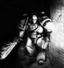
Duckie
Sith Marauder
Posts: 3980
Joined: 2003-08-28 08:16pm

Post by Duckie »

Ah, now the edited version. That is nice. Even the bastard in me can't find anything wrong with it except the nagging feeling that with all the action in the bottom right it sort of unbalances it (although that in itself isn't bad as it brings the focus of the painting to somewhere between the right purity seal and the Psycannon).

It might just be that I have Advent- One Winged Angel playing in the background, but I think you seem to have captured the badassedness of the Grey Knights in this picture. Good job on the lighting, I just realized that the muzzle flare, sword, lantern, etc, are all visible on other surfaces as reflections. That is quite an attention to detail, and better than I could do.
User avatar
Kuja
The Dark Messenger
Posts: 19322
Joined: 2002-07-11 12:05am
Location: AZ

Post by Kuja »

You know, I think the picture would be greatly enhanced if you were to omit the firing of the stormbolter. There's an element of action there that clashes with the rest of the scene.

When I look at this picture, I get a feeling of creeping erieness and fright, like something out of HP Lovecraft. The Grey Knight slowly descends the old and mildewed staircase, deep into the silent bowels of the earth, lantern held out before him like a guide, sword drawn to defend him against... something. He may not know what, but he is certain there is something ancient and terrible waiting for him. The naked sword is held more for a false sense of comfort than a real defense. Finally, hearts pounding in his chest, he comes around the final bend to look upon...what?!

That sense of cloying fear and suffocation is completely ruined by seeing the bolter in action. It bothers me even more than the fact that a guy who can see in the dark is carrying a lantern. :wink:
Image
JADAFETWA
weemadando
SMAKIBBFB
Posts: 19195
Joined: 2002-07-28 12:30pm
Contact:

Post by weemadando »

I second that opinion, the bolter fire spoils the feel of it.
User avatar
Feil
Jedi Council Member
Posts: 1944
Joined: 2006-05-17 05:05pm
Location: Illinois, USA

Post by Feil »

Whatever happened to "and they shall know no fear"? :wink:

The Stormbolter's muzzel-flash is the primary lightsource of the picture. While your point has value, my favorite thing about this picture is the dynamism given it by having two competing main lightsources (muzzel-flash, lantern), and several minor lightsources (in order of brightness: the sword, the off-camera hellfire, and the eyes). If I removed the muzzel flash, I would remove my source of contrast between reflection and shadow, which is what makes the pic so cool.

There is also the exchange of Doom-style badassery as opposed to horror-movie style fear. Both involve fear, but one mixes the adrenalyn of fear with the thrill of the fight. Anxiety would make a good pic, but this way is a different way, and good too.

And it's a holy lantern, alright? Alright, damnit?! This is 40k. Magic powers, deamons, gods, angels--I can have a lantern if I bloody well want to!

[EDIT: LOL! Megadeth- "Adicted to Chaos" just came on. The irony--it burns!]
Duckie
Sith Marauder
Posts: 3980
Joined: 2003-08-28 08:16pm

Post by Duckie »

I don't mind the bolter. While the "Creepy" angle works without it, the "Fighting The Creepy Things" angle works with it. And the lighting would be rather diminished by not having that.

Although a Grey Knight, cloaked in shadow, sword drawn, holding an antique lantern could enhance the Creepy Angle much more, too.
User avatar
Feil
Jedi Council Member
Posts: 1944
Joined: 2006-05-17 05:05pm
Location: Illinois, USA

Post by Feil »

Found an image host that will let me upload a PNG, so here's a better image of the same pic.
http://server6.theimagehosting.com/imag ... htfin6.png
User avatar
Kuja
The Dark Messenger
Posts: 19322
Joined: 2002-07-11 12:05am
Location: AZ

Post by Kuja »

Feil wrote:And it's a holy lantern, alright? Alright, damnit?! This is 40k. Magic powers, deamons, gods, angels--I can have a lantern if I bloody well want to!
To be perfectly honest, I LIKE the lantern. I accentuates the heavy gothic feel of the picture.
Image
JADAFETWA
Post Reply