EW.com reveals new Enterprise
Moderator: Vympel
- Oskuro
- Sith Devotee
- Posts: 2698
- Joined: 2005-05-25 06:10am
- Location: Barcelona, Spain
Re: EW.com reveals new Enterprise
^ Ok, Godzilla sucked, and I so wanted it to rock.
Transformers, on the other hand, I greately enjoyed (despite it's failings as a movie with the Transformers as guest starts). I guess I liked it because I did like the Transformers back in the day, but I was never such a big fan of the franchise.
I'm getting the same feel here. Hardcore fans will have a hard time adapting, but the more casual fans who enjoy ST without putting too much though into it will probably like it.
And I liked the Kirk-Era Movie version of the Enterprise best, although I was beginning to like the Sovereign class.
unsigned
- tezunegari
- Jedi Knight
- Posts: 693
- Joined: 2008-11-13 12:44pm
Re: EW.com reveals new Enterprise
This reimagined ENT-nil somehow has no real "That's a Connie!"-feeling to me.
If the design had been introduced as a new ship class, even as a prototype for a Connie-Update, I could have lived with it.
But as the Enterprise it does not really sit well with me.
I dislike the neck being moved towards the middle of the engineering section. It does look unbalanced with to much mass at the front and it cuts the lines that where defined by the original model with the neck directly behind the dish.
Even nBSG has kept the overall forms of the Battlestars. The new cylon basestars are completely different sharing only the biplane-like design which is essential to the look of a basestar.
So I fooled around with Photoshop.
Here the original:
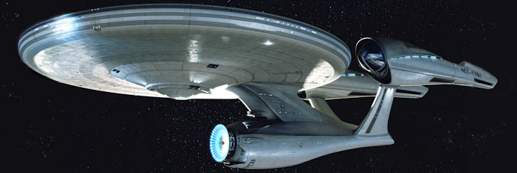
Here my modified version.

With the neck back at its original place the new model gets the old proportions necessary for the mentioned feeling without sacrifing the new detailed look.
I was sceptical when they anounced that the next movie would be a prequel/reimagining of the original.
But I like the pictures of the new bridge and the new Captain's chair.
I hope this movie is better than the TNG movies.
If the design had been introduced as a new ship class, even as a prototype for a Connie-Update, I could have lived with it.
But as the Enterprise it does not really sit well with me.
I dislike the neck being moved towards the middle of the engineering section. It does look unbalanced with to much mass at the front and it cuts the lines that where defined by the original model with the neck directly behind the dish.
Even nBSG has kept the overall forms of the Battlestars. The new cylon basestars are completely different sharing only the biplane-like design which is essential to the look of a basestar.
So I fooled around with Photoshop.
Here the original:

Here my modified version.

With the neck back at its original place the new model gets the old proportions necessary for the mentioned feeling without sacrifing the new detailed look.
I was sceptical when they anounced that the next movie would be a prequel/reimagining of the original.
But I like the pictures of the new bridge and the new Captain's chair.
I hope this movie is better than the TNG movies.
"Bring your thousands, I have my axe."
"Bring your cannons, I have my armor."
"Bring your mighty... I am my own champion."
Cue Unit-01 ramming half the Lance of Longinus down Adam's head and a bemused Gendo, "Wrong end, son."
"Bring your cannons, I have my armor."
"Bring your mighty... I am my own champion."
Cue Unit-01 ramming half the Lance of Longinus down Adam's head and a bemused Gendo, "Wrong end, son."
Ikari Gendo, NGE Fanfiction "Standing Tall"
- charlemagne
- Jedi Knight
- Posts: 924
- Joined: 2008-10-13 02:28am
- Location: Regensburg, Germany
Re: EW.com reveals new Enterprise
The modified neck looks way better, it's still a Hotrodprise, but one that actually looks like it can go really fast.

- Tsyroc
- Emperor's Hand
- Posts: 13748
- Joined: 2002-07-29 08:35am
- Location: Tucson, Arizona
Re: EW.com reveals new Enterprise
The movie and design are okay. I'd like it a lot more if they happened to call the creature Godzilla because of the fictional Godzilla. I mean, what else would you call a big ass radiation mutated reptile with spikes on it's back, that walks like a dinosaur and swims in the ocean that just seems to show up out of nowhere after trashing a Japanese fishing ship?La Maupin wrote: Godzilla - OK, you got me thereBut that wasn't just hardcore Godzilla fans complaining, either. And Godzilla's design from that movie was not really all that bad for a large, pseudo-dinosaur monster. Just not Godzilla.
I still would have rather seen something like the indestructible, nuclear fire spewing G but the 1998 movie isn't the worst remake I've seen.
-----------
tezunegari It's surprising how much your photoshop of the new ship seems to help. I wonder if that's just because I'm so used to the previous models. From a structural stand point I can see why the designers of the new one would have put the neck closer to the middle of the engineering section when they made the new version.
I hope they put out some pictures of this ship from different angles soon because I'm betting that the look will grow on me more if it's not a profile shot in which I'm automatically comparing it to the previous versions.
Those nacelles still do give it a "hot rodded" up look that doesn't make sense in a starship design. Maybe they should have been thinking a little more "Navy" or something when they finished it off instead of going with what looks like a "Hey, this looks cool, the kiddies will love it!". Which is all kind of funny considering what I just wrote about where the neck is located between the saucer and the engineering hull.
By the pricking of my thumb,
Something wicked this way comes.
Open, locks,
Whoever knocks.
Something wicked this way comes.
Open, locks,
Whoever knocks.
- McC
- Rabid Monkey
- Posts: 2775
- Joined: 2004-01-11 02:47pm
- Location: Southeastern MA, USA
- Contact:
Re: EW.com reveals new Enterprise
Scuttlebutt is that there will be plenty of views of the new E in the trailer tomorrow.
-Ryan McClure-
Scaper - Browncoat - Warsie (semi-movie purist) - Colonial - TNG/DS9-era Trekker - Hero || BOTM - Maniac || Antireligious naturalist
Scaper - Browncoat - Warsie (semi-movie purist) - Colonial - TNG/DS9-era Trekker - Hero || BOTM - Maniac || Antireligious naturalist
- Burak Gazan
- Jedi Council Member
- Posts: 1536
- Joined: 2002-12-30 07:45pm
- Location: Sault Ste Marie, Ontario
- Contact:
Re: EW.com reveals new Enterprise
You know, that one little move does the trick? Thats not half bad looking like that , if only..... 
"Of course, what would really happen is that in Game 7, with the Red Sox winning 20-0 in the 9th inning, with two outs and two strikes on the last Cubs batter, a previously unseen meteor would strike the earth, instantly and forever wiping out all life on the planet, and forever denying the Red Sox a World Series victory..."
- Bounty
- Emperor's Hand
- Posts: 10767
- Joined: 2005-01-20 08:33am
- Location: Belgium
Re: EW.com reveals new Enterprise
Seeing the original and the... "conventionalized" version side-by-side, I can see what the designer was going for. There is a line in the design, going from the neck through the secondary hull into the pylons, with the deflector dish almost underslung. The visual centre of the design isn't the deflector dish/neck connection like it was on the TMP Constitution, but a point somewhere almost at the back of the secondary hull. I've tried drawing what I'm babbling on about here:
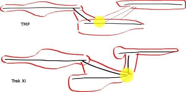
The yellow dots are where the... "lines" of the ship, for want of a better word, meet. I don't know how you say it in English.
I'm not sure I'm making any sense, but if you stop seeing the design as a TMP Connie with bad lipo and more as a ship that's bursting forth from it's own ass, it sorta makes sense.
- Stark
- Emperor's Hand
- Posts: 36169
- Joined: 2002-07-03 09:56pm
- Location: Brisbane, Australia
Re: EW.com reveals new Enterprise
Does that make it a more forward-leaning, aggressive design, with the entire secondary hull being 'forward' and sticking out forward under the saucer instead of being the 'central' part of the ship?
And hey, the ship will be destroyed and we'll get a raked design next movie anyway...
And hey, the ship will be destroyed and we'll get a raked design next movie anyway...
- Bounty
- Emperor's Hand
- Posts: 10767
- Joined: 2005-01-20 08:33am
- Location: Belgium
Re: EW.com reveals new Enterprise
I guess that's what they were going for. If you squint a bit it almost looks like the deflector is trying to outrun the ship.Does that make it a more forward-leaning, aggressive design, with the entire secondary hull being 'forward' and sticking out forward under the saucer instead of being the 'central' part of the ship?
- tezunegari
- Jedi Knight
- Posts: 693
- Joined: 2008-11-13 12:44pm
Re: EW.com reveals new Enterprise
Bounty, that's what I was thinking too.
And I believe that nearly all models of Star Trek ships had their center of mass rather close to the connection points of the "Bounty-lines" as described in your post.
The TOS/TMP Connie has a certain balance to it with the center being just behind the dish and below the neck.
This way it creates a graceful effect with enough mass being in front and behind the center of the ship.
The new model puts that center at he rear point of the engineering section. And by doing that the model looses the balance that gave the original the "grace of a legend" as a friend of mine put it.
To quote him: "The Connie has her curves in the right place and she has the grace of a legend. She is like the supermodel-mother of your best friend, you just have to stare at her whenever she walks by.
The new one... is too much mass in the front like a breast-augmentation surgery gone too far. "
"
It is too forward-leaning and I do not get the 'aggressive' in the design. It's more like a "I'm looking flashy you have to like me" feeling.
Well, we'll see if there will be a major refit for ST XII.
And I believe that nearly all models of Star Trek ships had their center of mass rather close to the connection points of the "Bounty-lines" as described in your post.
The TOS/TMP Connie has a certain balance to it with the center being just behind the dish and below the neck.
This way it creates a graceful effect with enough mass being in front and behind the center of the ship.
The new model puts that center at he rear point of the engineering section. And by doing that the model looses the balance that gave the original the "grace of a legend" as a friend of mine put it.
To quote him: "The Connie has her curves in the right place and she has the grace of a legend. She is like the supermodel-mother of your best friend, you just have to stare at her whenever she walks by.
The new one... is too much mass in the front like a breast-augmentation surgery gone too far.
It is too forward-leaning and I do not get the 'aggressive' in the design. It's more like a "I'm looking flashy you have to like me" feeling.
Well, we'll see if there will be a major refit for ST XII.
"Bring your thousands, I have my axe."
"Bring your cannons, I have my armor."
"Bring your mighty... I am my own champion."
Cue Unit-01 ramming half the Lance of Longinus down Adam's head and a bemused Gendo, "Wrong end, son."
"Bring your cannons, I have my armor."
"Bring your mighty... I am my own champion."
Cue Unit-01 ramming half the Lance of Longinus down Adam's head and a bemused Gendo, "Wrong end, son."
Ikari Gendo, NGE Fanfiction "Standing Tall"
- Bounty
- Emperor's Hand
- Posts: 10767
- Joined: 2005-01-20 08:33am
- Location: Belgium
Re: EW.com reveals new Enterprise
It's less sedate and stately than the TMP version, which is going to be a love-it-or-hate-it thing for most people. That said, I'm liking it more and more.It is too forward-leaning and I do not get the 'aggressive' in the design. It's more like a "I'm looking flashy you have to like me" feeling.
- RedImperator
- Roosevelt Republican
- Posts: 16465
- Joined: 2002-07-11 07:59pm
- Location: Delaware
- Contact:
Re: EW.com reveals new Enterprise
I see what you mean; the design makes more sense when you look at it that way. That said, I think I likeBounty wrote:Seeing the original and the... "conventionalized" version side-by-side, I can see what the designer was going for. There is a line in the design, going from the neck through the secondary hull into the pylons, with the deflector dish almost underslung. The visual centre of the design isn't the deflector dish/neck connection like it was on the TMP Constitution, but a point somewhere almost at the back of the secondary hull. I've tried drawing what I'm babbling on about here:
The yellow dots are where the... "lines" of the ship, for want of a better word, meet. I don't know how you say it in English.
I'm not sure I'm making any sense, but if you stop seeing the design as a TMP Connie with bad lipo and more as a ship that's bursting forth from it's own ass, it sorta makes sense.
tezunegari's Photoshopped version better. That one looks "fast", this one looks "aggressive", and I think overall I prefer fast. Still, not a terrible design. It has grown on me enough so that I'll withhold final judgment until I can see her in motion.

X-Ray Blues
- Bounty
- Emperor's Hand
- Posts: 10767
- Joined: 2005-01-20 08:33am
- Location: Belgium
Re: EW.com reveals new Enterprise
On a sidenote, I still think this ship is bigger than the TOS one, at the very least volume-wise. Eyeballing from the portholes, the engineering hull looks about as long as the one on the TMP Connie - so if the saucer looks out-of-scale, it's because it's been scaled up, not the rest of the ship scaled down. Neither does it lose all the volume from where the TMP saucer has those... "indents" between the rim and the core.
I'd love some ortho views to get proper measurements.
I'd love some ortho views to get proper measurements.
- Coyote
- Rabid Monkey
- Posts: 12464
- Joined: 2002-08-23 01:20am
- Location: The glorious Sun-Barge! Isis, Isis, Ra,Ra,Ra!
- Contact:
Re: EW.com reveals new Enterprise
I don't know if that really relates to this though. The reason I strongly disliked all the damn "new edition" add-ons to D&D was not because of changes in playability but because players were plunking down $100.00+ to buy the "upgraded" edition, then every year and a half Wizards of the Coast would change things, forcing new purchases. It was the obvious money-squeeze, not the changes in continuity or the "feel" of D&D. But that's a whole 'nother topic altogether.La Maupin wrote:D&D, EVERY edition changeover - the edition wars were venomous, inflammatory and highly vitriolic. They've mostly subsided for 4th Edition, but expect them to flare up again in 2016-2018 when 5th Edition rolls out.Uraniun235 wrote:Which other reboots do you have in mind when you say this?
This looks good, my only complaint with the "new, old Enterprise" is the placement of the neck/saucer assembly-- the aesthetics of it are somehow unpleasant; it has a distorted look... but apart from that I like everything else I see.
The idea of "updating" Star Trek is because it was very much a product of its times-- the social issues addressed the times, the look and feel reflected what society at that time thought the future should look like... but tastes change. Back in the '60's, having a black woman as a command level officer was "new" and "daring" and "wow", now it's not so groundbreaking (and this is good).
Gene Rodenberry made it obvious that he didn't have the budget he wanted (or the FX tech) to do certain things-- the only reason Trek has a "Transporter" was because doing a model and filming the effects for a shuttle landing just wasn't in the budget. If it had been, there'd be no "Transporter" today. So adding or changing certain cosmetics doesn't bother me.
The real "tone" or "feel" of Trek (or any story) is the characteristics of the setting that define it. If someone tried to "reboot" Star Wars into a show all about science and exploration and meeting new aliens for peaceful contact, it wouldn't really be Star Wars; likewise if they try to turn Trek into a guns-blazing war story, that would be the real discredit to the setting.
I'm still very open-minded about this, especially since Trek "continuity", as it has been establishe dover the years, is pretty much an oxymoron. Something needs to reboot it and try to pave over some of the rediculous stuff that has been allowed to crop up.
Remember: a full reboot allows the chance to re-invent a universe without Wesley Crusher. That, by itself, is worth giving this the benefit of the doubt.
Something about Libertarianism always bothered me. Then one day, I realized what it was:
Libertarian philosophy can be boiled down to the phrase, "Work Will Make You Free."
In Libertarianism, there is no Government, so the Bosses are free to exploit the Workers.
In Communism, there is no Government, so the Workers are free to exploit the Bosses.
So in Libertarianism, man exploits man, but in Communism, its the other way around!
If all you want to do is have some harmless, mindless fun, go H3RE INST3ADZ0RZ!!
Grrr! Fight my Brute, you pansy!
- Coyote
- Rabid Monkey
- Posts: 12464
- Joined: 2002-08-23 01:20am
- Location: The glorious Sun-Barge! Isis, Isis, Ra,Ra,Ra!
- Contact:
Re: EW.com reveals new Enterprise
Huh... soo.. the new Enterprise is, basically, Stiffler's Mom.tezunegari wrote:Bounty, that's what I was thinking too.
To quote: "The Connie has her curves in the right place and she has the grace of a legend. She is like the supermodel-mother of your best friend, you just have to stare at her whenever she walks by.
The new one... is too much mass in the front like a breast-augmentation surgery gone too far..
Something about Libertarianism always bothered me. Then one day, I realized what it was:
Libertarian philosophy can be boiled down to the phrase, "Work Will Make You Free."
In Libertarianism, there is no Government, so the Bosses are free to exploit the Workers.
In Communism, there is no Government, so the Workers are free to exploit the Bosses.
So in Libertarianism, man exploits man, but in Communism, its the other way around!
If all you want to do is have some harmless, mindless fun, go H3RE INST3ADZ0RZ!!
Grrr! Fight my Brute, you pansy!
Libertarian philosophy can be boiled down to the phrase, "Work Will Make You Free."
In Libertarianism, there is no Government, so the Bosses are free to exploit the Workers.
In Communism, there is no Government, so the Workers are free to exploit the Bosses.
So in Libertarianism, man exploits man, but in Communism, its the other way around!
If all you want to do is have some harmless, mindless fun, go H3RE INST3ADZ0RZ!!
Grrr! Fight my Brute, you pansy!
- tim31
- Sith Devotee
- Posts: 3388
- Joined: 2006-10-18 03:32am
- Location: Tasmania, Australia
Re: EW.com reveals new Enterprise
I think moving the neck forward make the stardrive section look a bit gangly. And I had thought that it would be the right move... Bounty's right on the money about the design cues.
lol, opsec doesn't apply to fanfiction. -Aaron
PRFYNAFBTFC
CAPTAIN OF MFS SAMMY HAGAR


PRFYNAFBTFC
CAPTAIN OF MFS SAMMY HAGAR

- Tribble
- Sith Devotee
- Posts: 3152
- Joined: 2008-11-18 11:28am
- Location: stardestroyer.net
Re: EW.com reveals new Enterprise
Maybe the saucer section is nice and big and hunched forward so that when the other weapons are rendered useless, Kirk still has some options 
Actually, the more I look at it, the more I like this new Enterprise. It actually looks like it's built to take some punishment.
Actually, the more I look at it, the more I like this new Enterprise. It actually looks like it's built to take some punishment.
"I reject your reality and substitute my own!" - The official Troll motto, as stated by Adam Savage
- Oskuro
- Sith Devotee
- Posts: 2698
- Joined: 2005-05-25 06:10am
- Location: Barcelona, Spain
Re: EW.com reveals new Enterprise
A M.I.L.F.?Coyote wrote:Huh... soo.. the new Enterprise is, basically, Stiffler's Mom.
unsigned
- La Maupin
- Youngling
- Posts: 59
- Joined: 2008-11-10 06:24pm
Re: EW.com reveals new Enterprise
The supplement treadmill is THE standard business model for RPGs. That's never going to change. Games that never come out with additional supplements are the exception, usually indie, and never sell very much.Coyote wrote:I don't know if that really relates to this though. The reason I strongly disliked all the damn "new edition" add-ons to D&D was not because of changes in playability but because players were plunking down $100.00+ to buy the "upgraded" edition, then every year and a half Wizards of the Coast would change things, forcing new purchases. It was the obvious money-squeeze, not the changes in continuity or the "feel" of D&D. But that's a whole 'nother topic altogether.La Maupin wrote:D&D, EVERY edition changeover - the edition wars were venomous, inflammatory and highly vitriolic. They've mostly subsided for 4th Edition, but expect them to flare up again in 2016-2018 when 5th Edition rolls out.Uraniun235 wrote:Which other reboots do you have in mind when you say this?
At the time, you might think that it's a mistake you can never undo.
Even if it is, if we kick and scream and fight like hell, we'll move forward, even just a little bit.
I was taught to believe in the me that believed in myself. Maybe that's how it should be.
- Simon the Digger
ASVS Vets | Class of 2000
Even if it is, if we kick and scream and fight like hell, we'll move forward, even just a little bit.
I was taught to believe in the me that believed in myself. Maybe that's how it should be.
- Simon the Digger
ASVS Vets | Class of 2000
- Lord Relvenous
- Jedi Council Member
- Posts: 1501
- Joined: 2007-02-11 10:55pm
- Location: Idaho
Re: EW.com reveals new Enterprise
I'm definately not hating it. Whether or not that translates into liking the desgin... well I do like the nacelles and saucer, and while the jutting forward of the lower part of the hull is a little distraction, it was present in preivous designs, just not as pronounced.
It's a "meh" for me.
It's a "meh" for me.
Coyote: Warm it in the microwave first to avoid that 'necrophelia' effect.
- Jon
- Jedi Council Member
- Posts: 1501
- Joined: 2004-03-02 10:11am
- Location: Manchester UK
- Singular Intellect
- Jedi Council Member
- Posts: 2392
- Joined: 2006-09-19 03:12pm
- Location: Calgary, Alberta, Canada
Re: EW.com reveals new Enterprise
Is it just me, or does Bounty's side view comparison suggest that the design has actually altered the ships centre of mass to more, well, centre?
This would certainly improve manueverability, assuming roughly equal mass distribrution.
This would certainly improve manueverability, assuming roughly equal mass distribrution.
"Now let us be clear, my friends. The fruits of our science that you receive and the many millions of benefits that justify them, are a gift. Be grateful. Or be silent." -Modified Quote
-
Bilbo
- Jedi Master
- Posts: 1064
- Joined: 2008-10-26 11:13am
Re: EW.com reveals new Enterprise
I am sorry but after reading this I had to laugh for a good five minutes.Count Chocula wrote:And if I look at the nacelle placement correctly, it appears to violate ST canon such as it is on nacelle placement.
I KILL YOU!!!
- Jon
- Jedi Council Member
- Posts: 1501
- Joined: 2004-03-02 10:11am
- Location: Manchester UK
Re: EW.com reveals new Enterprise
It's probably nothing but an effects error or something, but comparing the same shot as shown in empire a month ago to a hi res version released today;

Something funky is up with the saucer section, namely in the position of the registration being off in the new image (hi res here http://img.trekmovie.com/images/st09/st ... pockvs.jpg )

Something funky is up with the saucer section, namely in the position of the registration being off in the new image (hi res here http://img.trekmovie.com/images/st09/st ... pockvs.jpg )
- Enigma
- is a laughing fool.
- Posts: 7779
- Joined: 2003-04-30 10:24pm
- Location: c nnyhjdyt yr 45
Re: EW.com reveals new Enterprise
The bridge is rotating?Jon wrote:It's probably nothing but an effects error or something, but comparing the same shot as shown in empire a month ago to a hi res version released today;
<snip>
Something funky is up with the saucer section, namely in the position of the registration being off in the new image (hi res here http://img.trekmovie.com/images/st09/st ... pockvs.jpg )
ASVS('97)/SDN('03)
"Whilst human alchemists refer to the combustion triangle, some of their orcish counterparts see it as more of a hexagon: heat, fuel, air, laughter, screaming, fun." Dawn of the Dragons
ASSCRAVATS!
"Whilst human alchemists refer to the combustion triangle, some of their orcish counterparts see it as more of a hexagon: heat, fuel, air, laughter, screaming, fun." Dawn of the Dragons
ASSCRAVATS!