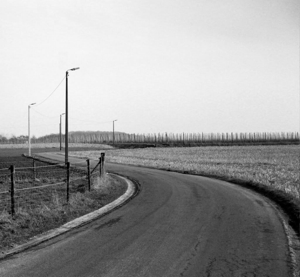
Bounty wrote:The original is still in the Argus thread for those who'd like to compare. Improvement or not?
I think it is a slight improvement. Comparing the two side-by side, you can see that the black-and-white version makes the stakes in the field and the wire of the fence more distinct, while the patch of tilled earth on the left is de-emphasized. The drainage channel on the left shoulder of the road also stands out a bit more, which helps to bring out the curve of the road. I took the liberty of cropping it further, though, since the sky is a lot of empty space and emphasizing the horizontal lay of the photo with a better aspect ratio helps it:

There's still a lot of empty space, but it is unavoidable empty space.
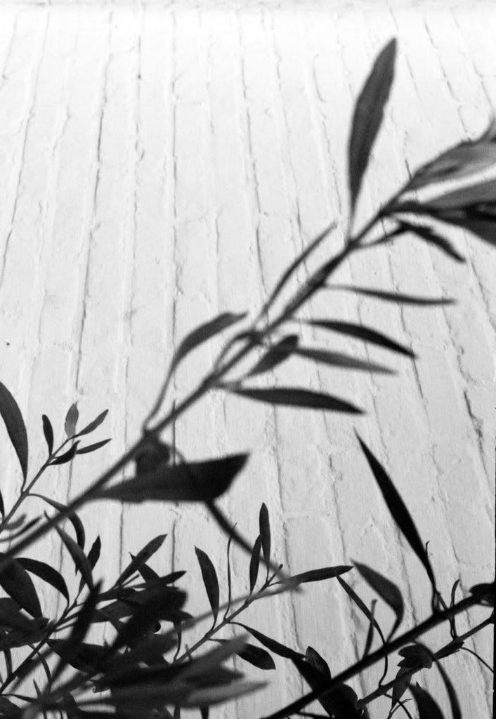
Taken with the Zorki. I'm actually not really sure what was going on here...
This one looks a bit better in landscape, but the focus really should have been on the foreground. As it is now, the large stalk says "Woah, how did I get in here" rather than "I am a part of the composition," while the focus is lost in the jumble of plants.
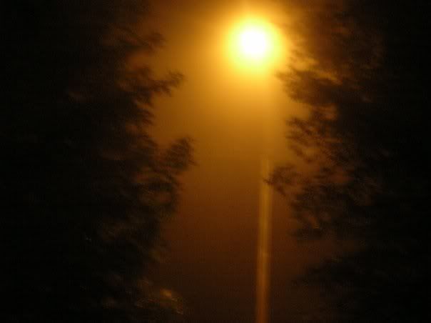
Death wrote:A bit dull. Maybe if at an hour of the day with shadows?
There are shadows; not everything has to be starkly lit. In fact, not everything
should be starkly lit.
It was a beautiful day, and I was bored in the train

.
This is where your editorial process needs to kick in. Anyone who doesn't live underground or isn't blind has seen a blue sky with clouds in before, and any of those people could take a picture of the same thing if they went out on a nice day with a camera and looked up. So there isn't much need to present such a photo to the world.
If you're going to just post snaps, at least say "I know it's just a snap" and still try to post only the least shitty snaps. I could drown this thread with
years' of "I wanted to take a picture of [x], so I did," but I have learned to apply the editing process - as a result, I've got 32 snaps set aside for this thread if nothing better comes along, out of a total of
thousands.
It was twisty, turny, tight (thus possible to compose into a closed frame), and I expected nice shadows and light from the glass.
Again, this is just a "Hey, I thought it looked nice" snapshot. An empty hallway makes for a poor subject; the lighting is perfectly ordinary midday light that anyone who has ever seen a window before is acquainted with, the shadows are plain frames on a flat floor and don't even grab the attention of the viewer, the p.o.v. is ordinary head height, and if there are any interesting architectural details here they are lost on the viewer because you didn't take a picture of them; you took a picture of the hallway they may or may not be in. If you mean to present serious photos for an audience or for critique, you need to put more work and especially more thought into them than this.
Actually, the focus was the sun. I should have used a flash, but couldn't (the dude was sleeping and would have gotten pissed from that, and no flash in the train!).
A flash would have reflected off the window and put an even brighter pointless glob of light smack in the middle of a thoughtlessly composed frame. In other words, it would have been
worse.
What is it with you and midday suns? At least go for sunsets and sunrises; they are cliche but they are cliche because they have pretty colors. The sun at any time other than <30 minutes after rise/set is boring, boring, boring. It's like taking unfiltered photos of light bulbs.
Agreed, that was actually one of my favourite shots from the Argus from a technical POV - good, rich, warm colours.
The frame and composition/elements/contrast just don't work that well in B/W.
You agree with an opinion that is completely opposite from yours? What? Also, "frame and composition/elements/contrast" are things that exist independently of whether there is color in the photo or not.