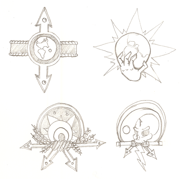
Big Orange wrote:I wonder if you can design an imposing corporate logo for your soldiers, tanks, and mechs, to hint they're all working for an quintessentially evil megacorporation.
This got me thinking of some stuff. Having night classes from 1630 to 2130, I have to stave off sleep by doodling and I decided to take a crack at some logos and insignia for giving my drawings a sense of unity. In accordance with Big Orange's suggestion here are some preliminary ideas for my evil megacorporation's logo!
After these, I'll upload some other stuff crowding the margins of my humanities notebook.
Top left is the only one that really says 'profit maximization' to me. Maybe bottom left too. The others are just way too obviously evil, nobody would ever support that corporation. Nobody would believe a word of their press releases, either:
"Sinister Corporation is pleased to announce we have donated $11 million dollars to clean water efforts in African villages, improving the lives of thousands of orphans."
"Isn't that because the courts ordered you to clean up the water after you poisoned all those wells? And didn't you kill all the parents of those kids, in the first place?"
"No comment."
Bottom left is too benign, actually. Top left works.
I like the one with the knot and the star and the leaves. It doesn't look as stereotypical as a dumb skull or a hand gripping a world, or Earth with arrows pointing up and down (unless if it doubles as a compass! A GOLDEN COMPASS!).
Man, your logo should totally be 40k. With banners of skulls with spikes, on top of spiked skull-banners, with banner-spike-skulls on them, waving on skull-spike banners!
"DO YOU WORSHIP HOMOSEXUALS?" - Curtis Saxton (source) shroom is a lovely boy and i wont hear a bad word against him - LUSY-CHAN! Shit! Man, I didn't think of that! It took Shroom to properly interpret the screams of dying people - PeZook Shroom, I read out the stuff you write about us. You are an endless supply of morale down here. :p - an OWS street medic Pink Sugar Heart Attack!
I like the Steampunk/Roman-style logo you've chosen, but maybe it is a bit too elaborate for corporate branding? Corporate branding in the last 60 years is actually pretty abstract and stark.
Here is my interpretation of two of your logos I liked the most (cruddy doodling alert):
Some more logos:
Some of those logos are based on fictional media: the owl emblem is for the Tyrell Corporation from Blade Runner, the "PI" lettering is for Page Industries from Deus Ex, the "T-A" brand represents Tessier-Ashpool from William Gibson's Neuromancer, and the coiled snake is of course supposed to represent COBRA from the G.I. Joe franchise.
'Alright guard, begin the unnecessarily slow moving dipping mechanism...' - Dr. Evil
'Secondly, I don't see why "income inequality" is a bad thing. Poverty is not an injustice. There is no such thing as causes for poverty, only causes for wealth. Poverty is not a wrong, but taking money from those who have it to equalize incomes is basically theft, which is wrong.' - Typical Randroid
'I think it's gone a little bit wrong.' - The Doctor
And here are two refined logos TheMuffinKing could use:
'Alright guard, begin the unnecessarily slow moving dipping mechanism...' - Dr. Evil
'Secondly, I don't see why "income inequality" is a bad thing. Poverty is not an injustice. There is no such thing as causes for poverty, only causes for wealth. Poverty is not a wrong, but taking money from those who have it to equalize incomes is basically theft, which is wrong.' - Typical Randroid
'I think it's gone a little bit wrong.' - The Doctor
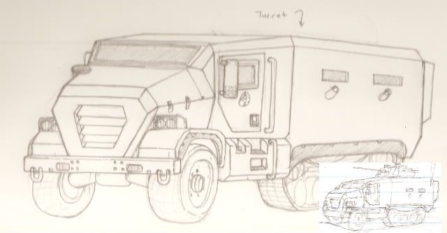
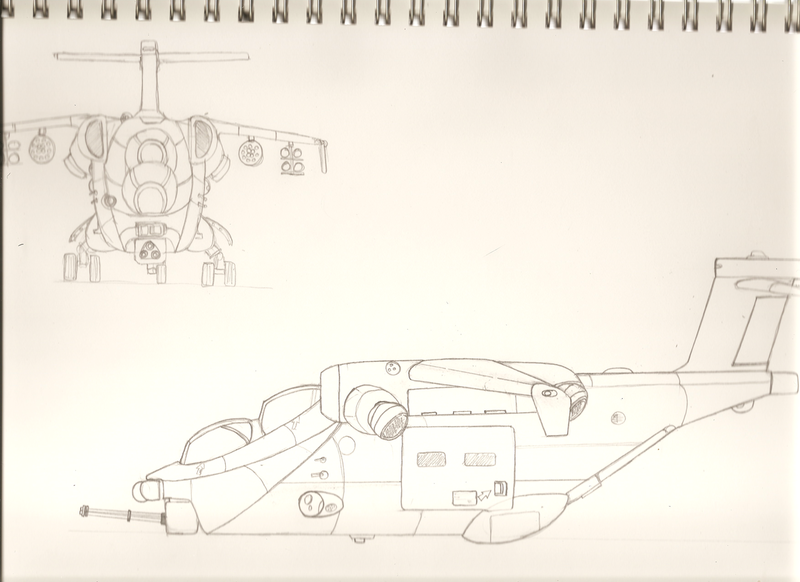
Here is a halftrack I doodled in Humanities class. I worked on it a bit after I got home. I was trying to make a huge halftrack MRAP...a "masstrack" if you will. I don't think it's beefy enough.
The top left one is definitely the superior choice for the reasons that have already been mentioned, although I do have a certain fondness for the evil-looking hand clutching the world (maybe they can use it on their internal memos?)
"America is impossible to conquer. There are too many gas stations and too many empty coca-cola bottles there." -Gregory Zhukov
"Whoever said the pen is mightier than the sword obviously never encountered automatic weapons." -Douglas MacArthur
Big Orange wrote:I like the Steampunk/Roman-style logo you've chosen, but maybe it is a bit too elaborate for corporate branding? Corporate branding in the last 60 years is actually pretty abstract and stark.
Here is my interpretation of two of your logos I liked the most (cruddy doodling alert):
IMAGES
Some of those logos are based on fictional media: the owl emblem is for the Tyrell Corporation from Blade Runner, the "PI" lettering is for Page Industries from Deus Ex, the "T-A" brand represents Tessier-Ashpool from William Gibson's Neuromancer, and the coiled snake is of course supposed to represent COBRA from the G.I. Joe franchise.
Very cool stuff. These seem more appropriate as logos, my stuff (as was pointed out) looks more 40kish than anything else. I may try my hand at refining your doodly art. I think your doodles are is very cool.
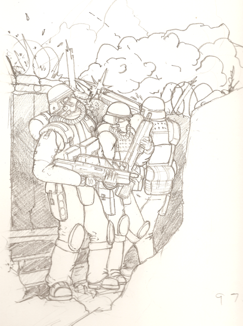
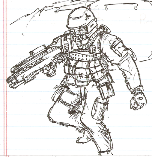
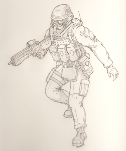
Great drawing, but I'm not so sure about the Helghast's forearms...
'Alright guard, begin the unnecessarily slow moving dipping mechanism...' - Dr. Evil
'Secondly, I don't see why "income inequality" is a bad thing. Poverty is not an injustice. There is no such thing as causes for poverty, only causes for wealth. Poverty is not a wrong, but taking money from those who have it to equalize incomes is basically theft, which is wrong.' - Typical Randroid
'I think it's gone a little bit wrong.' - The Doctor


 "
"