SDN Photo-a-Day (Rules updates - read the OP)
Moderator: Beowulf
- Bounty
- Emperor's Hand
- Posts: 10767
- Joined: 2005-01-20 08:33am
- Location: Belgium
Re: SDN Photo-a-Day
I like the swan shot. It's very serene. Any particular reason why you shot it vertical?
- DaveJB
- Jedi Council Member
- Posts: 1917
- Joined: 2003-10-06 05:37pm
- Location: Leeds, UK
Re: SDN Photo-a-Day
I think there was a big patch of that mossy weed stuff or something else that was distracting to one side of the swan, and I couldn't zoom in any further, so I had to change to portrait orientation in order to crop it out.
Either way, I'm going to make sure I invest in some decent film next time I try out something like this - I'm also considering picking up one of the EOS 1N models floating around on eBay, though that depends on me being able to get a decent price for one.
Either way, I'm going to make sure I invest in some decent film next time I try out something like this - I'm also considering picking up one of the EOS 1N models floating around on eBay, though that depends on me being able to get a decent price for one.
- phongn
- Rebel Leader
- Posts: 18487
- Joined: 2002-07-03 11:11pm
- The Grim Squeaker
- Emperor's Hand
- Posts: 10319
- Joined: 2005-06-01 01:44am
- Location: A different time-space Continuum
- Contact:
Re: SDN Photo-a-Day
Phongn: Both night shots are good, just different styles.
Country club shot:


Weakass Bokeh, but whatever. (I didn't notice that beforehand anyway).
Country club shot:


Weakass Bokeh, but whatever. (I didn't notice that beforehand anyway).
Photography
Genius is always allowed some leeway, once the hammer has been pried from its hands and the blood has been cleaned up.
To improve is to change; to be perfect is to change often.
Genius is always allowed some leeway, once the hammer has been pried from its hands and the blood has been cleaned up.
To improve is to change; to be perfect is to change often.
- Bounty
- Emperor's Hand
- Posts: 10767
- Joined: 2005-01-20 08:33am
- Location: Belgium
Re: SDN Photo-a-Day
I'd crop out some of the sky before I'd crop out the foreground. If the source image is big enough I'd even put it into landscape format and make the skyscrapers the focus of the image, not the clouds. But that's just my personal preference.Phongn wrote:A cropped view from my apartment ... not if removing some of the nearby buildings make this better or worse, though:
I've found out today that 4LR44 means one 4LR44 battery, not four LR44 batteries. Thankfully you can apparently make one 4LR44 battery out of 4 LR44 batteries, some paper, sticky tape and a metal hex nut
- The Grim Squeaker
- Emperor's Hand
- Posts: 10319
- Joined: 2005-06-01 01:44am
- Location: A different time-space Continuum
- Contact:
Re: SDN Photo-a-Day
Photography
Genius is always allowed some leeway, once the hammer has been pried from its hands and the blood has been cleaned up.
To improve is to change; to be perfect is to change often.
Genius is always allowed some leeway, once the hammer has been pried from its hands and the blood has been cleaned up.
To improve is to change; to be perfect is to change often.
- aerius
- Charismatic Cult Leader
- Posts: 14810
- Joined: 2002-08-18 07:27pm
Re: SDN Photo-a-Day
Is it real, or is it Photoshop?


Lusankya: Deal!
Say, do you want it to be a threesome with your wife? Or a foursome with your wife and sister-in-law? I'm up for either.
- The Grim Squeaker
- Emperor's Hand
- Posts: 10319
- Joined: 2005-06-01 01:44am
- Location: A different time-space Continuum
- Contact:
Re: SDN Photo-a-Day
The Bokeh blur? Hard to tell as it depends on the lens used, but offhand i'd guess photoshop since the even blur looks like the one Bounty had,
Photography
Genius is always allowed some leeway, once the hammer has been pried from its hands and the blood has been cleaned up.
To improve is to change; to be perfect is to change often.
Genius is always allowed some leeway, once the hammer has been pried from its hands and the blood has been cleaned up.
To improve is to change; to be perfect is to change often.
- Bounty
- Emperor's Hand
- Posts: 10767
- Joined: 2005-01-20 08:33am
- Location: Belgium
Re: SDN Photo-a-Day
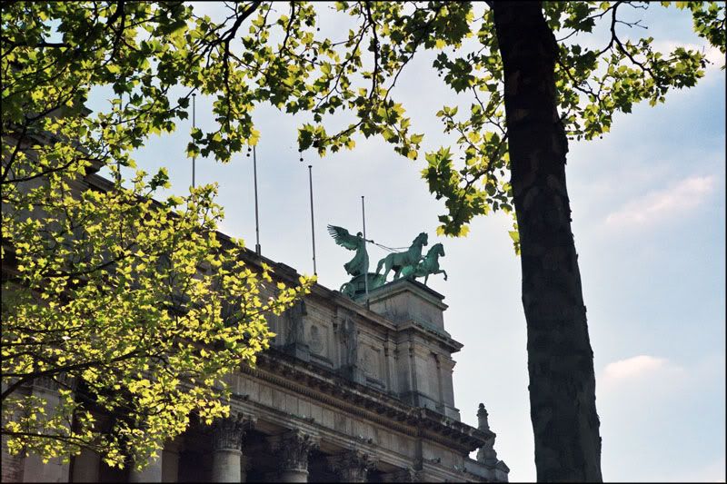
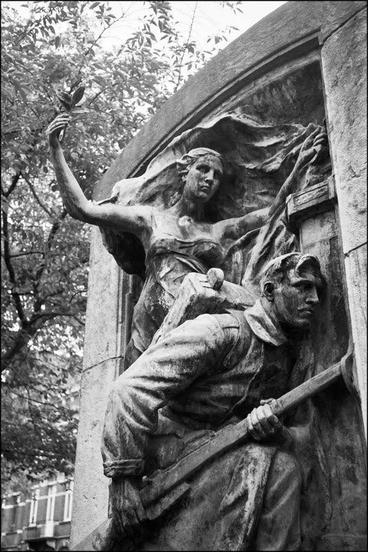
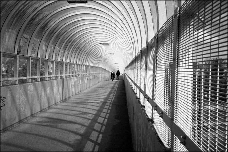
I guess I found out why people like the 35RC. It's not just a joy to use, the semi-automatic mode is pretty much dead-on ever after 35 years and with a not-quite-kosher battery.


- aerius
- Charismatic Cult Leader
- Posts: 14810
- Joined: 2002-08-18 07:27pm
Re: SDN Photo-a-Day
There is no bokeh, as there's no bright spots in the out of focus areas to create one. Also, look closer, it's not an even blur.DEATH wrote:The Bokeh blur?
Love the final shot in this set. It looks good as it is, but I think there's more potential in this picture with a bit of cropping and contrast adjustments.Bounty wrote:I guess I found out why people like the 35RC. It's not just a joy to use, the semi-automatic mode is pretty much dead-on ever after 35 years and with a not-quite-kosher battery.

Lusankya: Deal!
Say, do you want it to be a threesome with your wife? Or a foursome with your wife and sister-in-law? I'm up for either.
- phongn
- Rebel Leader
- Posts: 18487
- Joined: 2002-07-03 11:11pm
Re: SDN Photo-a-Day
The edges of the foreground object show artifacts, too, though that might just be JPEG compression.aerius wrote:There is no bokeh, as there's no bright spots in the out of focus areas to create one. Also, look closer, it's not an even blur.
- Bounty
- Emperor's Hand
- Posts: 10767
- Joined: 2005-01-20 08:33am
- Location: Belgium
Re: SDN Photo-a-Day
Go nuts. My skills with curves and contrast are pretty much zero.Love the final shot in this set. It looks good as it is, but I think there's more potential in this picture with a bit of cropping and contrast adjustments.
I thought bokeh was just a blurry background?There is no bokeh, as there's no bright spots in the out of focus areas to create one.
- Simplicius
- Jedi Council Member
- Posts: 2031
- Joined: 2006-01-27 06:07pm
Re: SDN Photo-a-Day
I say Photoshop; I can see an outline around parts of the bell and stand.aerius wrote:Is it real, or is it Photoshop?
Nice shots there, Bounty. With the last one, I think the issue for me is that although the cyclists are very neatly centered, the perspective of the bike path is very strongly off-center, and the combination of these two things makes the photo look visually unbalanced. I think a crop that places the cyclists toward the right side of the frame makes the photo what the viewer would 'expect' to see given the perspective of the bike path. On the other hand, a crop that places the cyclists toward the left of the frame also balances the image - the perspective looks toward the right, but the visual center of the image is on the left. If you decide to try editing this one, you'll find the placement of the cyclists in the frame is the key to the impact of the final result.
- aerius
- Charismatic Cult Leader
- Posts: 14810
- Joined: 2002-08-18 07:27pm
Re: SDN Photo-a-Day
Yup. The masking wasn't quite perfect. With more work I could probably get pretty close, but I don't have that kind of time. Still, I'm really getting to like Photoshop's quick mask mode, and it was a nice practice for some the fixes I plan on doing in the future with some of my earlier photos which have screwed up lighting.Simplicius wrote:I say Photoshop; I can see an outline around parts of the bell and stand.

Had some fun with the curves tool, but I had to some masking to keep the shadows on the right from getting too dark. The areas which I've circled below were adjusted separately from the rest of the picture.

Bokeh. Strangely enough I've actually known about this since I was a kid from the slides my dad took on his travels, and also from how out of focus points of light showed up in scenes in movies & TV. But it was only in the last few years that I learned there was a name for this effect.Bounty wrote:I thought bokeh was just a blurry background?

Lusankya: Deal!
Say, do you want it to be a threesome with your wife? Or a foursome with your wife and sister-in-law? I'm up for either.
- J
- Kaye Elle Emenopey
- Posts: 5842
- Joined: 2002-12-14 02:23pm
Re: SDN Photo-a-Day
I've decided to go abstract.


This post is a 100% natural organic product.
The slight variations in spelling and grammar enhance its individual character and beauty and in no way are to be considered flaws or defects
I'm not sure why people choose 'To Love is to Bury' as their wedding song...It's about a murder-suicide
- Margo Timmins
When it becomes serious, you have to lie
- Jean-Claude Juncker
- J
- Kaye Elle Emenopey
- Posts: 5842
- Joined: 2002-12-14 02:23pm
Re: SDN Photo-a-Day

Duck...

Duck....duck....

Goose!!
I never realized how hard it is to get the colours on a duck right. I tried several colour settings on my camera but nothing captures the iridescent green brilliance on the duck's head & neck. I also wish I had a better angle and timing on the last picture to get the boy & the goose closer together.
This post is a 100% natural organic product.
The slight variations in spelling and grammar enhance its individual character and beauty and in no way are to be considered flaws or defects
I'm not sure why people choose 'To Love is to Bury' as their wedding song...It's about a murder-suicide
- Margo Timmins
When it becomes serious, you have to lie
- Jean-Claude Juncker
The slight variations in spelling and grammar enhance its individual character and beauty and in no way are to be considered flaws or defects
I'm not sure why people choose 'To Love is to Bury' as their wedding song...It's about a murder-suicide
- Margo Timmins
When it becomes serious, you have to lie
- Jean-Claude Juncker
- The Grim Squeaker
- Emperor's Hand
- Posts: 10319
- Joined: 2005-06-01 01:44am
- Location: A different time-space Continuum
- Contact:
Re: SDN Photo-a-Day
Gah, how much did you crop those shots? That looks like small sensor noise. (And the colours came out great, it's just a pity about the smudging).
Photography
Genius is always allowed some leeway, once the hammer has been pried from its hands and the blood has been cleaned up.
To improve is to change; to be perfect is to change often.
Genius is always allowed some leeway, once the hammer has been pried from its hands and the blood has been cleaned up.
To improve is to change; to be perfect is to change often.
- The Grim Squeaker
- Emperor's Hand
- Posts: 10319
- Joined: 2005-06-01 01:44am
- Location: A different time-space Continuum
- Contact:
Re: SDN Photo-a-Day
@Bounty - the last 2 shots are great, I don't see any need to edit them.
2 shots from today: (It turns out that reading a new and awesome book while listening to music is not conductive to getting good shots in the middle of fucking awful weather, sand, bugs and heat):
Talking of Swans:

I'll upload another one involving a duck tommorow. Alass, I took my prime lense by accident, so no zooms this time .
.
I rather like this one for some reason, it's a bit different for me:

Attempts to work on the theme of "deserted/desolation" didn't work well. (Another example tommorow). Kudos to Stas, it's harder than I thought.

2 shots from today: (It turns out that reading a new and awesome book while listening to music is not conductive to getting good shots in the middle of fucking awful weather, sand, bugs and heat):
Talking of Swans:

I'll upload another one involving a duck tommorow. Alass, I took my prime lense by accident, so no zooms this time
I rather like this one for some reason, it's a bit different for me:

Attempts to work on the theme of "deserted/desolation" didn't work well. (Another example tommorow). Kudos to Stas, it's harder than I thought.

Photography
Genius is always allowed some leeway, once the hammer has been pried from its hands and the blood has been cleaned up.
To improve is to change; to be perfect is to change often.
Genius is always allowed some leeway, once the hammer has been pried from its hands and the blood has been cleaned up.
To improve is to change; to be perfect is to change often.
- Simplicius
- Jedi Council Member
- Posts: 2031
- Joined: 2006-01-27 06:07pm
Re: SDN Photo-a-Day
There's way too much in this frame that isn't swan, though, and the bird itself is cruising out of the frame like it's an afterthought. This one really wants a crop.Death wrote:swan
I find myself taking a lot of photos like this one, actually - I like to look for interesting geometry, particularly in tools or machinery, and wooden boats and buildings, and try to showcase it. It's like accidental abstract art, but without the pretentious bullshit: "Because it looks neat" is the only explanation I think it needs. I make a few of these on a rail siding back in March; I'll be getting that roll back tomorrow.panels
Since the geometry is the main (or only) feature of photos like this, it's important to present it so that the shapes and patterns are strongly conveyed. Yours is a little crooked and off-center; you might care to straighten and crop it so the photo is symmetrical about the four lines of reflection, or find some other way to spruce it up. This kind of photography is essentially still-life, so you want to make sure it looks deliberate.
Lighting is a large part of setting the mood of a photo. Another large part is the story that the subject(s) tell through their appearance and demeanor. Here, we have a kind of sunny day and a clean and well-maintained playground, which doesn't suggest desertion, while the frame is still quite populated, albeit not with people, which makes the scene look close and cozy rather than open and desolate.playground
- J
- Kaye Elle Emenopey
- Posts: 5842
- Joined: 2002-12-14 02:23pm
Re: SDN Photo-a-Day
A lot. Some of it might be noise, but most of it is bad reflections from the water and water droplets flying off the ducks when they flapped their wings. The goose picture blurred a bit since the subjects were running arount at speed and I barely had time to bring the camera up to snap a picture so I forgot to pan the camera along the direction of motion. The autofocus may be off as well.DEATH wrote:Gah, how much did you crop those shots? That looks like small sensor noise.
No, the colours are pretty poor. Trust me on this, with the sun reflecting off the ducks' heads, the colour was super super bright and rich, it was as if someone was shining a bright blue-green laser on the ducks' heads & necks.(And the colours came out great, it's just a pity about the smudging).
This post is a 100% natural organic product.
The slight variations in spelling and grammar enhance its individual character and beauty and in no way are to be considered flaws or defects
I'm not sure why people choose 'To Love is to Bury' as their wedding song...It's about a murder-suicide
- Margo Timmins
When it becomes serious, you have to lie
- Jean-Claude Juncker
The slight variations in spelling and grammar enhance its individual character and beauty and in no way are to be considered flaws or defects
I'm not sure why people choose 'To Love is to Bury' as their wedding song...It's about a murder-suicide
- Margo Timmins
When it becomes serious, you have to lie
- Jean-Claude Juncker
- The Grim Squeaker
- Emperor's Hand
- Posts: 10319
- Joined: 2005-06-01 01:44am
- Location: A different time-space Continuum
- Contact:
Re: SDN Photo-a-Day
I chose this composition deliberately, I've been playing with "portraits" involving a full body, wide angle lens, subject near the bottom of the frame, this past week.Simplicius wrote:There's way too much in this frame that isn't swan, though, and the bird itself is cruising out of the frame like it's an afterthought. This one really wants a crop.Death wrote:swan
Still, it doesn't work as well as the version of the shot with just water + rock in it.
Cool.I find myself taking a lot of photos like this one, actually - I like to look for interesting geometry, particularly in tools or machinery, and wooden boats and buildings, and try to showcase it. It's like accidental abstract art, but without the pretentious bullshit: "Because it looks neat" is the only explanation I think it needs. I make a few of these on a rail siding back in March; I'll be getting that roll back tomorrow.panels
Yeah, on a review it would look better straightened up as you said, I'll pass on the off kilter look next time.Since the geometry is the main (or only) feature of photos like this, it's important to present it so that the shapes and patterns are strongly conveyed. Yours is a little crooked and off-center; you might care to straighten and crop it so the photo is symmetrical about the four lines of reflection, or find some other way to spruce it up. This kind of photography is essentially still-life, so you want to make sure it looks deliberate.
Hmmm. So, underexposing at an hour of the day where there would be less light then, maybe... Eh, I should have just "stolen some kids doll, dipped it in acid, chipped it and left it there for the shot" tm. (All rights reserved).Lighting is a large part of setting the mood of a photo. Another large part is the story that the subject(s) tell through their appearance and demeanor. Here, we have a kind of sunny day and a clean and well-maintained playground, which doesn't suggest desertion, while the frame is still quite populated, albeit not with people, which makes the scene look close and cozy rather than open and desolate.playground
It doesn't look like the water droplets affected it, I was talking about the noise and smudging of the water (Where it's more evident), let alone the poor fowl!J wrote:
A lot. Some of it might be noise, but most of it is bad reflections from the water and water droplets flying off the ducks when they flapped their wings.
Your main problem seems to be simple image quality, how old is your camera? Less than ~4 years and maybe it's just wonky AF or an overly high ISO on a body meant to bear it.
Huh, I usually get excellent colours from my old shots of ducks.J wrote: No, the colours are pretty poor. Trust me on this, with the sun reflecting off the ducks' heads, the colour was super super bright and rich, it was as if someone was shining a bright blue-green laser on the ducks' heads & necks.
Photography
Genius is always allowed some leeway, once the hammer has been pried from its hands and the blood has been cleaned up.
To improve is to change; to be perfect is to change often.
Genius is always allowed some leeway, once the hammer has been pried from its hands and the blood has been cleaned up.
To improve is to change; to be perfect is to change often.
- The Grim Squeaker
- Emperor's Hand
- Posts: 10319
- Joined: 2005-06-01 01:44am
- Location: A different time-space Continuum
- Contact:
Re: SDN Photo-a-Day
Bee! (Well, Wasp). Taken during the summer in Raanana park. (With the 18-200 Sigma).

Yeah, I owe S.T.A.L.K.E.R licensing fees .
.

I tried to take a shot with the full frame inside the "frame", but I couldn't get higher and shooting with my hand holding the camera yielded this as the best result.

Damn lack of magnification or minimum focus range on my lenses!

Yeah, I owe S.T.A.L.K.E.R licensing fees

I tried to take a shot with the full frame inside the "frame", but I couldn't get higher and shooting with my hand holding the camera yielded this as the best result.

Damn lack of magnification or minimum focus range on my lenses!
Photography
Genius is always allowed some leeway, once the hammer has been pried from its hands and the blood has been cleaned up.
To improve is to change; to be perfect is to change often.
Genius is always allowed some leeway, once the hammer has been pried from its hands and the blood has been cleaned up.
To improve is to change; to be perfect is to change often.
- J
- Kaye Elle Emenopey
- Posts: 5842
- Joined: 2002-12-14 02:23pm
Re: SDN Photo-a-Day
With black & white photography that's a possibility with the right filters, in colour, that's a recipe for really bad colours. I think you just need to wait for the right time day & the right lighting conditions for the picture, maybe late evening right before the sun goes down on an overcast or hazy day, or possibly in the dark clouds right before a thunderstorm.DEATH wrote:Hmmm. So, underexposing at an hour of the day where there would be less light then, maybe...Simplicius wrote:Lighting is a large part of setting the mood of a photo. Another large part is the story that the subject(s) tell through their appearance and demeanor. Here, we have a kind of sunny day and a clean and well-maintained playground, which doesn't suggest desertion, while the frame is still quite populated, albeit not with people, which makes the scene look close and cozy rather than open and desolate.
This post is a 100% natural organic product.
The slight variations in spelling and grammar enhance its individual character and beauty and in no way are to be considered flaws or defects
I'm not sure why people choose 'To Love is to Bury' as their wedding song...It's about a murder-suicide
- Margo Timmins
When it becomes serious, you have to lie
- Jean-Claude Juncker
The slight variations in spelling and grammar enhance its individual character and beauty and in no way are to be considered flaws or defects
I'm not sure why people choose 'To Love is to Bury' as their wedding song...It's about a murder-suicide
- Margo Timmins
When it becomes serious, you have to lie
- Jean-Claude Juncker
- phongn
- Rebel Leader
- Posts: 18487
- Joined: 2002-07-03 11:11pm
- The Grim Squeaker
- Emperor's Hand
- Posts: 10319
- Joined: 2005-06-01 01:44am
- Location: A different time-space Continuum
- Contact:
Re: SDN Photo-a-Day
Phong, the second picture is really nice, very idyllic and nice sky. The bottom might benefit from being cropped out theough (some brush on the right and left).
I might be imagining it, but it looks a bit unstraight to me.
I might be imagining it, but it looks a bit unstraight to me.
Photography
Genius is always allowed some leeway, once the hammer has been pried from its hands and the blood has been cleaned up.
To improve is to change; to be perfect is to change often.
Genius is always allowed some leeway, once the hammer has been pried from its hands and the blood has been cleaned up.
To improve is to change; to be perfect is to change often.


