Photoshoot Modelling session Photos [NF56K]

AMP: sci-fi art, regular art, pictures, photos, comics, music, etc.

Moderator: Beowulf

Post Reply
User avatar
The Grim Squeaker
Emperor's Hand
Posts: 10315
Joined: 2005-06-01 01:44am
Location: A different time-space Continuum
Contact:

Photoshoot Modelling session Photos [NF56K]

Post by The Grim Squeaker »

I met a bunch of female photographers and a model or two over the weekend and we had some fun photographing each other :). (In Tel aviv's Yehushua garden).
A few select photos follow:

Starting off with one of the male models:
Select
Image
Select-1
Image
Select-2
Image
Select-3
Image
Kung Fu action!
Select-4
Image
Select-5
Image
Select-6
Image

Lookit the size of his chest!
Select-7
Image
Select-8
Image
Select-9
Image
Select-10
Image
This shot came out Really well (composition, angle, lines/directions wise):
Select-11
Image
Select-12
Image
Select-13
Image

Might I suggest a new category for the SDN monthly photo challenge?
"Colour photo that looks like a BW/Sepia shot"
Select-14
Image

Man nipples.
Select-15
Image
Select-16
Image
Select-17
Image
I took way too many photos of photographers taking pictures :D.
Select-18
Image
Select-19
Image
Select-20
Image


a quickr pickr post
Photography
Genius is always allowed some leeway, once the hammer has been pried from its hands and the blood has been cleaned up.
To improve is to change; to be perfect is to change often.
User avatar
Simplicius
Jedi Council Member
Posts: 2031
Joined: 2006-01-27 06:07pm

Re: Photoshoot Modelling session Photos [NF56K]

Post by Simplicius »

Should have grabbed it sooner - Einhander, Crossroads, your posts have been Barrelled for being off-topic for AMP. Death, yours too because it was a part of the tangent.
User avatar
Simplicius
Jedi Council Member
Posts: 2031
Joined: 2006-01-27 06:07pm

Re: Photoshoot Modelling session Photos [NF56K]

Post by Simplicius »

Comment:

For starters, I especially don't care for studio-type work done in plain-Jane daylight. I can't quite put my finger on why, and it's not a critical reflection because of the circumstances under which these photos were taken, but it just doesn't look right. Maybe it's got something to do with setting up a formal pose in an arbitrary lighting regime, and one that is rather plain at that. The light makes the photos prosaic and the shadows get in the way, or something.

Thus, a lot of these that might have looked decent in a studio setup don't look all that great with the lighting they've got.
Select
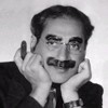
You handled the pose pretty well. Needs some fill lighting to control the shadows, especially those on his face.
Select-1
It doesn't work well as a portrait (doesn't really showcase the person) or as a formal (no emphasis on form), and those facial shadows are really harsh. You've lost both his eyes.
Select-2
I feel that the lighting as it is flattens the hand, arm, and torso too much.
Select-3
More flattening (not flattering) lighting. Another disadvantages of not doing this in a studio: clothes/props/settings should work with the poses for a unified impression. The pose suggests grace, the clunky shoes and plain old clothes don't. Form and figure being the main element of the shot, the background happens to distract from it with the haphazard detail in the grass and the chunky horizon line. Better to have a sweep or a deliberate set.
Select-4, Select-5
Two more where the lighting and background just aren't right. The big old shadows blasting across the model don't contribute to the picture, and the background really takes away (especially in the second one, with all that fiddly detail in the plants).
Select-6
Finally, a shot where the lighting at least highlights form instead of just shining across it randomly! The background still doesn't help, though. If you don't use a sweep to remove everything but the subject's form from the photo, another approach is to integrate that form with the background, e.g. by mimicking another significant shape in the scene.
Select-8, Select-9
Flat lighting again. You've also got the background brighter than the model in -9, which steals attention from her face. I'd quibble with the posing and framing in these as well; there could be a much stronger compositional connection between the two models. If you had any directorial input during this shoot - and I don't see why you would not have - it would have been a good opportunity to ask them to make small alterations in the pose for better effect and framing.
Select-10, Select-11
Where you have selective lighting, you have a very easy way to emphasize certain things, be they faces, shapes, or details. In this case what is being emphasized is random parts of the frame, which does nothing for the photo. Even using 'found' lighting, you have to make it work for you however you can instead of just accepting it.
Select-12
Much better. A respectable portrait at least.
Select-13
The most interesting parts of the photo are the fellow's face and arm, as his chest and the sky behind him are plain expanses. In light of that, I feel you gave his face short shrift when you framed it; this is another instance where some directoring would have been helpful.
Select-14
Nice. The texture of the water is well-represented. A little more space above the long plants might be good, though.
Select-15
With much different and more deliberate lighting and without the ring, it would be possible to make a shot like this that I'd find interesting. This one just gets a colossal "Meh" from me; it's far too straightforward to be an abstract body shot.
Select-16
Get some fill light from the right side and then expose a little less so the sunlit part of her face isn't so bright. Also, it would be nice if her eyes were either more open or totally closed.
Select-17
A respectable portrait. The lighting could be better, but at least what you had was workable.
Select-18
If you're going to include the photographer, he should be included in a more definite way. There's little enough here that the shot almost looks like a misfire.
Select-19
Best of the bunch. The lighting is decent and the shape of the hand and foot and the interaction between them is well-caught. The only thing I don't like is the triangle of shadow under the foot, because it looks like like a gray mush instead of a full shadow or an unshadowed wood surface. The foot and table merge there in a rather ugly way, and I think it would be better if the two were kept more distinct. Controlled lighting would have been useful.
Select-20
This one is kind of plain to be a decent portrait, and that arm could have been excluded (or included) in a much better way than it was.
User avatar
The Grim Squeaker
Emperor's Hand
Posts: 10315
Joined: 2005-06-01 01:44am
Location: A different time-space Continuum
Contact:

Re: Photoshoot Modelling session Photos [NF56K]

Post by The Grim Squeaker »

Simplicius wrote:Comment:

For starters, I especially don't care for studio-type work done in plain-Jane daylight. I can't quite put my finger on why, and it's not a critical reflection because of the circumstances under which these photos were taken, but it just doesn't look right. Maybe it's got something to do with setting up a formal pose in an arbitrary lighting regime, and one that is rather plain at that. The light makes the photos prosaic and the shadows get in the way, or something.
The main problem is harsh light (especially in the last shoot I did, the one with a single girl), and at times an overly cluttered background.
Still, I'm not going to buy or build a studio anytime soon, any I like improvizing, it suits my haphazard style well. (Though I know I really should work more on careful, formal planning).
Thus, a lot of these that might have looked decent in a studio setup don't look all that great with the lighting they've got.
I actually don't really agree with this point of your criticism, but I don't see myself using a studio to repeat those shots anytime soon, so it'll remain theoretical :0.
Select-13
The most interesting parts of the photo are the fellow's face and arm, as his chest and the sky behind him are plain expanses. In light of that, I feel you gave his face short shrift when you framed it; this is another instance where some directoring would have been helpful.
I was working on framing his chest and arms well, I didn't pay attention to his expression until later. A shame. (I agree with you that it could have used a tighter and closer composition. I was feeling a bit lazy about switching back from my 70-300mm lens to something a bit wider)
Select-14
Nice. The texture of the water is well-represented. A little more space above the long plants might be good, though.
I actually have a subsequent shot that does exactly that. (horizontal framing from a half hour after).
I'll see if I remember to upload it.
Select-18
If you're going to include the photographer, he should be included in a more definite way. There's little enough here that the shot almost looks like a misfire.
I like the less than 1/3 composition here, it looks a bit different than the dozens of "Here's a picture of another camera's lcd screen taking a shot". Still, maybe a bit more would have framed him better.
(He wasn't very cooperative. Kept asking if i'd mind going away so he could work alone on the girl. Very suspicious :P).
Select-19
Best of the bunch. The lighting is decent and the shape of the hand and foot and the interaction between them is well-caught. The only thing I don't like is the triangle of shadow under the foot, because it looks like like a gray mush instead of a full shadow or an unshadowed wood surface. The foot and table merge there in a rather ugly way, and I think it would be better if the two were kept more distinct. Controlled lighting would have been useful.
I thought you'd like that. (I had you & someone like you in mind, believe it or not) :P. The main flaw was a lack of lighting. I tried to talk her into dipping her feet above the water, but the water is, well, mildly toxic :P.

Thanks for the critique/feedback :).
(You'll pardon me for not answering all your comments, I don't have something fresh to add/argue/retort/elucidate to everything :P).
Photography
Genius is always allowed some leeway, once the hammer has been pried from its hands and the blood has been cleaned up.
To improve is to change; to be perfect is to change often.
User avatar
Bounty
Emperor's Hand
Posts: 10767
Joined: 2005-01-20 08:33am
Location: Belgium

Re: Photoshoot Modelling session Photos [NF56K]

Post by Bounty »

I'm not qualified to comment on technical aspects, but there's something very harsh about the shots you make. They are very in-your-face and confrontational, and not in what I feel is a good way. I don't really know how to explain it - with people shots I suppose I always subconsciously expect to them be either close and personal, with the subject interacting with the photographer, or distant, with the photographer just registering. These fall in a very uncomfortable spot in-between.

Stop me if I ramble.
User avatar
The Grim Squeaker
Emperor's Hand
Posts: 10315
Joined: 2005-06-01 01:44am
Location: A different time-space Continuum
Contact:

Re: Photoshoot Modelling session Photos [NF56K]

Post by The Grim Squeaker »

TheMuffinKing wrote:Very hot, if my wife sees these, there's no way I'll be allowed to go to Israel.
That would be a better coment on one of my other photo/model threads. Seeing as how the girls in this one are ages 15 & 17 respectively :P.
Bounty wrote:I'm not qualified to comment on technical aspects, but there's something very harsh about the shots you make. They are very in-your-face and confrontational, and not in what I feel is a good way. I don't really know how to explain it - with people shots I suppose I always subconsciously expect to them be either close and personal, with the subject interacting with the photographer, or distant, with the photographer just registering. These fall in a very uncomfortable spot in-between.

Stop me if I ramble.
Like I elaborated via PM - it's part and parcel of the whole problem with my neurology. It affects my art, not just my brain, perception and social behavior/view/worldview.
Photography
Genius is always allowed some leeway, once the hammer has been pried from its hands and the blood has been cleaned up.
To improve is to change; to be perfect is to change often.
User avatar
Simplicius
Jedi Council Member
Posts: 2031
Joined: 2006-01-27 06:07pm

Re: Photoshoot Modelling session Photos [NF56K]

Post by Simplicius »

MuffinKing's "oh so hot" one-liner has been Barreled.
User avatar
TheMuffinKing
Jedi Council Member
Posts: 2368
Joined: 2005-07-04 03:34am
Location: Ultima ratio regum
Contact:

Re: Photoshoot Modelling session Photos [NF56K]

Post by TheMuffinKing »

I think these are well shot photos, but I have no real photography experience.

What do you mean by barreled?
Image
User avatar
Darth Wong
Sith Lord
Sith Lord
Posts: 70028
Joined: 2002-07-03 12:25am
Location: Toronto, Canada
Contact:

Re: Photoshoot Modelling session Photos [NF56K]

Post by Darth Wong »

I have to concur with Simplicius. There's something odd about unnaturally posed studio-style pictures in a natural setting. Call it congitive dissonance: I expect pictures in a natural setting to feature people who also look natural.

Also, the first two pictures (Select and Select-1) look creepy to me, but maybe that's just because the guy looks creepy.
Image
"It's not evil for God to do it. Or for someone to do it at God's command."- Jonathan Boyd on baby-killing

"you guys are fascinated with the use of those "rules of logic" to the extent that you don't really want to discussus anything."- GC

"I do not believe Russian Roulette is a stupid act" - Embracer of Darkness

"Viagra commercials appear to save lives" - tharkûn on US health care.

http://www.stardestroyer.net/Mike/RantMode/Blurbs.html
User avatar
Sarevok
The Fearless One
Posts: 10681
Joined: 2002-12-24 07:29am
Location: The Covenants last and final line of defense

Re: Photoshoot Modelling session Photos [NF56K]

Post by Sarevok »

I dont know how to describe it but you are not very good taking pictures of people. I have seen your various photography threads where you post pictures from around the world. And i liked your take on buildings, scenary, cities etc. You captured places as they appeared on the camera without silly artistic flair. I liked the ordinary tourist eye point of view of various places worldwide. That was really great. In contrast setting up aritifical photoshoots seem stale and medicore.
I have to tell you something everything I wrote above is a lie.
User avatar
Big Orange
Emperor's Hand
Posts: 7105
Joined: 2006-04-22 05:15pm
Location: Britain

Re: Photoshoot Modelling session Photos [NF56K]

Post by Big Orange »

I'm not so sure about the nipple piecing. :shock:
'Alright guard, begin the unnecessarily slow moving dipping mechanism...' - Dr. Evil

'Secondly, I don't see why "income inequality" is a bad thing. Poverty is not an injustice. There is no such thing as causes for poverty, only causes for wealth. Poverty is not a wrong, but taking money from those who have it to equalize incomes is basically theft, which is wrong.' - Typical Randroid

'I think it's gone a little bit wrong.' - The Doctor
User avatar
loomer
Sith Marauder
Posts: 4260
Joined: 2005-11-20 07:57am

Re: Photoshoot Modelling session Photos [NF56K]

Post by loomer »

TheMuffinKing wrote:I think these are well shot photos, but I have no real photography experience.

What do you mean by barreled?
Bottom of the barrel - it's where shit posts get sent. check the HoS.

On topic, though.

I really like the shot of the reeds and the water, Death. Did you set up deliberately for the sort of sepia feel to it, or did that just come out luckily?
"Doctors keep their scalpels and other instruments handy, for emergencies. Keep your philosophy ready too—ready to understand heaven and earth. In everything you do, even the smallest thing, remember the chain that links them. Nothing earthly succeeds by ignoring heaven, nothing heavenly by ignoring the earth." M.A.A.A
User avatar
The Grim Squeaker
Emperor's Hand
Posts: 10315
Joined: 2005-06-01 01:44am
Location: A different time-space Continuum
Contact:

Re: Photoshoot Modelling session Photos [NF56K]

Post by The Grim Squeaker »

loomer wrote:
I really like the shot of the reeds and the water, Death. Did you set up deliberately for the sort of sepia feel to it, or did that just come out luckily?
Black and white feel actually, and yes, I did :). The extreme contrast and burning was obvious, I just worked with it. (in between shoots)
Photography
Genius is always allowed some leeway, once the hammer has been pried from its hands and the blood has been cleaned up.
To improve is to change; to be perfect is to change often.
Post Reply