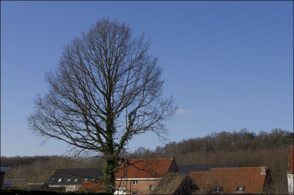
Sort of...I guess...when I shot Velvia it was in the style of Ken Rockwell, I chose subjects for maximum contrast and saturation, some of my slides are even richer and more saturated than that, I'm hoping the scans can get fairly close to the colours I'm seeing on film. We're currently researching and comparing various scanning services in my city, there's quite a few of them but few promising leads, they're mostly of either questionable quality or "do you really expect me to spend $250 to scan two dozen slides? Seriously? Get out!"Marcus Aurelius wrote:Here's some faux Velvia, although getting the sky as blue as the real thing would have required some work. This is just a straight saturation increase:
Anyway, I've now moved onto the Ektar 100 project, we were thinking about black & white but the prices were absurd if we wanted to make prints, like, even worse than the above for scanning slides. Yeah, no thanks, maybe if I were a large format fine arts photographer. Which I'm not.
So Ektar 100, I've read all kinds of conflicting reports about the colour, some say it's great while others complain it's too magenta and contrasty. An image search showed examples of everything, Ektar 100 was all over the place and there was no "signature" if you will to the film. Confusing. Well, it turns out there's a reason for it, through adjusting the exposure it's possible to get all kinds of looks to the film. So I now have a film which can be adjusted from soft portrait colours to cartoonish circus colours. Take that, digital! Hah!


