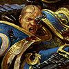


MOO2 Race Pick Screen. Simple, just had to move the cursor over
the button to pick a race to see their pic and specials...

MOO3 Race Pick Screen. Despite being at a higher resolution (800x600 vs 640 x 480), the MOO3 pick screen is a nightmarish mess of hidden tabs,
and clicking.
**************

MOO2 Custom Race Pick Screen. Simple, Showed effects of picking
specials, and was contained within 1 screen.

MOO3 custom race screen. Scroll bar/click hell. Also, there are only
4-5 "specials" left. They eliminated massive amounts of specials from
MOO2.
********

MOO2 Starmap, despite being a lower resolution than MOO3, the MOO2
starmap showed the ENTIRE galaxy in one screen, and pretty good, too.

By contrast, the MOO3 Starmap requires lots and lots of scrolling across
the map to see the galaxy. Ugh.
*****

The MOO2 Planet Screen was really cool. It showed a lot of information
and gave you a visceral feel that this was YOUR planet, and you could
see small colonies grow into bustling metropolises...

The MOO3 Planet screen by contrast looks like a orbital scan from a fucking
starship, rather than a planet itself.......
In short, MOO3 is a catastrophic trainwreck of a piss poor UI that
took them THREE years to make...
Oh yeah, remember MOO2's ingenious built-in help system, that allowed
you to see exactly what that special did simply by right clicking on it?
IT'S GONE. And the Manual is a piece of shit that doesn't tell
you what the specials do..