Favorite trains
Moderator: Edi
-
RedImperator

- Roosevelt Republican
- Posts: 16465
- Joined: 2002-07-11 07:59pm
- Location: Delaware
- Contact:
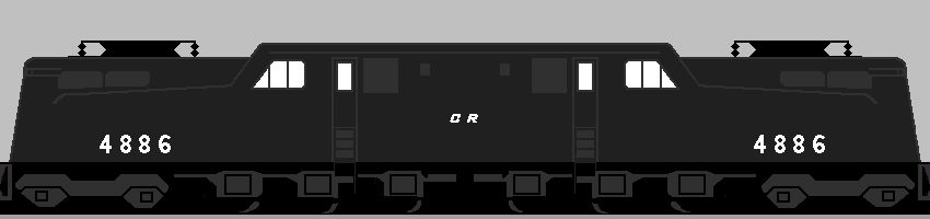
I think the fact that the GG1 wasn't especially pretty added to its charm. It managed to look good without being flashy the way the streamliners or carbody diesels were. They were tough, fast, powerful machines that are still symbolic of railroading in the Northeast. They even managed to look good in that hideous white "CR" on flat black paint paint that Conrail slapped on a lot of the units it inherited (it would have been interesting to see them in blue and white with the rainbow).

X-Ray Blues
-
Sea Skimmer

- Yankee Capitalist Air Pirate
- Posts: 37390
- Joined: 2002-07-03 11:49pm
- Location: Passchendaele City, HAB
White CR lettering on a black background? Something like this one?
http://www.spikesys.com/Bin/GG1/Paint/gg1_cr3.gif
I don't think it looks all that bad. Though if you look on the page its from, there's some redefinitions of ugly.
http://www.spikesys.com/Bin/GG1/Paint/gg1_cr3.gif
I don't think it looks all that bad. Though if you look on the page its from, there's some redefinitions of ugly.
"This cult of special forces is as sensible as to form a Royal Corps of Tree Climbers and say that no soldier who does not wear its green hat with a bunch of oak leaves stuck in it should be expected to climb a tree"
— Field Marshal William Slim 1956
— Field Marshal William Slim 1956
-
RedImperator
- Roosevelt Republican
- Posts: 16465
- Joined: 2002-07-11 07:59pm
- Location: Delaware
- Contact:
That doesn't look bad. What they actually looked like in real life was a different story. The paint jobs they got were shoddy--you could clearly make out the Penn Central markings underneath, for starters--and the black paint they used looked more like accumulated filth. Conrail inherited a few E and F units and painted them in the same scheme, where they looked even worse.Sea Skimmer wrote:White CR lettering on a black background? Something like this one?
http://www.spikesys.com/Bin/GG1/Paint/gg1_cr3.gif
I don't think it looks all that bad. Though if you look on the page its from, there's some redefinitions of ugly.
Part of the problem is that Conrail got a shitload of bag equipment and bad track that it had to either repair or replace quickly, and didn't have time for fancy paint jobs in the first few years. All their equipment looked like that in the beginning, but once they got their feet under them, they switched to the blue and white livery which, in my opinion, looked pretty good. The old stuff like the GG1s and F units never got the blue paint job and went to the scrapyard in the black and white scheme.
X-Ray Blues
