GIMP, from a source image R, C, TM, owned, belonging to, chained up in the basement of, enslaved to, gene-coded to such that it will explode if anyone but a Judge touches the handle, and soul-bound to for all eternity until the ending of days, Games WorkShop and/or its minions.
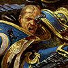
Any comments or suggestions for how to make it better? I'm not quite satisfied yet, but I'm not particularly skilled at GIMPing.
It's 106 miles to Chicago, we got a full tank of gas, half a pack of cigarettes, it's dark... and we're wearing sunglasses.
Hit it. Blank Yellow (NSFW)
You misspelled it too man. But we can do this all night
Desktop looks good Feil, but I agree that you need a more robust font... and spell checker.
It's 106 miles to Chicago, we got a full tank of gas, half a pack of cigarettes, it's dark... and we're wearing sunglasses.
Hit it. Blank Yellow (NSFW)
That's because Websters is wrong, deviant and... American.
40k is wrong and English.
I quite like the font there myself, it's a classy wallpaper.
According to wikipedia, "the Mohorovičić discontinuity is the boundary between the Earth's crust and the mantle."
According to Starbound, it's a problem solvable with enough combat drugs to turn you into the Incredible Hulk.
born in shadow wrote:Very clean and sharp, though I'll echo the comments about a beefier font. I mean, everything else in the Imperium is beefcake, why not its fonts?
-Aaron, thinking about making a sandwich
This needs to stop.
Any city gets what it admires, will pay for, and, ultimately, deserves…We want and deserve tin-can architecture in a tinhorn culture. And we will probably be judged not by the monuments we build but by those we have destroyed.--Ada Louise Huxtable, "Farewell to Penn Station", New York Times editorial, 30 October 1963 X-Ray Blues
May I suggest the font Kochfraktur instead of the Roman Capitals you have? It's very Gothic Bible-esque. Example, Latinised because I'm cool like that, but missing texturing or centering:
Kochfraktur and other Fraktur fonts
If you use one, make sure to read the directions to actually know what keys to hit to produce the extra ligatures/variant lettertypes. Oh, and probably know when to use which.
The font didn't really do it for me either. Changed it to Castellar, whaddya think?
"Death before dishonour" they say, but how much dishonour are we talking about exactly? I mean, I can handle a lot. I could fellate a smurf if the alternative was death.
- Dylan Moran
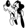
Two reasons. First, while the bird is sorta flat, there is some texture to it so I thought the font should have a bit as well. The second reason is that I just randomly tried stuff from what MS Paint has to offer and this one just hit a chord with me .
"Death before dishonour" they say, but how much dishonour are we talking about exactly? I mean, I can handle a lot. I could fellate a smurf if the alternative was death.
- Dylan Moran