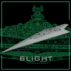
make the text a different color, e.g. white or light gray, maybe something like in mike´s logo. the text now is hard to see. it doesnt pop into your eye.
also the stardestroyer (executor?) in front of the logo needs to pop into the eye right away. it doesnt. it merges too much with the background. maybe you can place the planet in the background a bit higher so that the stardestroyer isnt on a gray background anymore but on a black one. or maybe give the sd a glow on it´s edges.
the sd´s in the background sholdn´t all be in the same size, because that looks like they´re all in the same distance which is very unlikely in space. some of them should be closer some further away.
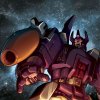
Galvatron wrote:I know it's unsolicited, but I stayed home sick today and here's what I cobbled together. Keep in mind, it's rough so don't be too harsh...
EDIT #1: Okay, by popular demand, I made it red. I may have gotten a little carried away putting Coruscant in there though...
"On the infrequent occasions when I have been called upon in a formal place to play the bongo drums, the introducer never seems to find it necessary to mention that I also do theoretical physics." -Richard Feynman
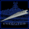
I would have to say go with the reflective flares. Executor prolly needs to be bluer. and the engine lights need to be more orange. outside of that, it fucking rocks man
Were you born with out a sense of humor or did you lose it in a tragic whoppy cushion accident? -Stormbringer
"We are well and truly forked." -Mace Windu Shatterpoint
"Either way KJA is now Dune's problem. Why can't he stop tormenting me and start writting fucking Star Trek books." -Lord Pounder
Excuse me, but at this instance in time I can see no image there. I liked it a lot, and was driven to produce the weak offering that I put up a little earlier.
But your image is missing at the moment. Please put it back.
What program did you use to produce it? I've only got Photo Editor and Paintbrush at work. (At home, I've got Paint Shop Pro 7, which is quite good.)
P.S. If you like, you could visit my Jolly Star Wars Pics site (more images on it).
Ah! That's better. I can see it now. Damn fine job! Couldn't do better myself.
Thanks to all those of you that are visiting my site (see signature). I'm always adding images. Now I've got a counter as well! Amazing how awkward some counter bots can be. The one I'm using (see site) is so simple to use that I have to give it thumbs up. Worth looking at if you have your own site.
May the Force be with you, and remain with you... always.
yay, very nice, man!
maybe one more idea. try to put a tie interceptor in a corner, very close to the viewer , so that only a small part of it can be seen, as if it´s just flying out of the cone of vision. i dont know if that´s going to look good but it might be worth a try.
just one more thing. could you, when you update the pictures post new ones, so that we can compare the update to the old pictures?
salm wrote:yay, very nice, man!
maybe one more idea. try to put a tie interceptor in a corner, very close to the viewer , so that only a small part of it can be seen, as if it´s just flying out of the cone of vision. i dont know if that´s going to look good but it might be worth a try.
just one more thing. could you, when you update the pictures post new ones, so that we can compare the update to the old pictures?
That is fucking bad ass. The Squint in the corner bothers me, but other than that, it should make even the most rabid of trekkies tremble in fear of the awesome power that is Mike Wong. LoL.
Were you born with out a sense of humor or did you lose it in a tragic whoppy cushion accident? -Stormbringer
"We are well and truly forked." -Mace Windu Shatterpoint
"Either way KJA is now Dune's problem. Why can't he stop tormenting me and start writting fucking Star Trek books." -Lord Pounder


