I've decided to finally update my banner thingy. I've got some art I want to use, but I'm not sure how to lay all the bits out and make the text decent etc. In the morning I'll post some WIPs, but in the meantime I'd like some advice.
What's the best way to block out a banner? How do you get text out of Photoshop that doesn't look like screenprinting?
Banner Help Question thingy
Moderator: Beowulf
Banner Help Question thingy
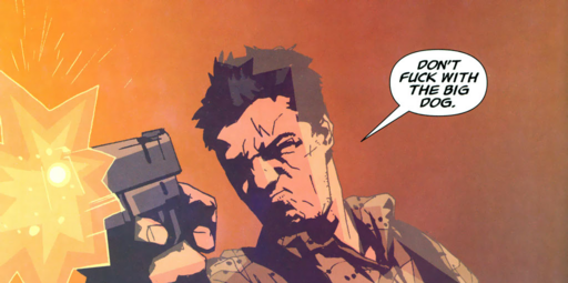
Heh. I'm not very artistic, it turns out. My current banner is pretty unimaginative, so I wanted to combine some Losers panels with the 'HAB INF' text to spruce it up a bit... but I'm not having any luck. And chopping the panels down and resizing too 100h leaves me with unreadable text. :S
So here's the two files I'm using as a source, full size:
panel
cards
I'm wearing my attempt... the text is wrong (I want rotated, read-downwards text but can't work out how to do it), I couldn't find a way to link the red with the grey in the middle, and the panel text is unreadable. I've got a pretty good idea what I want in my head, but I don't know enough Photoshop to make it.
So here's the two files I'm using as a source, full size:
panel
cards
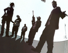
I'm wearing my attempt... the text is wrong (I want rotated, read-downwards text but can't work out how to do it), I couldn't find a way to link the red with the grey in the middle, and the panel text is unreadable. I've got a pretty good idea what I want in my head, but I don't know enough Photoshop to make it.
-
Ford Prefect

- Emperor's Hand
- Posts: 8254
- Joined: 2005-05-16 04:08am
- Location: The real number domain
Well, I don't even have photoshop, so I can't help. I asked a friend, though, who does have it and is very good with it, though it turns out he does it on instinct. His only advice was 'fiddle around with it for a few hours'. Of course, that's a few hours of your life gone and could be better spent doing something else, I suppose.
Well, that was practically a pointless post, but I just have to say this Losers comic looks cool. Very, in fact, and it happens to have passed your high standards, so it has to be good.
Well, that was practically a pointless post, but I just have to say this Losers comic looks cool. Very, in fact, and it happens to have passed your high standards, so it has to be good.
What is Project Zohar?
Here's to a certain mostly harmless nutcase.
Here's to a certain mostly harmless nutcase.
Well it's not superhero nonsense, and it's full of cool lines. 'For a revenge-driven conspiracy nut, you're pretty fucking gullible'. 
If someone can tell me how to 'rotate' Photoshop elements, that'd be nice. I want the text to be 'sideways', not 'vertical'
n l t
o i h
t k i
e s
PS, does the 'hab inf' part show up proper on the other themes? I'm using the white one, so it looks fine to me.
If someone can tell me how to 'rotate' Photoshop elements, that'd be nice. I want the text to be 'sideways', not 'vertical'
n l t
o i h
t k i
e s
PS, does the 'hab inf' part show up proper on the other themes? I'm using the white one, so it looks fine to me.
-
Ford Prefect
- Emperor's Hand
- Posts: 8254
- Joined: 2005-05-16 04:08am
- Location: The real number domain
-
Ford Prefect
- Emperor's Hand
- Posts: 8254
- Joined: 2005-05-16 04:08am
- Location: The real number domain